Strategies for dealing with Orientation Changes
[Update March 29th to add info on SupportedOrientations]
Several people have asked me what the best strategy is for dealing with portrait and landscape layouts in the same page, and really the answer depends on what kind of content you have, how you want it to behave when it’s laid out, etc.
So today’s post brings you not one, not two, but three different ways of dealing with orientation changes in Windows Phone 7 Silverlight applications (XNA applications typically won’t deal with orientation changes, being hard-coded to either portrait or landscape).
Opting in to multiple orientations is easy: you just set the SupportedOrientations property of your PhoneApplicationPage to PortraitOrLandscape, either in XAML or in code. Since orientation is a page-level property, different pages in your application can have different orientations and the system will make sure each page displasy correctly.
Putting your head in the sand
First, there’s the “non-way” of dealing with orientation: just ignore it. By default, when you create a new page in Visual Studio you get to choose if it is Portrait-only or Landscape-only, and if you want your page fixed in that orientation there’s nothing more to do. (Note that the default page created with the New Project template opts you in for both orientations, but you can delete that code from MainPage.xaml.cs if you like).
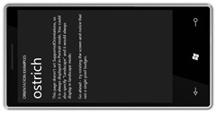
If you set your application to only support one orientation and the user rotates the device, they will see something like the image below, and hopefully they’ll rotate it back again!. In the demo code this is called “ostrich” mode because you’re just ignoring the change (which is perfectly fine, by the way!)
Auto-sizing and Scrolling
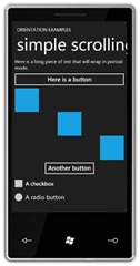
One of the simplest ways of supporting multiple orientations (and screen sizes) is simply to rely on the automatic layout of StackPanel in conjunction with a ScrollViewer. If you are showing information in a list, or just have different controls that appear one after the other, this is a great way to get simple support (almost) for free. Here’s the simple layout in portrait:
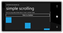
And in landscape:
Note how the content just flows to the width of the device and a scroll indicator appears in the landscape mode, letting the user know there is more content below. The XAML for this is really simple (I’ve removed extraneous stuff) and there is no code required:<ScrollViewer>
<!--Remember to give things a background -->
<StackPanel Background="{StaticResource PhoneBackgroundBrush}">
<TextBlock TextWrapping="Wrap" />
<Button />
<Rectangle HorizontalAlignment="Left" />
<Rectangle HorizontalAlignment="Center" />
<Rectangle HorizontalAlignment="Right" />
<Button HorizontalAlignment="Center"/>
<CheckBox />
<RadioButton />
</StackPanel>
</ScrollViewer>
Simple horizontal and vertical layouts
The next easiest way is to use a Grid to change the way your page lays out in each orientation. For those of you familiar with Outlook (or probably any other modern e-mail client), this is like switching the reading pane from the bottom of the screen to the right of the screen.
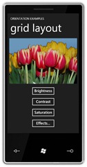
Here’s what our sample looks like in portrait mode:
And in landscape:
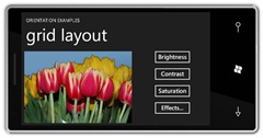
Note that the buttons have moved from being on the bottom of the screen to being on the right-hand side of the screen.
Again, the XAML and code are pretty simple. Basically we divide the screen up into 4 cells (two rows and two columns) and then change which cell the buttons end up in (the image is always in the top-left cell).
Here’s the pertinent XAML, which lays out the screen in portrait mode:
<!--Use a 2x2 grid and change the position of the buttons when the orientation changes (see code)—>
<Grid>
<Grid.RowDefinitions>
<RowDefinition Height="Auto"/>
<RowDefinition Height="*"/>
</Grid.RowDefinitions>
<Grid.ColumnDefinitions>
<ColumnDefinition Width="Auto"/>
<ColumnDefinition Width="*"/>
</Grid.ColumnDefinitions>
<!--Image is always in the top-left corner—>
<Image Grid.Row="0" Grid.Column="0" />
<!--Buttons start in the bottom-left, but will move to top-right in landscape—>
<StackPanel Grid.Row="1" Grid.Column="0">
<Button Content="Brightness" />
<Button Content="Contrast" />
<Button Content="Saturation" />
<Button Content="Effects..." />
</StackPanel>
</Grid>
And the code, which simply changes the location of the buttons in landscape mode (and is triggered by the OrientationChanged event):
private
void OnOrientationChanged(object sender, OrientationChangedEventArgs e)
{
// Switch the position of the buttons.
if ((e.Orientation & PageOrientation.Portrait) == PageOrientation.Portrait)
{
Grid.SetRow(buttons, 1);
Grid.SetColumn(buttons, 0);
}
else
{
Grid.SetRow(buttons, 0);
Grid.SetColumn(buttons, 1);
}
}
Using Visual States
The final mechanism we’ll use is to set up different visual states for each of the orientations. Whilst the previous two methods have been relatively generic and should work for many different types of content, visual states are probably most useful when you have very specific layouts you want to use, and the content you will be displaying is of a known, fixed size. It’s certainly possible to use visual states with arbitrary content, but you may end up having to do a lot of manual fix-ups to your states, especially if you want smooth animations (as in this example).
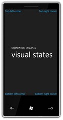
For this example, we’re going to use visual states to move four TextBlocks around the screen so that they anchor to the physical corners of the device, rather than the logical corners of the display. Here’s what it looks like in portrait:
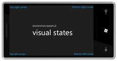
And in landscape:
Note that the TextBlocks have changed positions relative to each other, and are still sitting in the correct physical locations (you probably have to click on the images to see the full-size versions).
To do this, first we set up the portrait XAML with each text block aligned to the correct corner:
<!--A set of textblocks that will animate to the physical corners of the device—>
<Grid Grid.Row="1">
<TextBlock Text="Top-left corner" x:Name="topLeft" HorizontalAlignment="Left" VerticalAlignment="Top">
<TextBlock.RenderTransform>
<TranslateTransform/>
</TextBlock.RenderTransform>
</TextBlock>
<TextBlock Text="Top-right corner" x:Name="topRight" HorizontalAlignment="Right" VerticalAlignment="Top">
<TextBlock.RenderTransform>
<TranslateTransform/>
</TextBlock.RenderTransform>
</TextBlock>
<TextBlock Text="Bottom-left corner" x:Name="bottomLeft" HorizontalAlignment="Left" VerticalAlignment="Bottom">
<TextBlock.RenderTransform>
<TranslateTransform/>
</TextBlock.RenderTransform>
</TextBlock>
<TextBlock Text="Bottom-right corner" x:Name="bottomRight" HorizontalAlignment="Right" VerticalAlignment="Bottom">
<TextBlock.RenderTransform>
<TranslateTransform/>
</TextBlock.RenderTransform>
</TextBlock>
</Grid>
Then we define the visual states, one for each orientation. Note that this is super-easy to do in Expression Blend, which has full WYSIWYG support for visual state management and animation, but for this simple example I just hard-coded the values in Visual Studio. Basically each TextBlock animates either up/down or left/right when the orientation changes:
<VisualStateManager.VisualStateGroups>
<VisualStateGroup x:Name="OrientationStates">
<!--Portrait up is the default state—>
<VisualState x:Name="PortraitUp" />
<!--Landscape Right—>
<VisualState x:Name="LandscapeRight">
<Storyboard>
<!--These values are specific to the size of the textblocks—>
<DoubleAnimation Storyboard.TargetName="topLeft" Storyboard.TargetProperty="(UIElement.RenderTransform).(TranslateTransform.X)" To="650" />
<DoubleAnimation Storyboard.TargetName="topRight" Storyboard.TargetProperty="(UIElement.RenderTransform).(TranslateTransform.Y)" To="450" />
<DoubleAnimation Storyboard.TargetName="bottomLeft" Storyboard.TargetProperty="(UIElement.RenderTransform).(TranslateTransform.Y)" To="-450" />
<DoubleAnimation Storyboard.TargetName="bottomRight" Storyboard.TargetProperty="(UIElement.RenderTransform).(TranslateTransform.X)" To="-599" />
</Storyboard>
</VisualState>
<!--Landscape Left—>
<VisualState x:Name="LandscapeLeft">
<Storyboard>
<!--These values are specific to the size of the textblocks—>
<DoubleAnimation Storyboard.TargetName="topLeft" Storyboard.TargetProperty="(UIElement.RenderTransform).(TranslateTransform.Y)" To="450" />
<DoubleAnimation Storyboard.TargetName="topRight" Storyboard.TargetProperty="(UIElement.RenderTransform).(TranslateTransform.X)" To="-635" />
<DoubleAnimation Storyboard.TargetName="bottomLeft" Storyboard.TargetProperty="(UIElement.RenderTransform).(TranslateTransform.X)" To="614" />
<DoubleAnimation Storyboard.TargetName="bottomRight" Storyboard.TargetProperty="(UIElement.RenderTransform).(TranslateTransform.Y)" To="-450" />
</Storyboard>
</VisualState>
</VisualStateGroup>
</VisualStateManager.VisualStateGroups>
Finally, we have a trivial piece of code that switches to the correct state when the page’s orientation changes:
private void OnOrientationChanged(object sender, OrientationChangedEventArgs e)
{
// Switch to the visual state that corresponds to our target orientation
VisualStateManager.GoToState(this, e.Orientation.ToString(), true);
}
And that’s it! Download the attached code (below) if you want to experiment for yourself.

