Customizing Picker Box dialog.
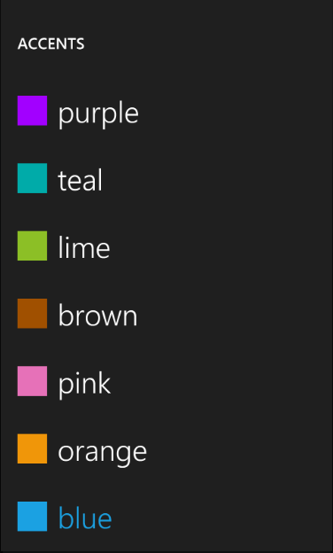
Today I am going to show you how you can customize the Picker Box dialog to display a color picking dialog similar to the one that you see in the Settings\theme applet in the emulator instead of just a list of strings:
In order to be able to display the colored rectangle and the text we need to implement appropriate binding source for the ListBox inside of the dialog. So I've added the following ColorItem class:
   public class ColorItem
  {
      public string Text { get; set; }
      public Color Color { get; set; }
  }
Looks pretty innocent and simple. The next step is to modify the template for the ListBox in the PickerBoxDialog to display the colored rectangle and the binding, So I've copied tand modified the XAML from the generic.xaml into the Resources section of the MainPage.xaml:
   <Style TargetType="control:PickerBoxDialog" x:Key="Custom">
            <Setter Property="Background" Value="{StaticResource PhoneChromeBrush}"/>
            <Setter Property="Width" Value="480" />
            <Setter Property="Height" Value="800" />
            <Setter Property="Margin" Value="0" />

            <Setter Property="Template">
                <Setter.Value>
                    <ControlTemplate TargetType="control:PickerBoxDialog">
                        <Grid x:Name="LayoutRoot" Background="{StaticResource PhoneChromeBrush}" >
                            <Grid.RowDefinitions>
                                <RowDefinition Height="Auto"/>
                                <RowDefinition Height="*"/>
                            </Grid.RowDefinitions>

                            <!--TitlePanel contains the name of the application and page title-->
                            <StackPanel x:Name="TitlePanel" Grid.Row="0" Margin="12,30,0,40">
                                <TextBlock x:Name="DialogTitle" Text="MY DIALOG TITLE" Style="{StaticResource PhoneTextNormalStyle}" />
                            </StackPanel>

                            <!--ContentPanel - place additional content here-->
                            <Grid x:Name="ContentPanel" Grid.Row="1" Margin="12,0,12,0"  >
                                <ListBox Name="listBox" >
                                    <ListBox.ItemTemplate>
                                        <DataTemplate>
                                            <StackPanel x:Name="item" Orientation="Horizontal" Margin="5, 25, 0, 25">
                                                <Rectangle Fill="{Binding Color, Converter={StaticResource ColorToBrushConverter}}" Width="42" Height="42" />
                                                <TextBlock Margin="15, 0, 0, 0" Text="{Binding Text}" FontSize="40" TextWrapping="Wrap" />
                                            </StackPanel>
                                        </DataTemplate>
                                    </ListBox.ItemTemplate>
                                </ListBox>
                            </Grid>
                        </Grid>
                    </ControlTemplate>
                </Setter.Value>
            </Setter>
        </Style>
We will also need to converter that'd do a conversion of the Color to Brush for the Fill property binding:
  public class ColorToBrushConverter : IValueConverter
 {

     #region IValueConverter Members
      public object Convert(object value, Type targetType, object parameter, System.Globalization.CultureInfo culture)
     {
         if (value != null)
         {
             return new SolidColorBrush((Color)(value));
         }

         return null;
     }

     public object ConvertBack(object value, Type targetType, object parameter, System.Globalization.CultureInfo culture)
     {
         throw new NotImplementedException();
     }

     #endregion
}
And don't forget to declare this converter in xaml:
<local:ColorToBrushConverter x:Name="ColorToBrushConverter" />
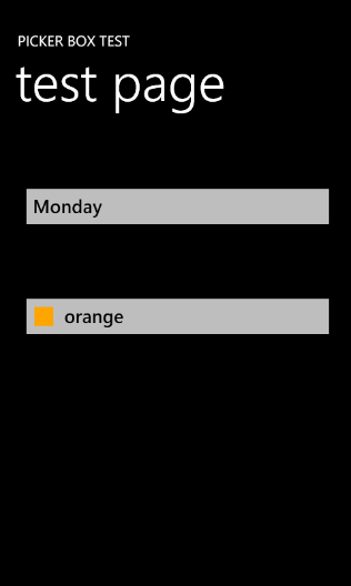
The next step is to add the button on the screen that will show the PickerBox dialog and display the selected color:
 <Button Name="buttonColor" Background="{StaticResource PhoneTextBoxBrush}"
        Click="buttonColor_Click"  BorderThickness="0" Height="72" Style="{StaticResource PickerBoxButton}"
        HorizontalAlignment="Left" Margin="12,200,0,0"  VerticalAlignment="Top" Width="438">
        <StackPanel Orientation="Horizontal" Width="362">
             <Rectangle Fill="{Binding Color, Converter={StaticResource ColorToBrushConverter}}" Margin="-15, 2, 0 0" Width="26" Height="26" />
                 <TextBlock Margin="15, 0, 0, 0" Foreground="{StaticResource PhoneTextBoxForegroundBrush}"
                             Text="{Binding Text}"  />
             </StackPanel>

 </Button>
We are using the same bindings as we did for the ListBox data template to display the selected ColorItem.
Now we should be ready to jump in to the code. First we need to create a data source that will contain an array of ColorItems. So I added the DialogViewModel class:
public class DialogViewModel
{
public DialogViewModel()
{
this.Items = new List<ColorItem>()
{
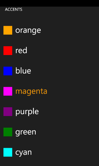
new ColorItem() {Text="orange", Color = Colors.Orange},
new ColorItem() {Text="red", Color = Colors.Red},
new ColorItem() {Text="blue", Color = Colors.Blue},
new ColorItem() {Text="magenta", Color = Colors.Magenta},
new ColorItem() {Text="purple", Color = Colors.Purple},
new ColorItem() {Text="green", Color = Colors.Green},
new ColorItem() {Text="cyan", Color = Colors.Cyan},
new ColorItem() {Text="brown", Color = Colors.Brown},
new ColorItem() {Text="yellow", Color = Colors.Yellow},
};
}
public List<ColorItem> Items
{
get;
set;
}
}
This is how we initialize our custom PickerBox:
  private void InitCustomPickerDialog()
 {
      // Initialize viewmodel
      this.viewModel = new DialogViewModel();
      this.currentColorItem = viewModel.Items[0];

      // Assing it to the page's DataContext
      this.DataContext = currentColorItem;
      this.customDialog = new PickerBoxDialog();
      this.customDialog.Title = "ACCENTS";

      // Assign our style to the dialog
      this.customDialog.Style = this.Resources["Custom"] as Style;
      this.customDialog.ItemSource = viewModel.Items;
      this.customDialog.Closed += new EventHandler(customDialog_Closed);
 }
In the method above we initialize view model, create an instance of the custom dialog, assign the style that we declared before and ItemSource from the viewmodel. The customDialog_Closed looks like this:
  void customDialog_Closed(object sender, EventArgs e)
 {
      this.currentColorItem = (ColorItem)this.customDialog.SelectedItem;
      this.DataContext = currentColorItem;
 }
In this event handler we get the currently selected item from the dialog and assing it to page's data context.
And that is all what's required to have color picker dialog:
You can download the latest version of the PickerBox control and this sample from here.
One more thing that I wanted to mention is that I consolidated all the WP7 controls and components in place now. I created a resource on MSDN code galleries that contains the latest versions for the List Picker, Scrollable TextBlock and PickerBox.