How to Highlight Table Rows Based on Slicer Selection
When you connect Slicers to Pivot Tables or Pivot Charts, their effect on the data is obvious: changing your Slicer selection causes data values to change and in some cases, rows to disappear. However, rather than excluding rows with a Slicer, sometimes you want to highlight the rows that correspond to the Slicer Selection.
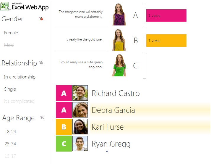
When we built the Excel Web App experience for Office Labs Photo Vote, we wanted to do just that. Our workbook shows a list of the friends who voted on your poll. You can slice through the data using Gender, Relationship and Age Range slicers provided on the left. Changing your Slicer selection causes the data bars on the chart to update, but it also highlights each of your friends who are in the intersection of your Slicer selections. We’ve embedded the Photo Vote workbook below so you can see this functionality in action!
For example, if you slice down to Female friends who are In a Relationship and are between 18-24 years old, only the rows corresponding to that selection will be highlighted. Pretty cool, huh?
In this article, we’ll explain how we built this functionality using Slicers, Pivot Tables, a few slick formulas, and a conditional formatting trick.
First, you may want to download the workbook we’re using in this example. You will find it attached to this blog post.
The image above shows a simple state of this workbook: the data has been sliced to show Gender = Female only. As you can see, the two women who voted on this poll are highlighted with conditional formatting.
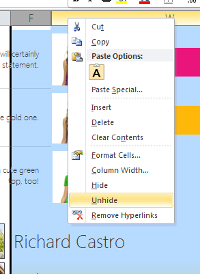
To see how this works, we’ll need to unhide a bunch of helper data that we use to determine which rows to highlight. To start, unhide the worksheet named “Pivot Helper” by right-clicking in the sheet tabs area, then selecting Unhide… and then Pivot Helper.
You’ll see the following pivot table. As you can see, we’ve added the Age Range, Gender and Relationship status to the report filter section of the Pivot Table. We’ve also connected the corresponding slicers (found on the Results sheet) to the same Pivot Table. When the Slicers change, the values in B1:B3 change accordingly. This gives us an easy way to look up the values that are currently set for any of our Slicers.
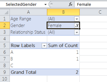
Also notice that we’ve created named ranges for each of the cells B1, B2 and B3 (B2 is named “SelectedGender” as shown in the screenshot above). This will make it easier to reference these values in formulas later on.
The next step is to return to the Results worksheet and unhide the rows and columns in which our calculations take place. Unhide columns F:W by selecting those two columns, right-clicking and choosing Unhide.
Similarly, unhide row 9 to view the table headings.
You’ll now see a view similar to the screenshot below (In the screenshot, I’ve hidden and resized columns so I can fit all of the important information in this article.).
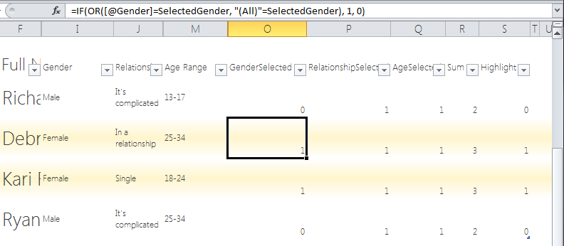
You’ll notice that, in addition to the actual values for Gender, Relationship Status and Age Range, we also have columns named GenderSelected, RelationshipStatusSelected, and AgeSelected. These columns will contain a 1 if the corresponding value is included in the current slicer selection. We calculate this using the following formula:
=IF(OR([@Gender]=SelectedGender, "(All)"=SelectedGender), 1, 0)
This formula looks at the actual value for that row’s gender and compares it to the value in the Report Filters area of our Pivot Helper table, which we’ve named “SelectedGender”. If there is no gender selected by the slicer, the value of SelectedGender will be (All). Otherwise, it will be one (*or more) of the values of the Gender column. If the SelectedGender matches the Gender for that row, or if SelectedGender is (All), the formula will put a 1 in the GenderSelected cell.
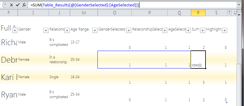
We repeat the exact same pattern for the RelationshipSelected and AgeSelected columns.
Next, we’ve added a Sum column (R) that sums the values of GenderSelected, RelationshipSelected, and AgeSelected for each row. Why do we care about the sum? We need to distinguish between rows that are intentionally included by Slicer selection from rows that are included because a Slicer is unselected. Otherwise, all of the rows would be highlighted if any (not all) criteria matched a slicer selection.
We’ve created a Highlight column (S) that is responsible for the final calculation in determining if the row should be highlighted. The formula for the Highlight column is:
=IF(AND([@Sum] = MAX([Sum]), AVERAGE([Sum]) < 3), 1, 0)
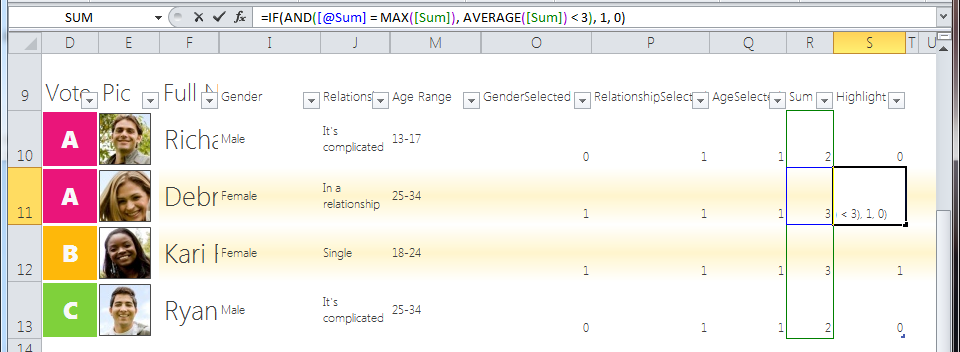
This says, if the sum of GenderSelected, RelationshipSelected and AgeSelected is the maximum out of any value in the sum column and the average of the sum column is less than 3, highlight this row. The second part of the AND statement protects us from the case where no Slicer values are selected and every row would otherwise be highlighted.
The final piece of this solution is to create the conditional formatting rule to highlight the rows.
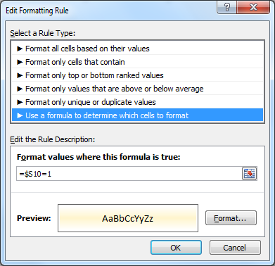
We use a formula to determine which cells to format, and we’ve specified the format as a subtle, gradient highlight on the background of the cell.
For the formula, we use a little trick to make the formula evaluate relative to the current cell. The formula is:
=$S10=1
This will evaluate the current row value of the Highlight column (S) against the value 1. If they match, the conditional format will be applied.
The final result is a table that comes to life as you click through various Slicer combinations. We think it’s a cool way to visualize your data in Excel and we hope it finds some use in your own scenarios!
*Yes, it’s true that this approach doesn’t work when multiple values are selected in a single slicer, since the Report Filter will display “(Multiple Items)”. However, we still thought this was a neat trick!
Scott Heimendinger
Program Manager, Office Business Intelligence