Conversations with data in analytic charts
Today’s post is by Jason Robertson, showing some ways to have a conversation with data using analytic charts in PerformancePoint Services for SharePoint 2010. I built a simple model using Bureau of Transportation 's Airline On-Time Performance and Causes of Flight Delays and let Jason to go hunting. He built the initial chart using Dashboard Designer then did the rest of his investigation within a SharePoint dashboard page. Jason is not a professional air traffic controller but he does know the difference between “clearance” and “Clarence.” Roger?
Flight delays are never fun and often, as a traveler, the reason behind a specific delayed flight is a mystery.
I started by creating a simple chart that I thought might have useful information. It has Flight Carrier on Series and Delay Departure times on the Bottom Axis.
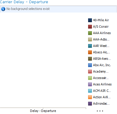
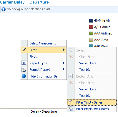
When I first see this I know that something must be wrong… I can't see any data and I'm sure there are some airlines with departure delay. I can see the start of a long list of carriers in the legend and all the ones that are displayed have no data. I can easily filter out all those empty series to show only those with data. I right-click on the chart, select Filter, select Filter Empty Series.
Now that all those empty series are gone I'm able to see data that may be interesting.
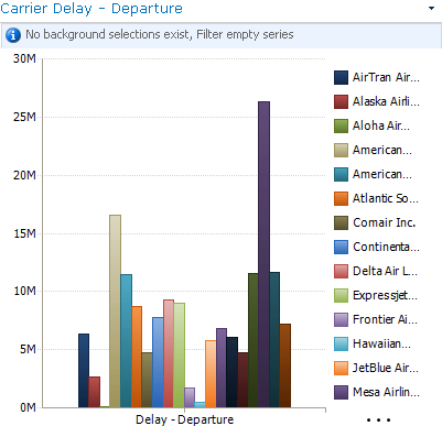
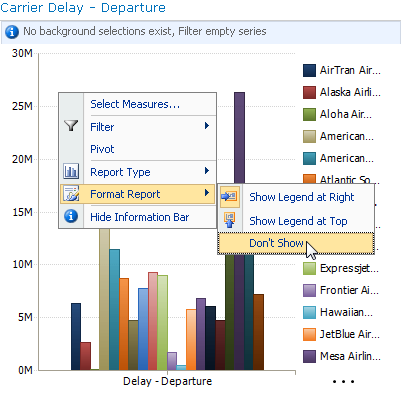
My bars are a little crowded on this chart. I don't really need the legend so I'll hide it. I'll be able to see the same information by hovering over the bars. I right-click on the chart again and this time I select Format Report then Don't Show.
Now I can start to poke around to find interesting data. First I see that there's one member that's about twice the average. I can hover over it to see what member it is and what the data is.
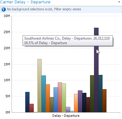
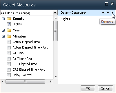
It turns out that it's Southwest. I've heard that Southwest makes a lot of shorter flights and I wonder if this is related to their delayed departures. I can switch my Series measure to see carriers by Count of Flights. I right-click again and select Select Measures…. In the Select measures dialog I remove the departure delay measure and add a flight count measure.
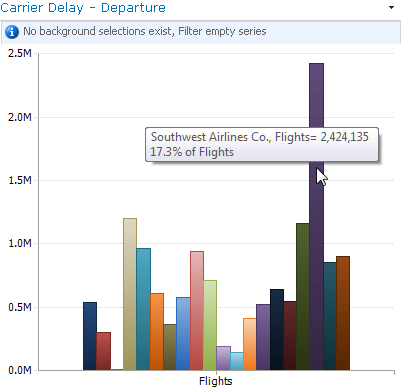
Sure enough, Southwest has over twice as many flights as all of the other airlines.
A better measure would be an average of delay per flight. Luckily the cube also has average measures so I use Select Measures to switch to delay average.
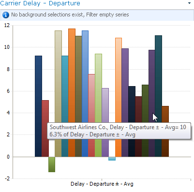
Now Southwest is more in line with the other airlines with an average delay of 10 minutes. There are, however, two airlines that stand out on this new chart for having negative delay departures. That's obviously well below the industry average. The data dictionary provided with the cube tells me that they can be negative because this measure counts early departures as time credited towards delays. I hover over the two stand-outs to see that they are "Aloha Air Cargo" and "Hawaiian Airlines." Now I know that if I want my flights to be on time I need to spend more time in Hawaii.
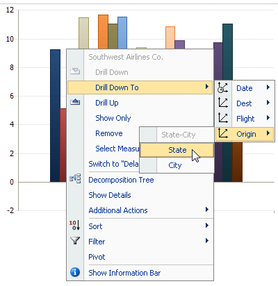
I'm still interested in Southwest because I fly them often and I wonder how they perform when flying out of my home state of Idaho. To find out I'll need to cross drill to flight origin by state. I right-click on Southwest, select Drill Down To and select origin state.
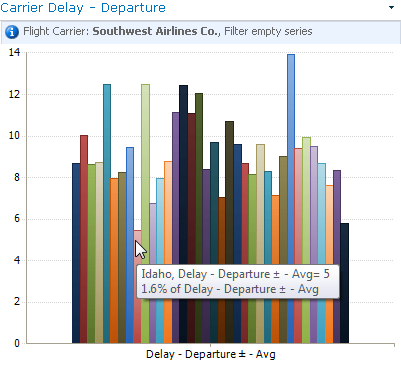
The chart shows that Idaho has the lowest departure delay. I hover over it to see that the average delay departure there is only 5 minutes on Southwest. That's something I can live with.