Decomposition Tree: Contribution Analysis & Presentation
PerformancePoint Services for SharePoint 2010 introduces the decomposition tree, an interactive arrangement of bar charts that makes it easy to explore contribution relationships. It provides an effective alternative to the “Drill Down To” feature in analytic charts.
Flight delay: a simple analysis and presentation scenario
I’ve built a model using US Bureau of Transportation Statistics data on flight delays and a dashboard that identifies aircraft by tail number. (I used only a slice from 2004, not all the data.)
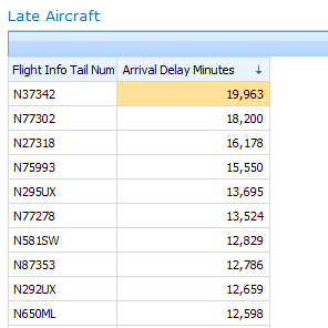
In the dashboard below, we see that N37352 has the highest amount of arrival-time delay, expressed in total minutes:
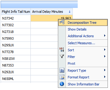
So, which cities cause delays for most delays for this aircraft? Drilling down several times in this grid would give us the answer, but from a presentation standpoint it’s more effective if we see origin city and destination city side by side. We’ll use Decomposition Tree, which is available from the right-click menu:
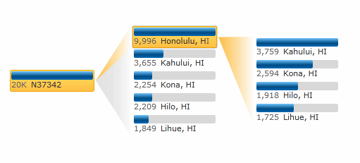
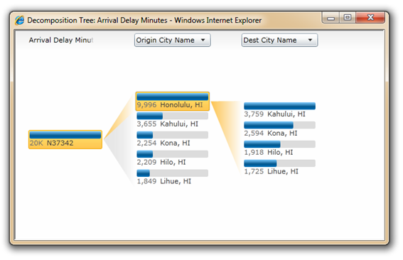
With two drilldowns - the first on Origin City Name and the second on Destination City Name - I see that N37352 did exclusively Hawaii-regional flights during this time period, and the Hololulu-to-Kahului route had the largest sum of delay minutes:
I wonder, then: does this one aircraft fully account for the overall delays, or is it just a drop in the bucket, so to speak? I can’t really tell from here.
So I drill up in the analytic grid (to All), then I use Decomposition Tree again. Now I see that N37342’s delay, when compared to all 4695 aircraft, is almost irrelevant (insignificant.)
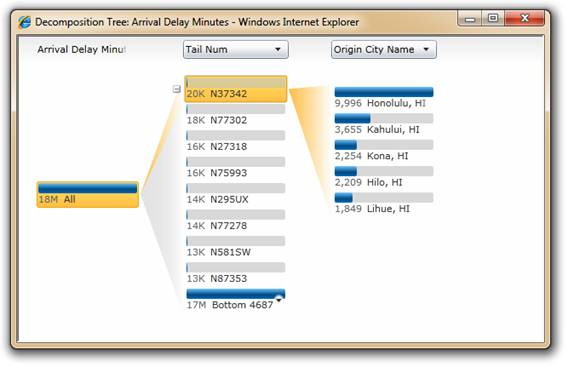
With a single click, I can quickly flip between other aircraft.In the process, I notice that the second-ranked aircraft is also Hawaii-origin:
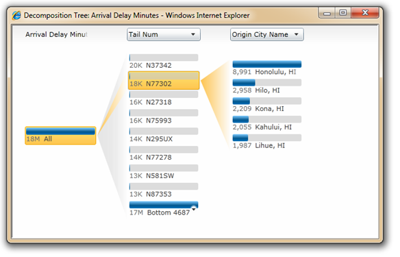
With a couple more clicks, I proceed down a different analysis path:
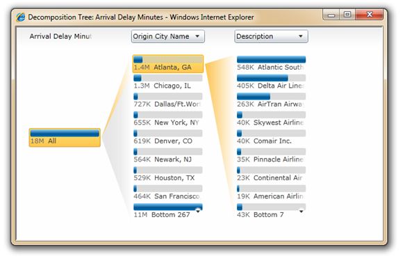
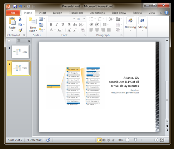
Having derived some useful presentation elements, I use PowerPoint 2010’s Insert Screenshot and Crop commands, and dress it up:
Enjoy!
Wade Dorrell
Program Manager, PerformancePoint Services
Decomposition Tree FAQ
Do I need ProClarity for this?
No. The decomposition tree shown above is built into the PerformancePoint Services web parts and the PerformancePoint Services service application for SharePoint 2010.
The “Decomposition Tree” option does not appear (or is disabled) in the right-click menu.What’s going on?
Microsoft Silverlight 3 enables the option. If Silverlight 3 is not installed, or disabled, the menu command will be hidden (analytic reports) or visible, but disabled (scorecards.) The “Drill Down” commands will be available regardless of Silverlight.
If you have Silverlight installed, enabled, and Decomposition Tree is still unavailable, please verify the following:
- If using a scorecard, the data mapping of the KPI's actual or target (whichever is to be analyzed) must be directly to an Analysis Services member or members,and the calculation-type must be set to “Data value" (which is not the default.)
- If using an analytic chart or grid, it must be designed using the Design tab, not the Query tab. (You might check to be sure that you need to use the Query tab; many common reports can be built with the Design tab alone and dashboard filters can be applied to the reports without adding "parameters" as you do in the Query tab... give it a try!)
If you’d like to know more about Silverlight deployment (PerformancePoint Services web parts are not the only SharePoint features that get better when Silverlight’s installed) we recommend taking a look at the Silverlight Enterprise Deployment guide.
