XAML – How to Style?
Following the practice of WPF, both in Windows Phone and Windows 8 Store apps, Style element of XAML is alive and is used to define style (look and feel) for UI controls. Style element has number of attributes, most important of which is TargetType that defines which type (UI Control) this style is applicable at. For example,
<Style TargetType="Button">
</Style>
Suggests that this style will be applied at Button type control. Note that these styles are contained within Resources section of relative page (other variations exist as we’ll discuss shortly). So, if you are working in Windows 8 Store app the section might be,
<Page.Resources>
<Style TargetType="Button">
</Style>
</Page.Resources>
The same in Windows Phone app will rather be enclosed as following,
<phone:PhoneApplicationPage.Resources>
<Style TargetType="Button">
</Style>
</phone:PhoneApplicationPage.Resources>
The Style element contains multiple Setters depending upon your requirements. Each Setter defines which ‘Property’ of TargetType control you want to affect and provide a relative ‘Value’ for that. For example let’s change the ‘Background’ property of the Button control,
<Style TargetType="Button">
<Setter Property="Background" Value="Chartreuse"></Setter>
</Style>
However to reference this Style in UI control we’ll make use of extended ‘Key’ attribute which will uniquely distinguish this Style given its scope (we’ll discuss scope later in this article),
<Style TargetType="Button" x:Key="Style1"></Style>
Next we’ll apply/reference this style on our UI control as following,
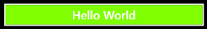
<Button Style="{StaticResource Style1}">Hello World</Button>
Note the use of StatisResource that “provides a value for any XAML property attribute by looking up a reference to an already defined resource.”
Let’s go ahead and create a new style with more than one contained Setter elements in our new style.
<Style TargetType="Button" x:Key="Style1">
<Setter Property="Background" Value="Chartreuse"></Setter>
</Style>
<Style TargetType="Button" x:Key="Style2">
<Setter Property="Background" Value="Chartreuse"></Setter>
<Setter Property="BorderThickness" Value="20"></Setter>
<Setter Property="BorderBrush" Value="Orange"></Setter>
</Style>
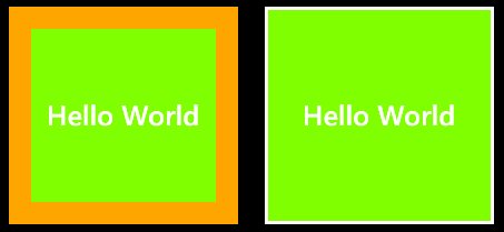
When applied to buttons,
<Button Style="{StaticResource Style1}">Hello World</Button>
<Button Style="{StaticResource Style2}">Hello World</Button>
Just like we saw above, you can place style within Resources section of the page. This will make the style accessible only at that particular page. But what if you want the Style to be accessible across all pages in your app? For this purpose define the Style in App.xaml file which will have a global impact,
<Application.Resources>
</Application.Resources>
One final alternative to is create a custom .xaml file that will contain all style elements known as ResourceDictionary and reference that file in your App. This way you can keep your designers work exclusive to development and end up with a comprehensive Resource Dictionary that can be used across your product line,
<Application.Resources>
<ResourceDictionary Source="CustomResourceDictionary.xaml" />
</Application.Resources>
Where CustomResourceDictionar.xaml file contains following,
<ResourceDictionary xmlns="https://schemas.microsoft.com/winfx/2006/xaml/presentation"
xmlns:x="https://schemas.microsoft.com/winfx/2006/xaml"
xmlns:d="https://schemas.microsoft.com/expression/blend/2008"
xmlns:mc="https://schemas.openxmlformats.org/markup-compatibility/2006"
mc:Ignorable="d">
<Style TargetType="Button" x:Key="Style1">
<Setter Property="Background" Value="Chartreuse"></Setter>
</Style>
<Style TargetType="Button" x:Key="Style2">
<Setter Property="Background" Value="Chartreuse"></Setter>
<Setter Property="BorderThickness" Value="20"></Setter>
<Setter Property="BorderBrush" Value="Orange"></Setter>
</Style>
</ResourceDictionary>
Exploring Properties of UI Control?
If you are a newbie and learning about styles for the first time then probably you would be wondering what properties can play with? Here’s how,
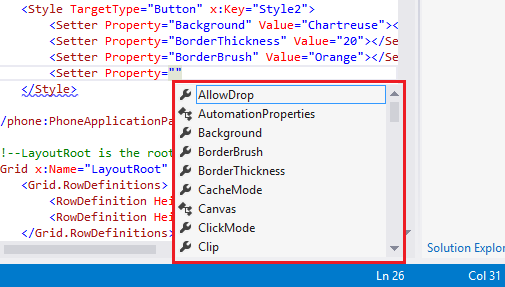
1- Simplest way is that as soon as you start type Property=” intellisence will popup with list of properties that can be overridden (TargetType attribute specified in Setter elements plays a vital role since the properties are listed using TargetType by means of Reflection)
2- You can also identify the list of properties (and perhaps about Visual State as well) if you right click on your User Control (Button in our case) > Edit Template > Edit a Copy…
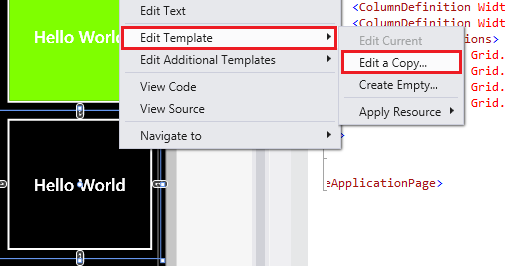
A dialog will appear to provide Style name (key) and where you want to place the style (see previous section on scope),
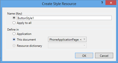
Pressing Ok will create Style that reflects this particular control’s current visual display (font size, border, background, etc) and will also apply that style on user control. This newly created style is a great place for you to explore various properties that make this control’s view look the way it is.
3- A third way (specific to Windows 8 apps) is to look into the file generic.xaml that serves as foundation to the display and Visual State for all UI controls. This file can be found at,
C:\Program Files (x86)\Windows Kits\8.0\Include\winrt\xaml\design
Try omitting (x86) if above path doesn’t work for you.
Inheritance of Styles
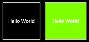
One great thing about Styles is that they can be extended or inherited using BasedOn attribute of Style element. Consider you defined MyButtonStyle as following,
<Style TargetType="Button" x:Key="MyButtonStyle">
<Setter Property="Background" Value="Chartreuse"></Setter>
</Style>
Now you want to create another style for another button with different border thichkness but you still want to keep the background color as it is. This can be achieved by creating a new style BasedOn MyButtonStyle
<Style TargetType="Button" x:Key="ThickBorderStyle" BasedOn="{StaticResource MyButtonStyle}">
<Setter Property="BorderThickness" Value="20"></Setter>
<Setter Property="BorderBrush" Value="Orange"></Setter>
</Style>
This way BorderThicknessStyle plays only with border related properties but since it is inherited from MyButtonStyle it will also reflect the Background color as defined in MyButtonStyle. The resultant when applied on buttons appears as following,