Apps for SharePoint Page Patterns
When building your app, there are a few patterns we hope you will use for your pages. In choosing a pattern, you should consider the user scenarios for your app and which pattern would make the most sense. Be aware that this post focuses on the design patterns for building app pages; if you are looking for information about specific styles and controls, for example, the chrome control, that you can leverage in your app you can find several examples in our UX guidelines .
In apps for SharePoint there are basically two parts to the patterns that come together to form each page – the chrome and the content area:
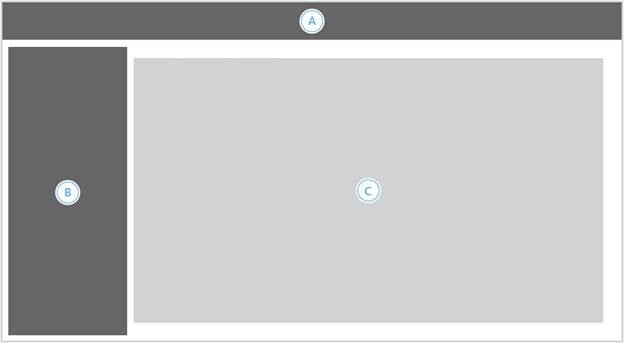
Figure 1. Chrome and content are of an app page
A. Top Chrome area – This contains things like the page title, the back to site link, and the app homepage link
B. Left Navigation area – This is an optional piece of chrome that can allow users to switch between different pages of your apps quickly, such as when you have a few different views of similar content
C. Content area – This is where the content for your pages would go
While the chrome area should be consistent between different pages in your app, the content area of your app pages might employ many different options from the available patterns to fulfill the different functions on those pages. For example, you might start with a dashboard layout for your start page, but then each item in the dashboard might link to a standard layout for information about that particular item.
Chrome pattern
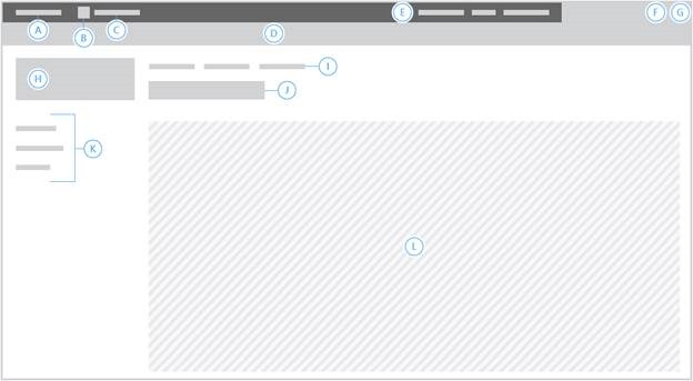
Figure 2.The chrome pattern
A. Back to site link – All apps should have a link back to the site they were launched from in the upper left corner of the page. This allows users to easily find their way back where they came from and lends consistency across multiple app experiences.
B. Small icon (only available when using chrome control) – This should only be used when you’re not using the title area and thus don’t have a Main icon (H).
C. Main app link (only available in this location when using chrome control, app.master puts it in I) – All apps should have a link to their start page, either here or in the top nav area.
D. Ribbon area – should only be used if your page uses ribbon tabs, otherwise should be hidden.
E. Suite nav (only available when using app.master) – This allows the user to quickly switch between services on Office 365.
F. Settings – While generally apps are better the fewer settings they require the user to understand and choose between, some rich experiences can only be supported by giving the user some options. The Settings menu is a consistent place to surface the entry points for this kind of functionality. If your app doesn’t have settings, though, you don’t need to use this. Settings links should be in this order: page specific settings, followed by any purchase-related options, and the main app settings page (if it exists) should always be last in the menu. You don’t need to add an About link, since this information is already surfaced in SharePoint UI and the Store.
G. Help – Anything you can do to help users out is a good idea, especially if you can make your help contextual to the scenario they’re in.
H. Main icon – This should match the icon that represents your app in the Store and in the Site Contents page in SharePoint, but if you have a version of the image uses a different aspect ratio you can specify an image up to 64px high by 180px wide. If you use the same image as your main app icon, it will be scaled down to 64px when used in this placement.
I. Top nav (also holds main app link when using app.master, only available when using app.master) – At the least, this area should hold the app link back to its start page, but can also be used for other high level links if there is a clear separation between different functionalities inside the app.
J. Page title – Unless your page is not using the title area at all (such as for a more immersive experience where only the top chrome is used), each page should have a unique name that helps the user identify where they are within the app.
K. Left nav – This area can be used for in-app navigations between more closely related functionality that the user might need to do more frequently, or which might need to be more visible to them. NOTE: This should only be used when there is a good scenario to do so, otherwise it should be left off.
L. Content area – This is where the main page content goes, using one of the content patterns from the next section.
Content patterns
There are several patterns you might follow for your content area. Aside from a couple exceptions, each of these can be used with any or all of the chrome patterns above. For example, the left nav area should not be used on pages that already have functionality in a left column, such as with filters. Also, as mentioned above, if your page doesn’t use the ribbon you should not have the ribbon area either. Other exceptions are more specific to the particular page pattern and will be called out when applicable.
Shared elements
Some content elements can also be added to any of the content patterns.
Search box
Within apps, search should be exposed contextually to the item it is searching, such as at the top of a list of data. You should not place the search box near the upper right corner (where it is in default SharePoint designs) unless you’ve built a complete experience around searching content within your app or architected in such a way that SharePoint will provide an accurate search experience for you. For example, if all of your data are in SharePoint lists and libraries, then the SharePoint search controls can be used to provide search with no extra work on your part.
Right content area
These are a few things that all make sense in a right column in the content area. If they’re used, they should only be in the right-most column on the screen, and that column should have a fixed width of 300px.
Action links
These should be used when you have five or more commands which are not specific to particular data or items being shown. In other words, while these actions might be specific to the page itself they should not change while the user interacts with the rest of the page and should not in any way be tied to focus or selection. These would be displayed in a vertical list of links.
Related items
This is an area to show other content the user might be interested in, based either on the page they’re on or on their current selection within that page. Commands should not be surfaced in this UI. How the related items are displayed should be tailored to what those items are, although in many cases a list of links would be appropriate.
Ads
The right content area is a good place to place advertisements if you’re building an ad-funded app. Having ads in that area is a common pattern on the internet, so users will more easily recognize them and understand why they’re there.
Standard page layout
This is one column of content, possibility with individual pieces such as lists or a carousel of quick actions the user could employ. This layout works well as a start page for the app, as well as for simpler pages focused on a single set of data.
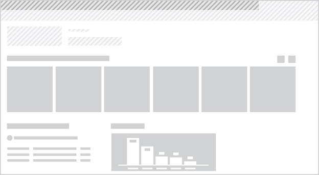
Figure 3. Standard page layout
Data navigation layout
This is a three column layout, well suited to allowing the user to progressively drill down into information. Apps created with Access follow this pattern, showing the user the list of lists, the selected list items, and then the details of the selected item.
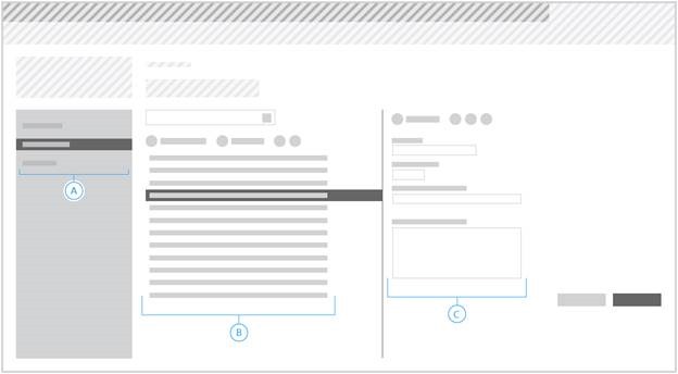
Figure 4. Data navigation layout
A. Top level organization, such as a list of lists – This can also use the left navigation area styling, although Access apps instead give this special treatment.
B. List items from the selected list – This might have contextual search for a long list of items, or a small number of bulk commands that can be applied when multiple items in this column are selected.
C. Details about the selected item – This might have actions the user can take on the item in a contextual toolbar at the top of the item details, and/or buttons for saving or cancelling any changes.
Search Results layout
This page type should be used when you have a lot of items for the user to filter through, possibly as the result of a search. You should use the left side for any available filters, place the search box at the top of the results column in the middle, and if you have callouts to show more information it should show up on the right side of the page.
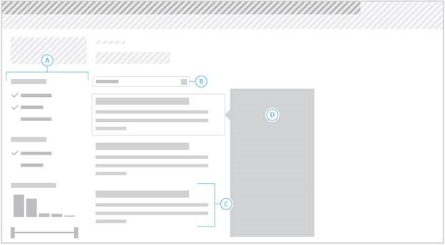
Figure 5. Search results layout
A. Filter – Available filters for the displayed results. When displaying these filters, your app should not also have a left navigation chrome area.
B. Search box.
C. Result – A single result in the results column.
D. Callout – Callout for a particular item which the user has hovered over or selected.
Item Grid layout
This page pattern uses a tile-based layout to show a list of items or categories to a user in a more engaging or graphical way. The tiles should be 150px square with 10px padding between them, and paged using standard forward/back controls. Having a dynamic width of the tile section and allowing for tile rearrangement is preferable, but in some cases a fixed width of 4 tiles can be used, which will lead to a content area of about 700px including padding between and next to the tiles.
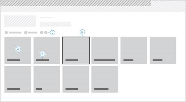
Figure 6. Item grid layout
A. An individual tile – This should include some imagery to draw the user in, such as a photo or icon. If using a photo, it should go edge-to-edge within the tile. If using an icon, the icon should be a white glyph and the background of the tile should be a rich color, such as would be applied by using the ms-emphasis CSS class from the SharePoint styles.
B. Title – The title for the tile should be bottom-aligned with the tile contents.
C. Filters and commands – If you have filtering or sorting controls for the tile list, these should be horizontally aligned at the top of the tile section.
D. Tile – Although most tiles should just be used for launch points and thus should not have a selection mechanism, in some cases (such as when displaying a set of photos in a folder) it might make sense to allow single or multiple selection of the tiles in the list. The mechanism for tile selection should be obvious, such as a check box in the corner of each tile, and when selected the tile should have a thick border applied around it. For more information, see Table 7 Background and border styles in Apps for SharePoint UX design guidelines.
Two or Three Column layout
This page layout should be used if you need a more dense presentation of information than a single column would provide, possibly so you can reduce the amount of navigation a user will have to do in order to see related data. At least one of your columns should flex to fill the space up to a reasonable maximum page width, and you should not have any columns with less than 300px width.
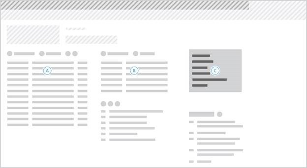
Figure 7. Two or three column layout
A. The first column of content.
B. The second column of content.
C. (optional) The third column of content.
Dashboard layout
Dashboards are a good way to show the user a lot of status information all at once. They are similar to the Two or Three Column layout and Item Grid layout, but differentiated in that they often are made up of mostly visual elements such as graphs or quick checklists which likely are not all a fixed size and which might make sense in more than three columns. This type of page generally should not have a left nav area, with any filters exposed at the top of the page if there is only one level of filtering or as the first part on the page if there is nested or deep filtering involved.
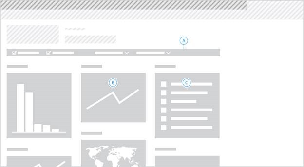
Figure 8. Dashboard layout
A. (optional) Filters for the dashboard. These can also be surfaced in the first “part” instead if they’re too complicated to be shown in a single line above the content.
B. Example of a part shown in the dashboard.
C. Another example part in the dashboard.
Settings Page layout
While your app should work “out of the box” as much as possible, there are cases where it might be good to expose some settings for the user to change. These should be surfaced through a settings page with clearly defined options and reasonable default settings. The options on the page should be well organized, with a clear hierarchy if it makes sense to group some options together with others.
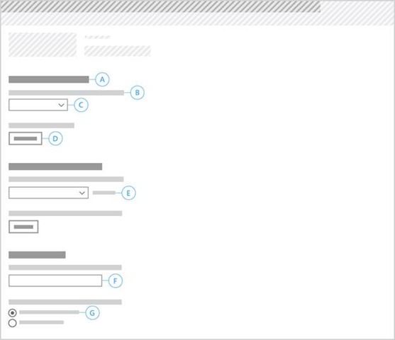
Figure 9. Settings page layout
A. Header for the setting section – This should be a concise description of the underlying settings group. There should be at least one section of settings on the page.
B. Individual setting – The descriptive text should briefly explain the impact of changing this setting.
C. Control for the individual setting – Each control should be appropriate to the possible values of this setting. This one represents a drop down for when there are three or more distinct choices with short labels. Other possible controls include buttons (D), text fields (F), radio buttons (G), or check boxes. See below for more details on when to use which control type.
E. Optional status message (such as if you need to show a temporary “Connecting…” message after the user has taken an action) – This can be used next to any of the input controls, and should always be used if delays or other issues prevent the user from getting instant feedback about their preferences being saved.
The choice of which control to use is dependent on what kind of options the user has for the particular setting:
- Buttons – Good for on/off or other single binary settings. Their label should clearly indicate what action will happen when the user chooses. If the action isn’t completed immediately after the user chooses, the button should be disabled and paired with a status message (E, above) until the action is completed. When the action is completed, the label on the button should change to indicate the inverse action. An example would be a button to turn on a connection that says “Connect”. When chosen, it will disable the button and put a “Connecting…” status message next to it. Once the connection is confirmed, the button re-enables with the new label “Disconnect”. If the action is immediate when the user chooses the button, then there is no need to disable the button or add a status message, in that case the button should just change its label and action to the inverse when the user chooses it.
- Check boxes – (not shown in image above) These should only be used when there are multiple yes/no choices the user has to make for the same setting, such as a list of services to connect to where the same description (B) applies to each decision. The label of the check box should specify the individual choice under the setting, such as a service name in the list of services. For a single binary choice, a button as described above should be used instead.
- Drop down lists – Good for choices where the labels are easy to understand and relatively short.
- Radio buttons – Good for choices where the labels require explanation or are relatively long.
- Text fields – Used for text or number input when the other controls are too restrictive. It’s good practice to trim the size of the text field to match the length of the expected value (for example don’t use a very long text field for usernames).
Well, that’s is pretty much the gist. Let us know if you have any comments or questions. As usual, we are happy to get any feedback here or hit our forum where you can post any questions related to building apps for SharePoint
This post is brought to you by Carlos Perez (designer), Aesha Shah, Elisabeth Olson, and Humberto Lezama, program managers on the Office Developer Platform team.