On the Hunt for the One-Page View of an Enterprise
I am currently noodling the idea of a one-page view of my employer (Microsoft) for the purpose of rationalizing the sharing of services across business units and business models. (If you understood the previous sentence, you are probably an enterprise architect, even if that is Not your title).
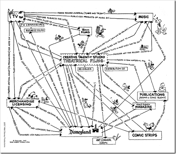
As a result, I’m on a hunt for the various one-page views that other companies have produced. The excellent book “Enterprise Architecture As Strategy” (Ross and Weill) provides three tangible examples (Delta Airlines, ING-Direct, and MetLife). A fourth I found entirely by accident this morning… a very old one drawn by a Disney cartoonist in 1957, and made available here: (https://taotwit.posterous.com/the-visualisation-of-business-models-did-disn).
This is an interesting view in that it illustrates the relationships between the business units and how they functionally support one another. It doesn’t allocate responsibility, but rather demonstrates responsibilities through the relationships. In effect, it is a somewhat “contractual” view, indicating the accountabilities between business units. Fascinating for many things, one of which is the date.
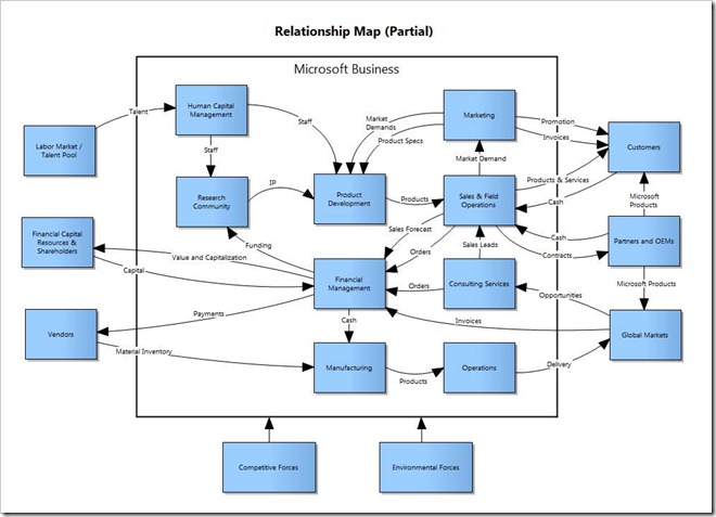
The synchronicity of this find is resonating for me because yesterday, a friend and fellow Enterprise Architect within Microsoft named Krishna Srinivasan, shared a very similar view that demonstrated how the functional units of Microsoft could be viewed. I’m sharing it here because, honestly, the view was so generic that it is difficult to view it as “revealing” anything that someone couldn’t guess. That said, it is a fascinating, modern depiction of many of the same key concerns that the 1957 view of The Disney Company was trying to illustrate. One key distinction: in stead of communicating relationships in terms of accountabilities, it demonstrates process relationships (inputs and outputs).
One bit of brilliance to consider is that you can track the various processes in the company by following the arrows from box to box to box. It doesn’t quite meet the needs I’m looking for in shared service rationalization, but it does say a lot about how organizations can be represented visually.

