Usability Testing the WF Designer vNext (or, Yelling at Customers)
One of the things that my team is working on is the next version of the workflow designer. In order to help us get real feedback, we engaged with our usability teams to design and execute a usability study.
For details on what the test looks like (when we did them 3 years ago for the first version of the WF designer, see this great channel9 video). The setup is still the same (one way glass mirror, cameras tracking the face, screen, posture of the subject), the only difference is the software, we're busy testing out some new concepts to make workflow development much more productive. At this stage of the lifecycle, we're really experimenting with some different designer metaphors, and a usability test is a great way to get real feedback.
One thing I've always tried to do since I came to Microsoft is being sucked into the Redmond bubble. The symptoms of placement inside said bubble are a gradual removal from the reality that everyday developers face. When I came to the company two years ago, I was chock full of great thoughts and ideas from the outside, and much less tolerant of the "well, that's just how it works" defense.
Slowly, though, as you start to get deep into thinking about a problem, and tightly focusing on that problem, those concerns start to fade away, as you look to optimize the experience you are providing. Sitting in on the usability labs yesterday was a great reminder to me of how easily one can slip into the bubble. Our test subject was working with a workflow in the designer and had a peculiar style of working with the property window in VS. Now, when I use VS, I use the property grid in one way. I have it docked, and I have the dock set to automatically hide. I have known some developers who prefer the Apple / photoshop style where the property pane floats. The customer's way of working with the property grid was that he had it floating, but he would close it after every interaction. This required him to do one of two things in order to display the grid again, either go to the View menu, or (and what his style of work was) right clicking on an element and selecting properties.
The prototype we were doing the usability testing with, however, does not have that feature wired up, in fact, it currently doesn't displa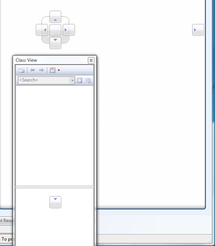 y the properties item in the context menu at all. Not because we have an evil, nefarious plan to remove the properties item inconsistently throughout our designer, but rather because no one gave it any thought when we put the prototype together as we had other UI elements we wanted to focus on.
This became a serious problem for our customer, as the way he expected to work was completely interrupted. At one point, we asked him to dock the property window so we could continue with the test. This is the most fascinating part of the study to me, and that was watching him work to dock the property grid in the left panel. I've become so used to the docking behavior in VS (see screenshot below), that it didn't even occur to me that this might present a problem for the user. Instead, we watched for 3 minutes or so as he attempted to figure out how to move the window, and then try to process the feedback that the UX elements give. About 60 seconds in or so, the property grid was about at a similar location to the screenshot, with just a centimeter or two's distance away from being in "the right place". Watching his face, we saw him look slightly confused and then move it elsewhere. Two more times he came back to that same spot, just far enough away to not get the feedback that might help him in the right direction. It was at this point, the spontaneous yelling started among the observers in the room. Something that has become so obvious to us, something we have internalized and accepted as "just the way the world," was becoming crystal clear to us how much difficulty this was causing. The yelling was things like "Move up, move up" "no, wait, over, over" "oh, you almost, almost, no...." trying to will the customer through the soundproof wall what we wanted him to do.
This situation repeated itself time and time again with different UI elements, and it was very, very educational to see the way different users manage their workspace and interact with a tool that I've become so familiar with that I forget to see the forest for the trees. I also realized, that although I had worked with a lot of customers and other developers, very rarely had I paid attention to how they work, rather than simply their work.
Now, here's where I open up the real can of worms. We're looking to make usability improvements in the WF designer. Are there any that really bother you? What can we do to make you a more productive WF developer?