Accessing Native Operating System Features with Xamarin.Forms
Editor's note: The following post was written by Visual Studio and Development Technologies MVP Matthew Soucoup as part of our Technical Tuesday series. Simon Timms of the MVP Award Blog Technical Committee served as the technical reviewer for this piece.
Xamarin.Forms empowers software developers to build mobile applications with both shared application logic, and shared user interface code across iOS, Android, and UWP applications.
Building a shared application logic in Xamarin.Forms is the same as with traditional Xamarin-based development.
Xamarin.Forms takes only the user interface elements that are common across all the operating systems - such as a Button or a Label - and then provides an API for those elements. That means user interface elements that only exist natively in one platform (that is, those controls and styling techniques that give that platform its signature look) are not present in Xamarin.Forms.
This leads to the common complaint that Xamarin.Forms apps look a bit generic, since they are built against the lowest common denominator of controls available for all three operating systems.
However, this does not need to be the case. Xamarin.Forms provides several methods to bring the custom, signature platform controls and styles into the core application, thus providing the ability to create beautiful and customized apps. In this article, I will show you two of those methods: Effects and Bindable Native Views.
Effects
Effects are used for small styling changes to the native version of Xamarin.Forms controls. For example, an Effect can create a border around an iOS UIView or a shadow around an Android TextView.
Effects are not meant to change or add to the behavior of a given control, rather they are meant to only apply small styling changes. A good rule of thumb is if the desired change can be obtained by modifying a property on the native control, you should use an Effect. If the desired change requires modifying many properties and/or overriding functions on the native control, then a Custom Renderer is the preferred solution.
In this section, I will show you how to create an Effect that applies a shadow around the text of a Xamarin.Forms label on iOS. For the sake of this example, I will leave out the Android version of this Effect, to demonstrate how it does not need to be implemented on every platform to be used in the Xamarin.Forms core project.
This is what the label looks like before the shadow was applied 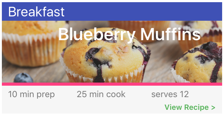
The word “Blueberry Muffins” is washed out against the image in the background.
However, when the shadow is applied to the text, it becomes more legible. 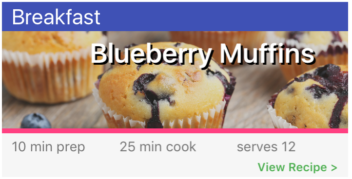
It’s subtle change, but one that improves the overall user experience of the app.
Parts of an Effect
An Effect is comprised of several constituent parts spanning both the platform and core projects. Before exploring how an Effect is implemented, it helps to understand the various pieces.
Within the platform projects, we must implement the small styling changes to the native controls desired for the Effect in a subclass of the PlatformEffect class. Two attributes then need to be applied to the class. Those attributes combined register the Effect with a unique ID for Xamarin.Forms.
In the core project, the best way to consume the Effect is by creating a subclass of the RoutingEffect class. The RoutingEffect class represents a platform-independent effect – and it “routes” to the appropriate platform-specific effect by wrapping it in an inner effect. Thus the subclass will serve as a surrogate to the platform’s implementation of the Effect.
Every Xamarin.Forms control that comes from the Element class contains an Effects collection. The subclass of the RoutingEffect is added to that collection to enable the Effect.
Platform Effect Implementation
To create the shadow on a Xamarin.Forms Label on iOS devices, a new class must be created in the iOS project that inherits from PlatformEffect.
There are three important properties that PlatformEffect exposes: Container, Control, and Element.
- Container – references the native control that implements the layout of the control being styled
- Control – references the native control that is being styled
- Element – references the Xamarin.Forms control that is being styled
The Control property and Element property both refer to the same control – Element refers to it on the Xamarin.Forms side and Control refers to it on the native, or platform, side.
Those three properties are then used within two abstract functions that must be overridden to apply the styling to the native control: OnAttached and OnDetached.
OnAttached is invoked as soon as the Effect gets added to the control.
Use the OnAttached function to perform setup prior to applying the styling – such as saving the current state of the native properties that are about to change, or subscribing to any events.
The most important function of OnAttached is to invoke the styling changes to the control.
The OnDetached function may be used to perform any cleanup, such as restoring a state that was stored during the OnAttached or unsubscribing from event handlers. OnDetached is invoked as soon as the Effect is removed from the control.
A very basic implementation of a shadow Effect on iOS looks like the code below. Note the current state being saved in OnAttached and reapplied in OnDetached.
 public class LabelShadowEffect : PlatformEffect
{
    UIColor oldColor;
    CGSize oldOffset;

    protected override void OnAttached()
    {
        var c = Control as UILabel;
        oldColor = c.ShadowColor;
        oldOffset = c.ShadowOffset;

        c.ShadowColor = UIColor.Black;
        c.ShadowOffset = new CGSize(2, 2);
    }

    protected override void OnDetached()
    {
        var c = Control as UILabel;
        c.ShadowColor = oldColor;
        c.ShadowOffset = oldOffset;
    }
}
There is one more function within PlatformEffect that bears mentioning: OnElementPropertyChanged(PropertyChangedEventArgs e).
OnElementPropertyChanged is fired every time a property value is updated on the Xamarin.Forms control. The PropertyChangedEventArgs parameter contains one public property called PropertyName, which contains the name of the control’s property that was updated.
Using that function along with the Element property of the PlatformEffect class, one can react to changes happening on the Xamarin.Forms control to customize and change the style at runtime.
Registering the Effect
Once the Effect is created it must be registered with Xamarin.Forms for the core project, where the shared UI code resides, and can find and apply Effect.
This is accomplished with two attributes: ResolutionGroupName and ExportEffect.
The ResolutionGroupName attribute takes a single string parameter used to uniquely identify all Effects created by a company or entity. Think of this as something of a namespace to avoid naming collisions with other Effects that share the same effect name. There should only be one ResolutionGroupName attribute per assembly.
The ExportEffect attribute takes two parameters: the type name of the Effect being created, and the name of the Effect. This attribute registers the Effect type with Xamarin.Forms. When combined with the ResolutionGroupName, it is used to uniquely identify the Effect.
Both attributes are assembly level attributes, and look like this when applied to the shadow effect being created:
 [assembly: ResolutionGroupName("com.codemilltech")]
[assembly: ExportEffect(typeof(LabelShadowEffect), "ShadowEffect")]
namespace Foodie.iOS
{
    public class LabelShadowEffect : PlatformEffect
    {
Consuming the Effect
Now that the Effect has been created in the iOS project, it needs to be consumed in the core project.
This is pretty straightforward. First the platform Effect must be resolved, or brought into the core project. Then the Effect must be added to the target control that it will style.
The purpose of the RoutingEffect class is to resolve and wrap individual PlatformEffects. All of this is done by creating a subclass of the RoutingEffect and then passing a concatenation of the ResolutionGroupName and EffectName from the Effect creation steps into the base constructor.
A full implementation of a RoutingEffect looks like this:
  public class ShadowEffect : RoutingEffect
{
    public ShadowEffect() : base("com.codemilltech.ShadowEffect")
    {

    }
}
It is worth noting that the platform Effect the RoutingEffect is referring to does not need to exist on every platform. If Xamarin.Forms does not find a native implementation of the ResolutionGroupName and EffectName, it will ignore the Effect.
Once the RoutingEffect has been created, it can be added to the Effects collection to a control. This can be done at run-time or at design-time.
Here is an example of adding the RoutingEffect at design-time via XAML:
 <label text="{Binding RecipeName}" textcolor="White">
   <label.effects>
       <local:shadoweffect shadowcolor="Black"></local:shadoweffect>
   </label.effects>
</label>
Bindable Native Views
Another way to add a custom, single-platform look and feel to a Xamarin.Forms app is through Bindable Native Views.
Bindable Native Views are 100% native with iOS, Android, UWP control, which is referenced from within the Xamarin.Forms core project’s XAML. Not only that, but the properties on these views are bindable (both one-way binding from source to view, and two-way source to view, and view to source).
It’s easier to implement a Bindable Native View than an Effect, and it provides quite a bit of a native look for a small amount of work.
Bindable Native Views are accessed through XAML in the following format:
<{xml namespace}:{native class name} {native class or Xamarin.Forms properties} />
The key here is to define the XML namespace. Within XAML, XML namespaces are how controls from other assemblies are imported and used within the XAML page.
Xamarin.Forms introduced a new keyword for the XML namespace declaration that allows controls defined in platform assemblies – or non-Xamarin.Forms assemblies – to be referenced.
The name of that attribute is targetPlatform.
If you want to import controls defined in iOS, the XML namespace declaration looks like this:
xmlns:foodieIOS=”clr-namespace:UIKit;assembly=Xamarin.iOS;targetPlatform=iOS”
In specifying “iOS” for the targetPlatform keyword, the XAML parser knows only to use any control prefixed with “foodieIOS” when compiling for iOS, and ignore it for any other platform.
Here, an iOS UILabel is being referenced and data-bound:
<foodieIOS:UILabel Text="{Binding RecipeName}" />
The normal Xamarin.Forms binding syntax works as well. To specify two-way binding, make sure to include the “Mode=TwoWay” attribute within the binding definition.
It may also be necessary to include another new keyword in the binding definition to enable two-way binding: UpdateSourceEventName. Set this value to the native event’s name. This should fire the update of the view model from the view.
The real fun starts when referencing controls that only exist in one platform and not in the rest, such as a Floating Action Button (FAB) in Android. By adding a FAB to a Xamarin.Forms project, the app might not even look like it was developed with Xamarin.Forms at all - that is, it looks very customized.
The following example shows both how to create a FAB within Xamarin.Forms, and how to enable a bindable Commanding on it so the view model can react to events.
First let’s look at how to implement the Floating Action Button. This subclass is created within the Android project and inherits from the standard Android FloatingActionButton control.
What it does differently, however, is provide a Command property. On the FloatinActionButton’s click event, the Command gets executed if anything has been attached to it – like a Command property from a view model class.
  public class FoodieFab : FloatingActionButton
{
    public Command Command { get; set; }

    public FoodieFab(Context context) : base(context)
    {
        this.SetImageResource(Resource.Drawable.ic_add_white_24dp);

        Click += (sender, e) =>
        {
            Command?.Execute(null);
        };
    }
}
Next let’s look at the XML namespace declarations in the XAML file. For Android, two are necessary. The first gets a reference to the Xamarin.Forms.Platform.Android assembly, and the second to the assembly where the new “FoodieFab” button was created. The Xamarin.Forms.Platform.Android assembly reference is needed because Android controls need a reference to the current Android Context sent into the constructor, and it’s located in this assembly.
 xmlns:formsDroid="clr-namespace:Xamarin.Forms;assembly=Xamarin.Forms.Platform.Android;targetPlatform=Android"
xmlns:foodieDroid="clr-namespace:Foodie.Droid;assembly=Foodie.Droid;targetPlatform=Android"
Finally, we’ll look at implementation inside the XAML file. Android FAB properties, the Command property, and Xamarin.Forms properties are referenced all from the same control declaration.
 <foodieDroid:FoodieFab x:Arguments="{x:Static formsDroid:Forms.Context}" UseCompatPadding="true"
    AbsoluteLayout.LayoutBounds="1,1,AutoSize,AutoSize" AbsoluteLayout.LayoutFlags="PositionProportional"
    Command="{Binding AddRecipeCommand}"/>
When the app is running, it looks like the screenshot below. Upon clicking the FAB, the “AddRecipeCommand” will get fired in the backing view model, and the appropriate action occurs.
All in all, the FAB makes this Xamarin.Forms look like a native Android app. 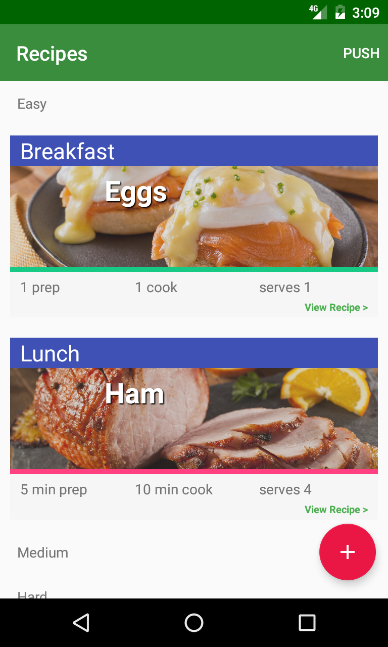
Summary
Xamarin.Forms provides a single API to write user interfaces against, which greatly speeds up development. However, only common controls from iOS, Android, and UWP are included in the API and the resulting apps can look generic.
But that does not need to be the case. With the help of Effects, which apply small styling changes to the native version of controls already found in Xamarin.Forms and Bindable Native Views and introduce 100% pure native controls, Xamarin.Forms apps can obtain a beautiful, highly customized user interface.
 Matthew Soucoup is a principal at Code Mill Technologies based out of Madison, WI. He regularly speaks at conferences and user groups around the midwest and the nation, and founded the Madison Mobile .Net Developers Group. Follow him on Twitter @CodeMillMatt.