Using The R Visual in Power BI
Editor’s note: The following post was written by Data Platform MVP Mark Wilcock as part of our Technical Tuesday series.
Financial regulators are unreasonable people – at least that’s the impression those of us who report a banks’ risk numbers to them would have you believe. Not only do they demand daily reporting but they also require the charts that we provide to have a defined layout and format. This does raise a problem for Power BI in that while it has very good visual practices, these are not exactly those of the regulator. However, we can use the R visual to create a chart in exactly the fashion that a regular demands.
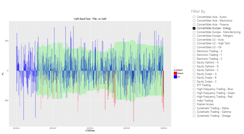
One very important chart for regulators is the market risk back test chart. It is really two charts in one; a bar and area chart. It compares the profit and loss (P&L) that the bank, or part of the back such as a legal entity or desk, against a margin of safety, known as value-at-risk or VaR, that we promise that the P&L will stay within most of the time. On those days that the P&L exceeds the VaR, that’s a breach. If we have too many breaches, the regulator will take action.
The regulator wants to see the VaR as an area chart with VaR as a mirror image both above and below the x (date) axis since a breach occurs if the bank makes either a profit or a loss outside this VaR envelope. Regulators want this VaR envelope to be partly transparent so that we can superimpose the P&L on it. The daily P&L must be shown as blue bars with breaches shown in red.
In Power BI chart we can get close to these requirements – close, but no cigar.
There are three problems
- The VaR envelope is shown as two boundary lines rather than area chart. The Power BI combo chart visual combines a bar chart (used for the P&L) with a line chart but we can’t combine with any other chart
- The P&L bars are all blue; there is no means of changing the colour of individual bars based on a condition
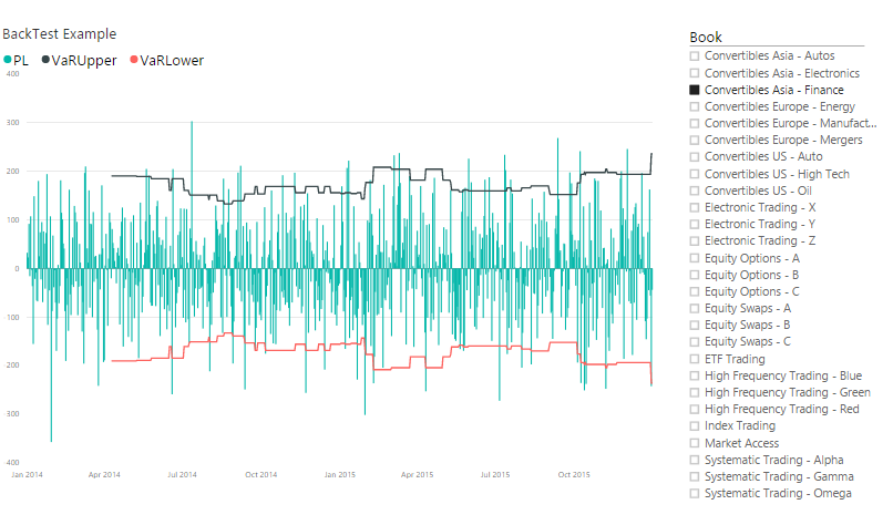
- The snapshot below shows synchronized axes for P&L and VaR but if the ranges of these two measures are sufficient different, the chart will automatically have different scales for P&L and VaR, which is not what we want and is potentially misleading.
However, we can meet all requirements if we use the R visual. We can use the fine tuning allowed in the plotting package to define our chart elements precisely. The snapshot below shows the R chart.
The R visual creates a script editor in a lower pane. It provides the first 2 lines of R code to create an R data frame (R’s equivalent of a table) that contains all unique values of the columns in the values well. From here we can add a few lines of R code firstly to determine if there is a breach on a given day and then to plot the chart. The R code uses two very popular R packages. The dplyr package enables us to manipulate data frames and the ggplot2 package gives us the ability to plot exactly the chart we require. The ggplot call first creates the P&L bar chart. It selects the colour of the P&L bars based on the breach condition. It then overlays this with partially transparent area charts – one for the upper VaR bound, then one for the lower (negative) VaR bound.
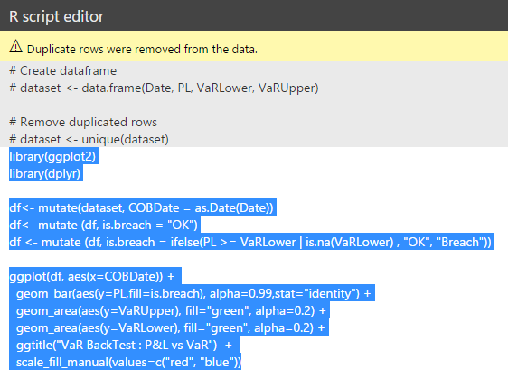
Even with a small amount of R code like this, it is best to build and test the R code within the RStudio, the typical development environment for R, then copy it into the code window for the visual once it is fully working.
The ggplot2 package allows fine tuning of a charts appearance – enough to satisfy the most unreasonable regulator.
About the author 
Mark specialises in the analysis and reporting of financial and risk data. He has built data warehouses, cubes, reports and dashboards for risk managers within banks to manage market risk and other financial risks.
He also is the organiser of the London Business Analytics group, a popular community group that meets about once a month in central London to discuss varied topics from data ethics in medicine to climate change analytics.