PowerPoint and Excel: Perfect Partners to Bring the Heat to Your Presentations
Editor’s note: The following post was written by PowerPoint MVP Glenna Shaw as part of our Technical Tuesday series .
Tables are a powerful tool for visually organizing data, but a table takes time for an audience to absorb. When you’re giving a presentation you want your audience to listen to what you have to say, not looking at a table trying to decipher the patterns in the data.
So how can you make a table that your audience can absorb at a glance? The answer is turn it into a heat map. A heat map uses color to indicate values or ranges in value, making it easier for the viewer to see the patterns in the data.
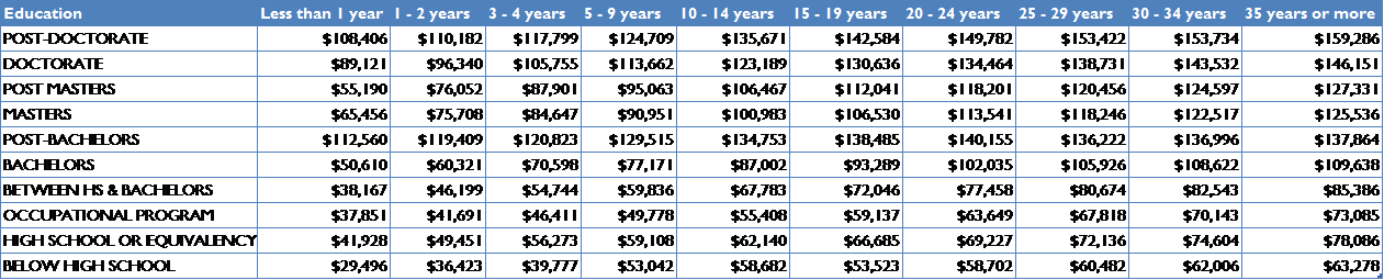
The difference is easily seen in this example:
Data Table
vs. Heat Map
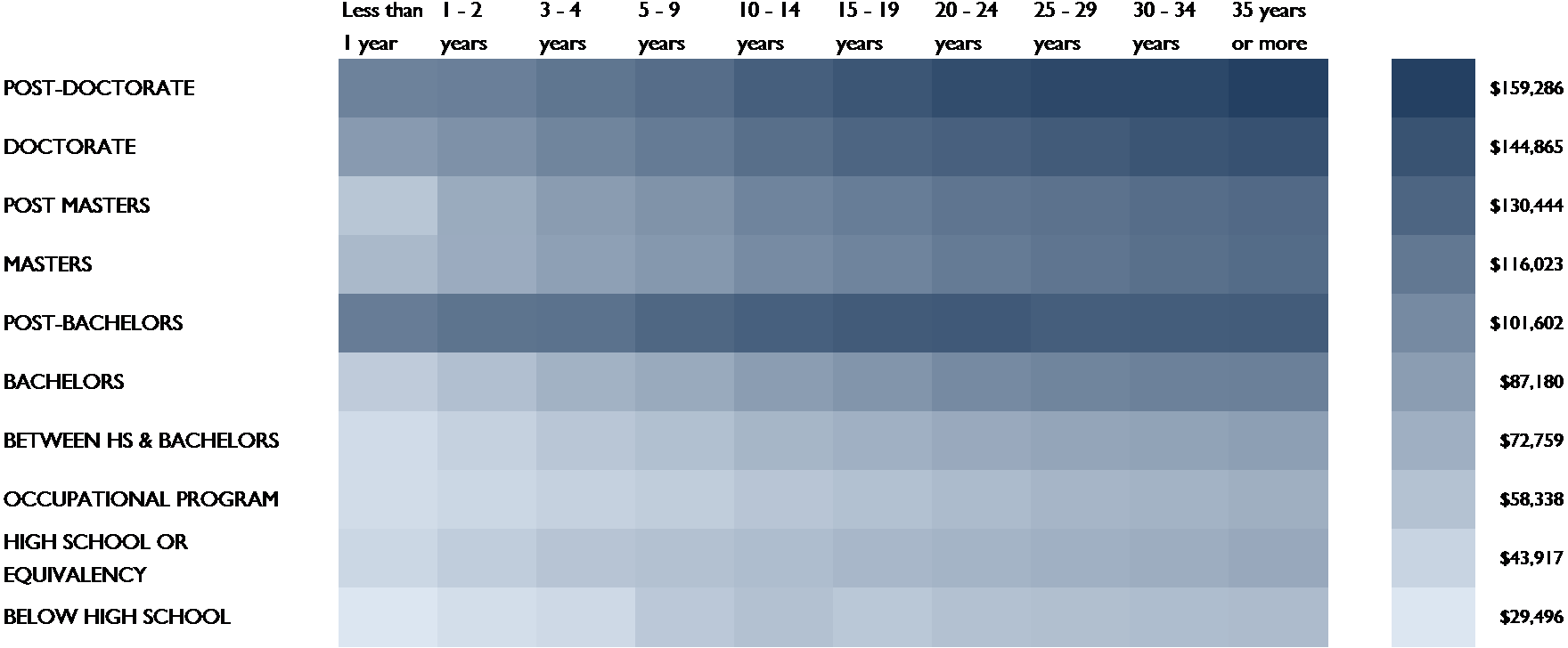
Without the heat map it’s nearly impossible to see that the Post-Bachelor’s degree is as effective for earning potential as the Post-Doctorate.
Match Formatting in PowerPoint and Excel
Unless you want to color the PowerPoint table manually, your best option for creating a heat map is to do it in Excel. Since you’ll be copying the heat map into PowerPoint the first thing you want to do is make sure you’re using the same theme for both PowerPoint and Excel. If you don’t know how, follow these instructions for PowerPoint: https://support.office.com/en-us/article/Apply-a-theme-to-add-color-and-style-to-your-presentation-f1616ee1-2820-4eaf-a9f3-525347eeace1 and these instructions for Excel: https://support.office.com/en-in/article/Apply-customize-and-save-a-document-theme-in-Word-or-Excel-da3f1e8e-2338-457c-977f-25f950016710. This ensures you’re using the same colors, fonts and effects for your heat map and your presentation.
Using Excel to Create the Heat Map from a Table
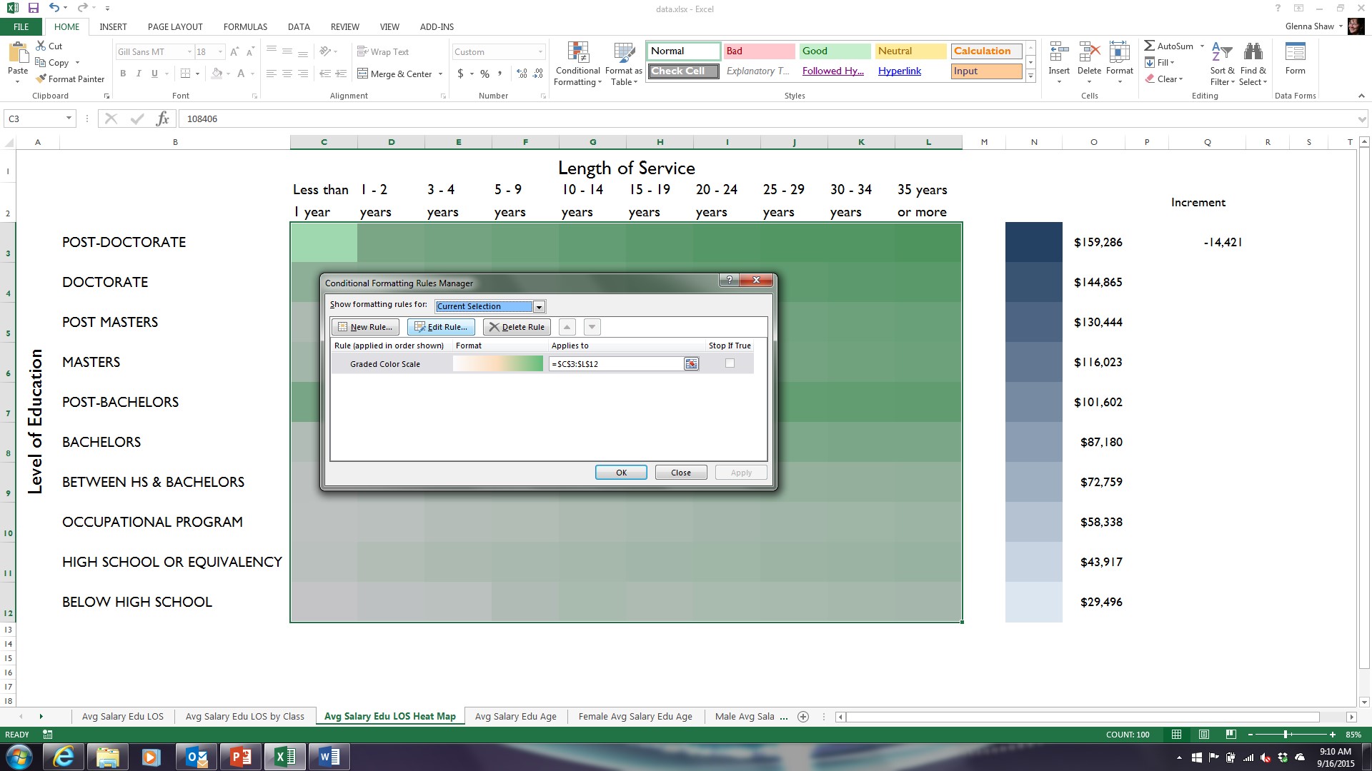
Excel’s conditional formatting feature makes creating a heat map very easy. To create a heat map like the one in the example all you have to do is highlight all the values in your table, click on Conditional Formatting in the Home tab, click Color Scales and choose the one you want. I choose the Green – White Color Scale and then modified it by clicking on Conditional Formatting, Manage Rules, and Edit Rule and changed the white to light blue and the green to dark blue.
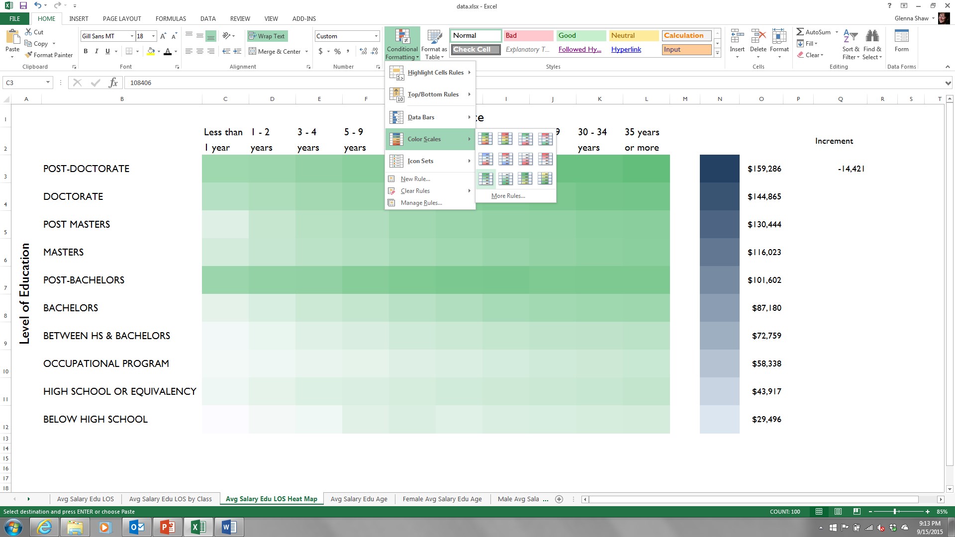
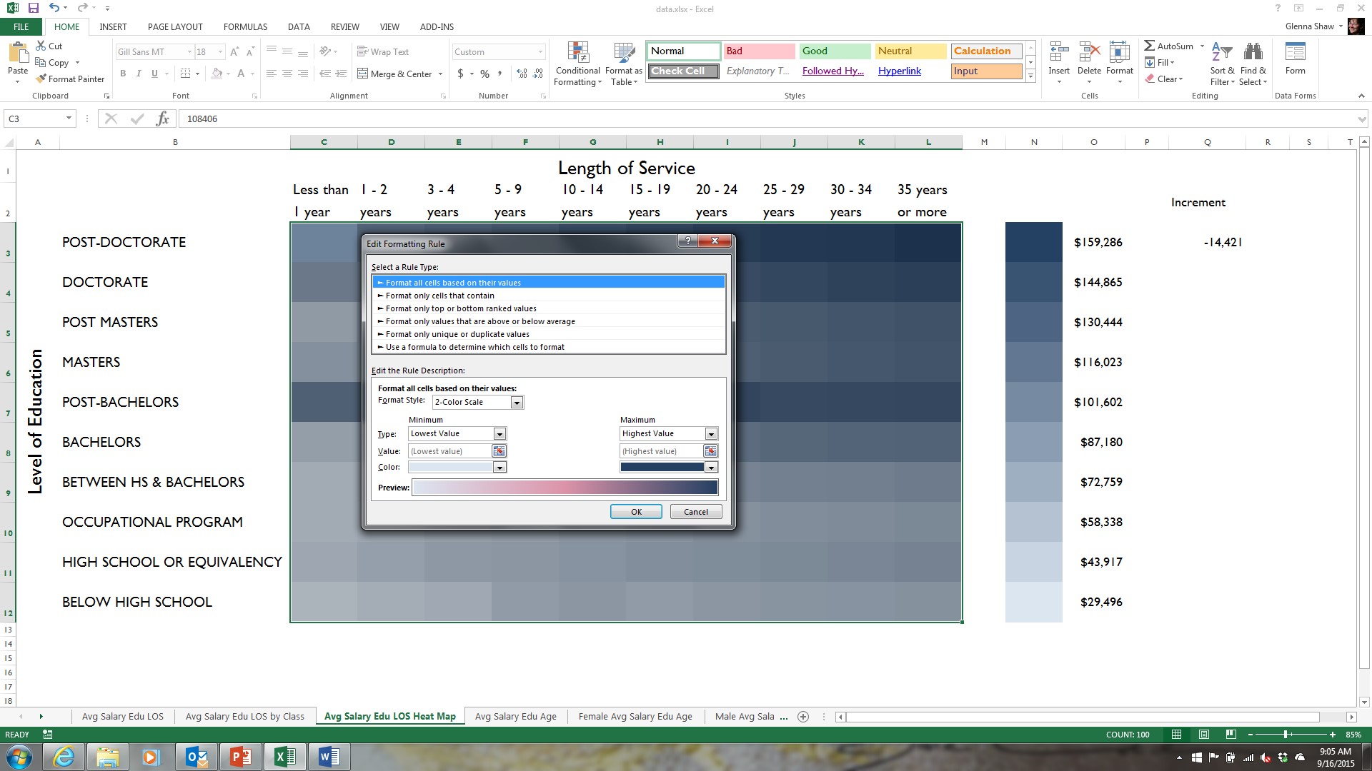
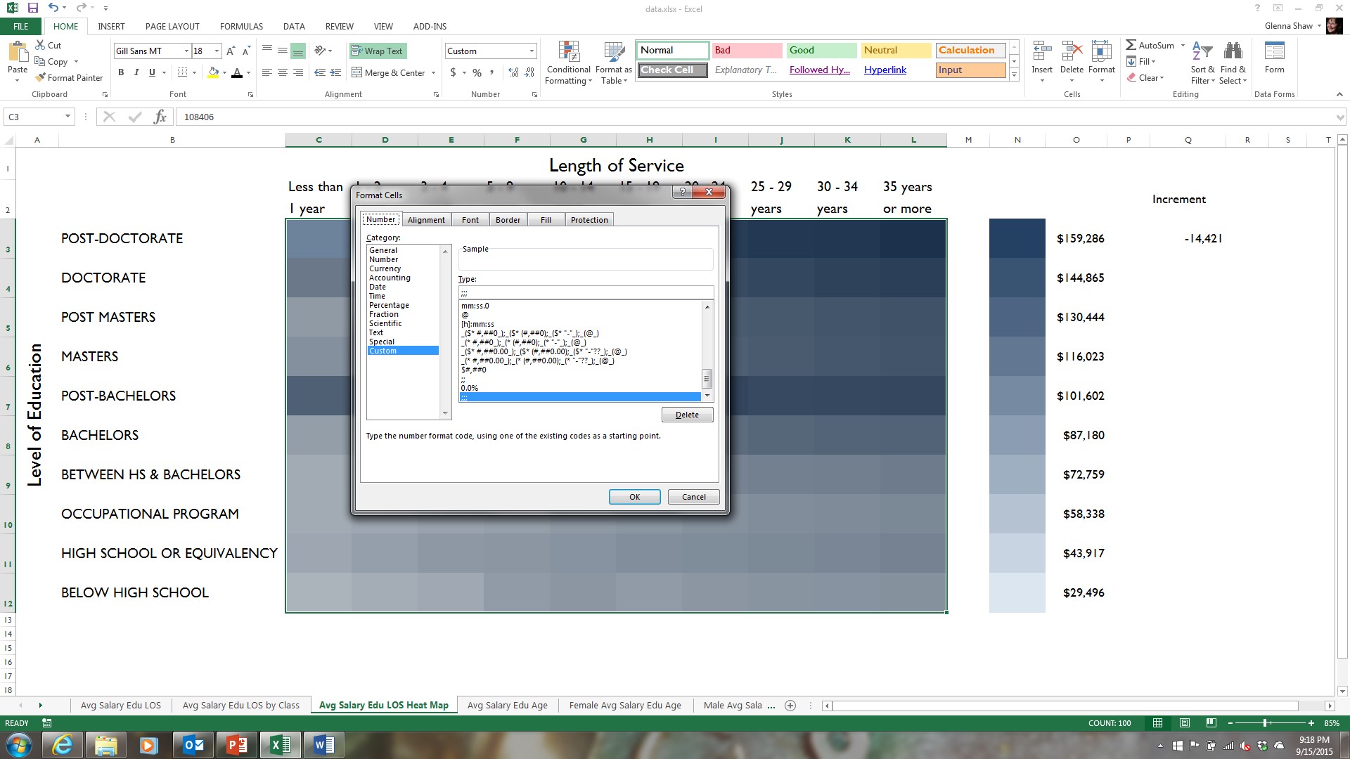
To hide the values in the table, simply highlight all the values in your table and click Format in the Home tab, click Format Cells and apply a custom format of three semi-colons (;;;) as the type.
Creating a Custom Heat Map
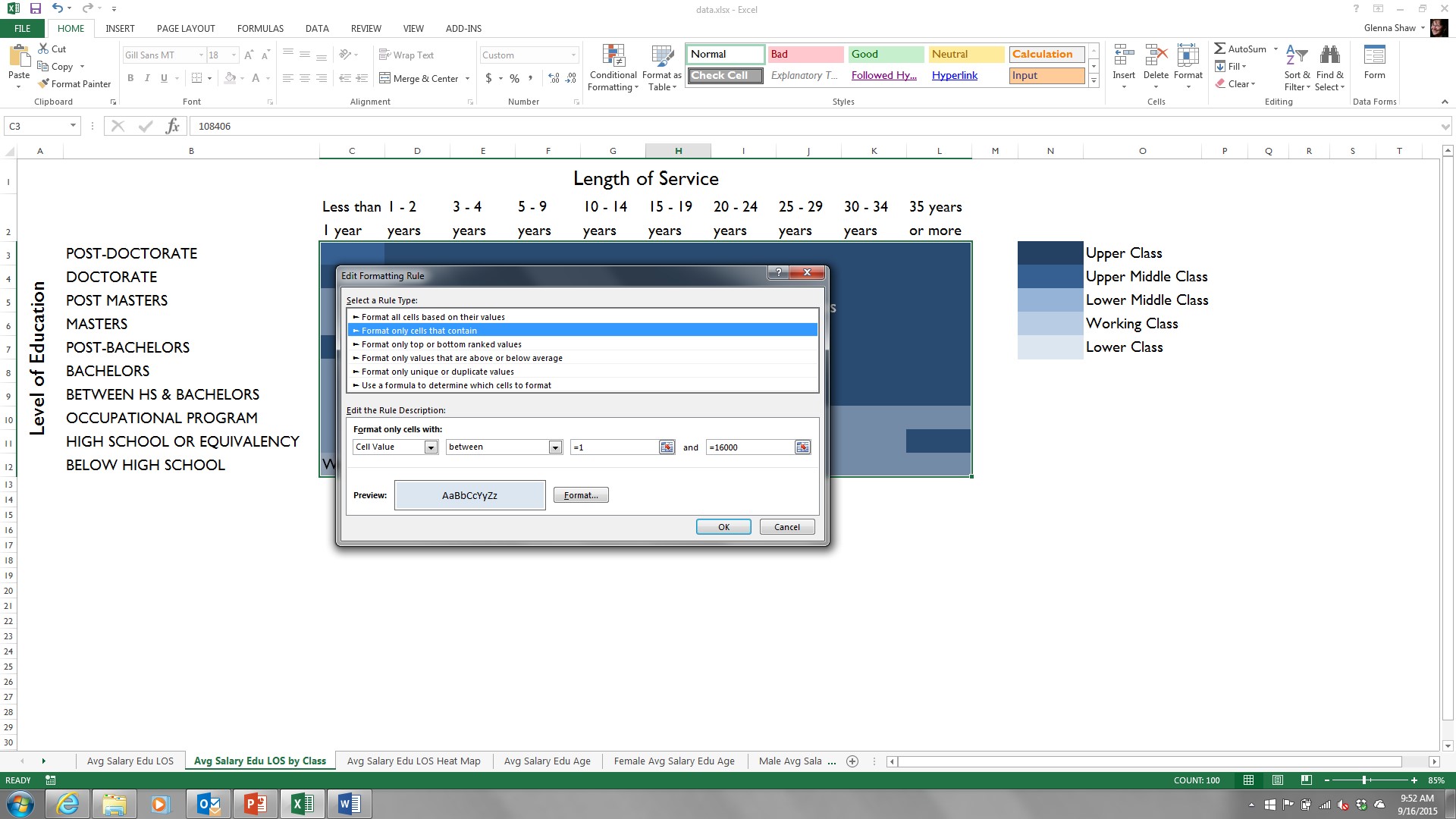
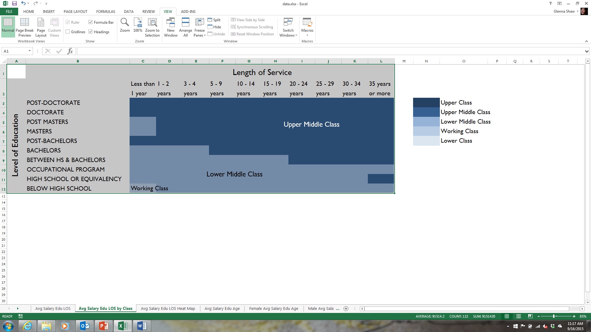
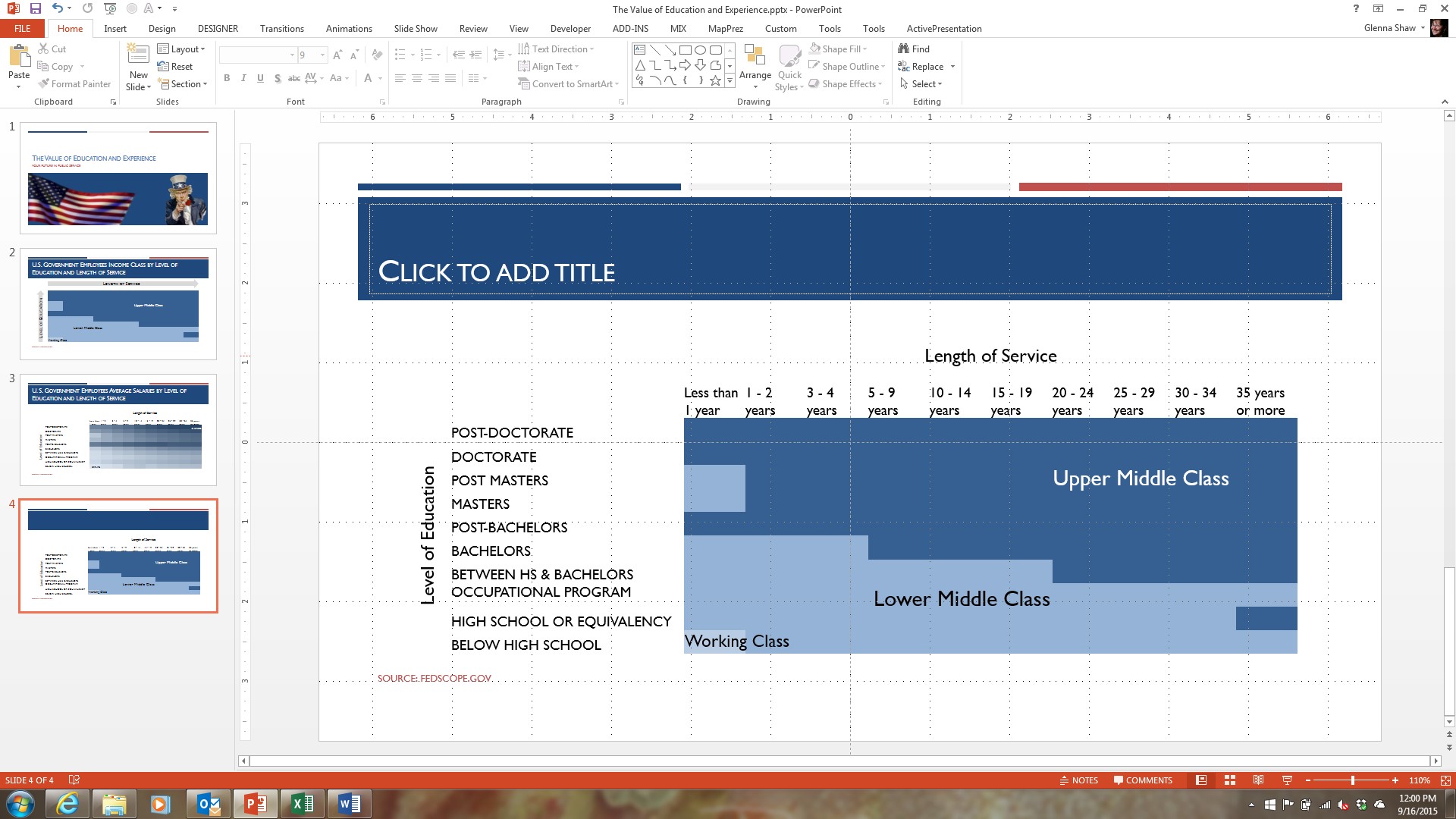
If the standard conditional formatting options don’t meet your needs, it’s pretty easy to create your own. In the example below, I applied conditional formatting to the same table to show the values that fall within the ranges for income classes in the United States.
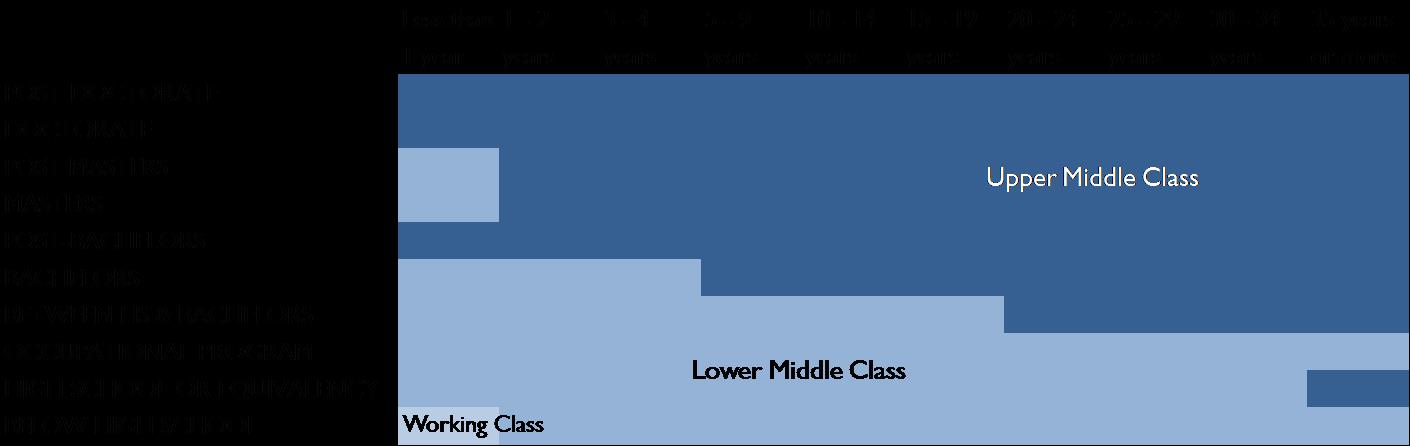
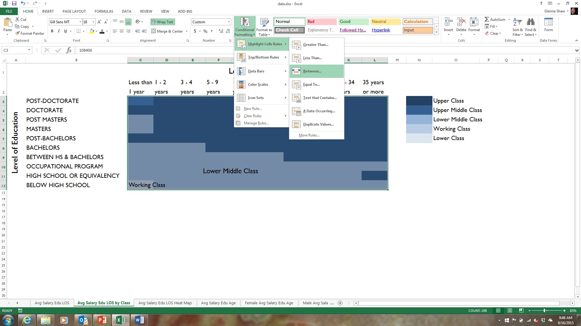
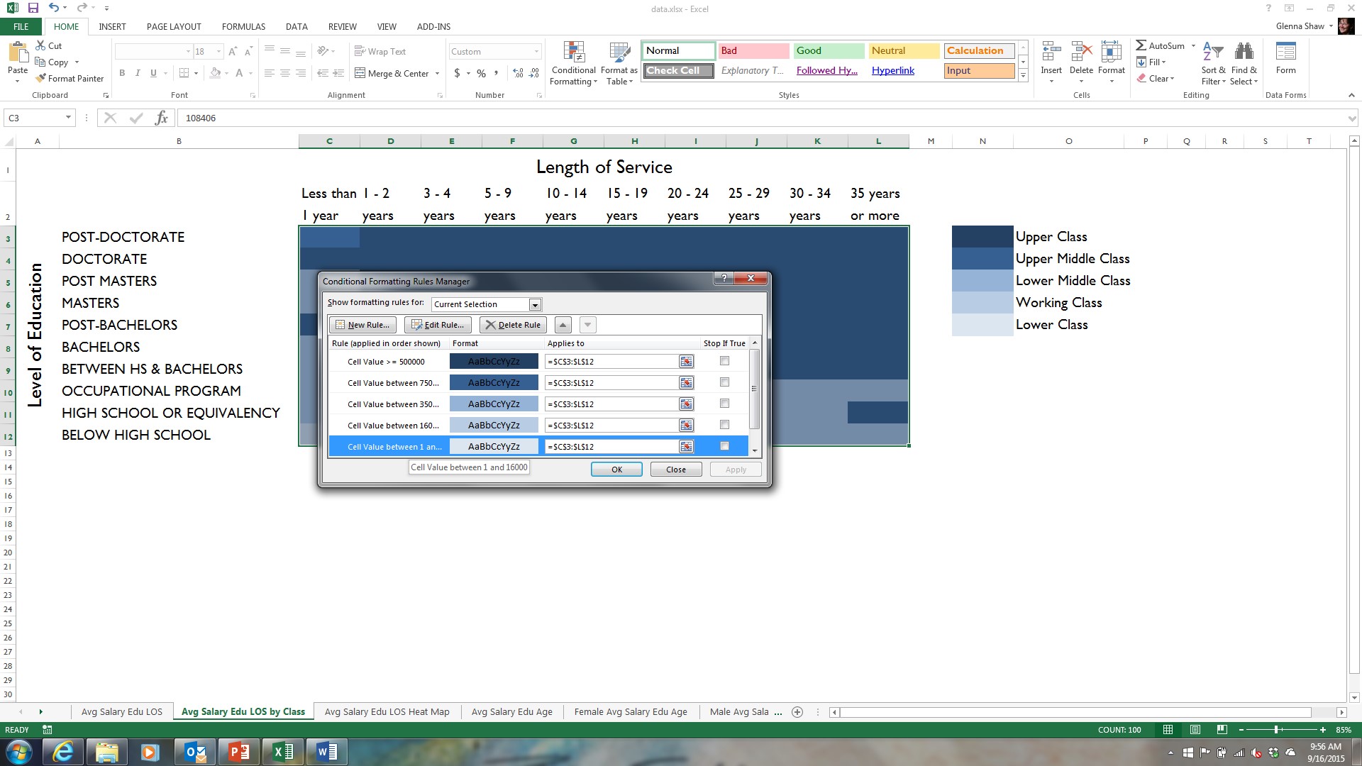
In order to get this type of formatting, I created a conditional formatting rule for each level of income class; from lower class to upper class. To do this, I selected all the values in my table and clicked on Conditional Formatting, Highlight Cell Rules, Between…, set the values for lower class annual salary range (between 1 and 16000) and formatted the cell with a very light blue fill. I then repeated these steps for each of the remaining income class ranges choosing a slightly darker blue fill as I progressed through the income class levels. This gave me 5 conditional formatting rules applied to the same cells, but, as you can see in the example, the values in my table meet the criteria of only three of the rules. Without conditional formatting, I would’ve had to figure this out manually.
The Legend Controversy
No matter what type of heat map you chose to make, you’re going to have to offer some type of explanation to help your audience recognize the pattern. Current trends prefer direct labeling of values like I’ve shown in the heat map for the income classes by using text boxes. This works great when you only have a few colors to label. For a heat map that shows a large variety of colors you have a number of options:
1. You can simply tell the audience that the darker the color the higher the value and vice versa.
2. You can add a shape formatted with a gradient using your two colors and label it.
3. You can format the cells for the highest and lowest values to show the values in the cell.
4. If you want to provide more detailed information you can include a legend like I’ve shown in the first example. To create this legend, I first used a formula to create equal increments of the values between the highest and lowest value and then applied the same conditional formatting to it as the table. It’s important to note that using this type of legend will be more of a distraction for your audience, so I might save it for a hand out instead of a presentation.
Adding Your Heat Maps to a Presentation
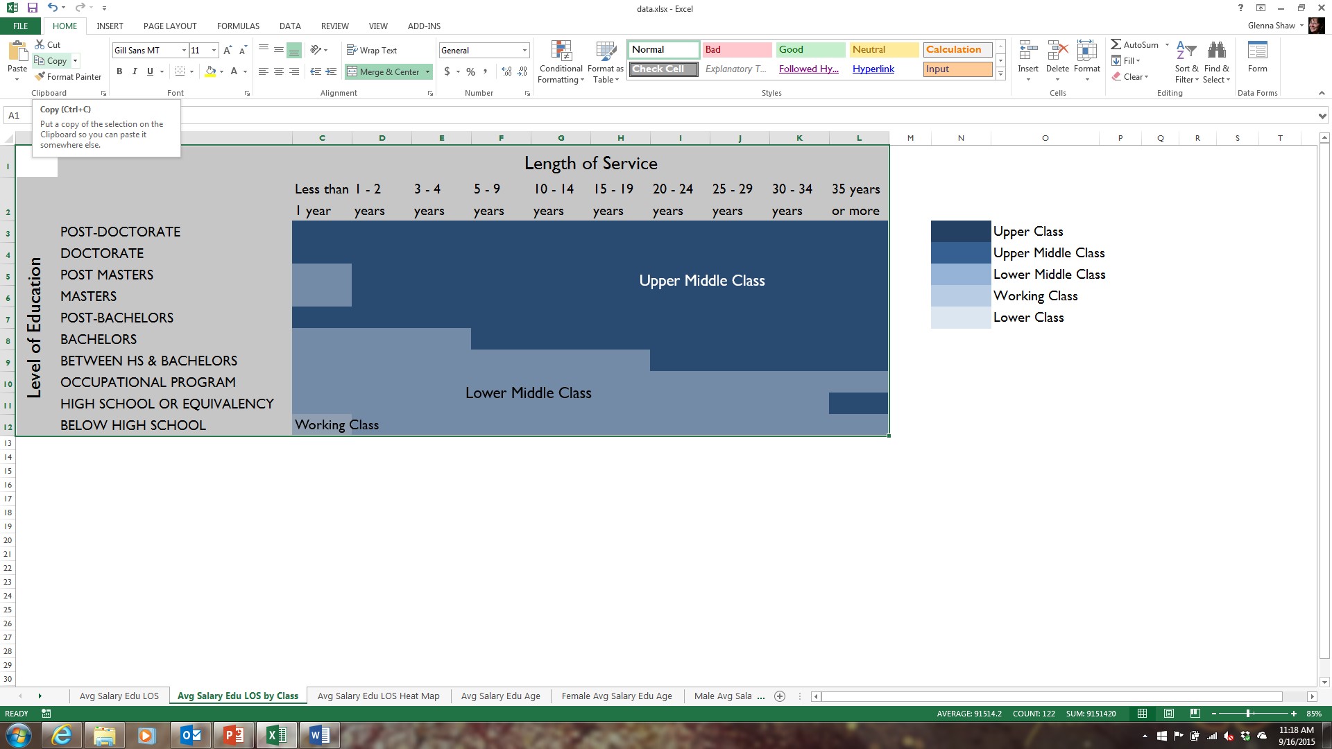
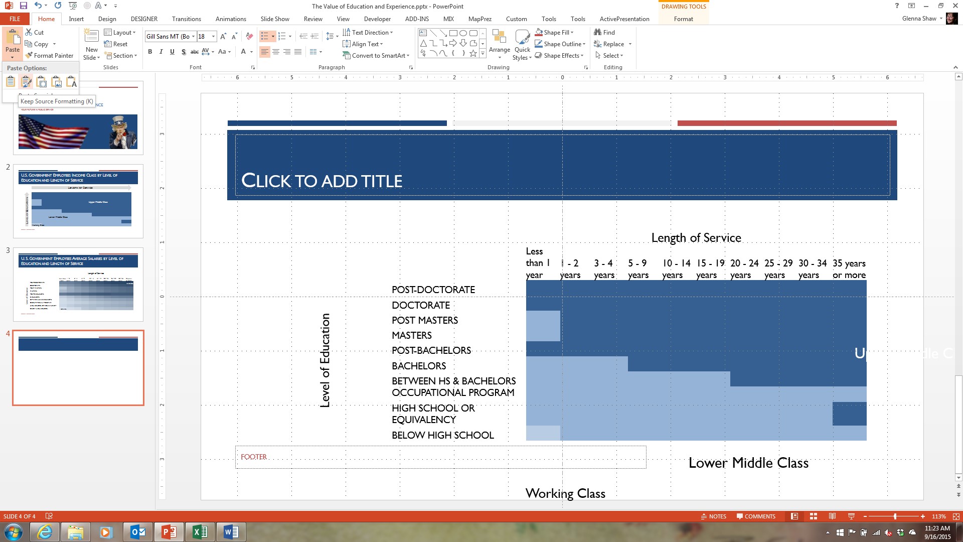
The best option to getting your heat maps into a PowerPoint presentation is to copy and paste them while retaining the original formatting. Make sure you’ve done all your formatting in Excel before you copy the heat map. This includes any labels. Then select Copy from the Home tab. Your selected area will now be bounded by a dashed line.
Go to your presentation and click on the border of your placeholder to select the entire placeholder (this will help with sizing your heat map to the slide). Make sure you’ve selected the entire placeholder. You’ll know this because the handles will appear on the corners of the placeholder instead of your cursor inside it. In PowerPoint, click the Paste drop down on the Home tab and click the second icon to Keep Source Formatting.
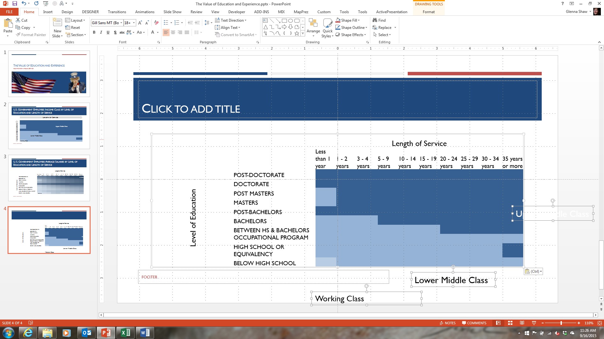
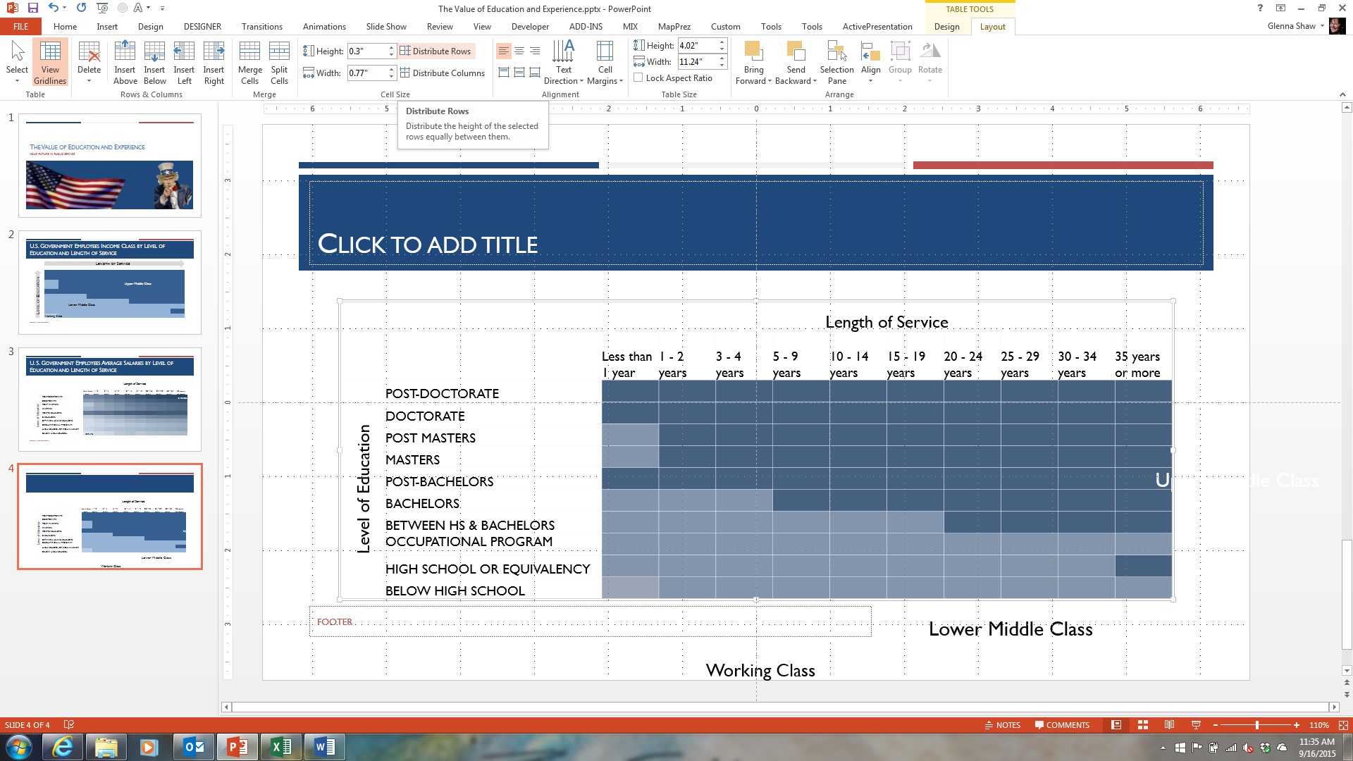
This will paste your heat map into your slide. As you can see by the example below, you’ll probably need to make some adjustments. Because the entire thing is a table, you can click and drag the column width and row height as desired until you get the look you want. It’s important that the heat map cells are exactly the same size as each other, so once you’ve formatted all the text columns and rows surrounding your heat map, select all the colored cells and click on Table Tools, Layout, Distribute Rows, and Distribute Columns. In my example, I also have to move and adjust my text labels. The final result is an attractive heat map that is much more effective in a presentation than a table.
This method copies the heat map into a PowerPoint table. If your table data frequently changes you may want to link your heat map to your presentation instead. Linking tables from Excel to PowerPoint is tricky at best. For my part, I prefer just to recopy/paste into PowerPoint since I can do it faster. But if you do want to link your heat map see my tutorial here about Dynamic Tables in PowerPoint for how to do it: https://blogs.msdn.com/b/mvpawardprogram/archive/2014/04/07/powerpoint-and-excel-perfect-partners-for-dynamic-tables-and-dashboards.aspx
Finally, I’d like to give a nod to Excel MVP Jon Peltier for his excellent tutorials on Excel. Most of what I know about Excel came from his site. His site is: https://peltiertech.com/.
The files used to create this tutorial are available for download as a heat map.zip file at: https://1drv.ms/VCaYgL.This is a OneDrive.com site so you must be able to access it to download the files. My other tutorials and sample files are also available.

About the author
Glenna is the owner of the PPT Magic and GlennaShaw.com web sites and the Visualology blog. She is a Project Management Professional (PMP) and holds certificates in Knowledge Management, Accessible Information Technology, Graphic Design and Professional Technical Writing. Follow her on Twitter @GlennaShaw.