Powerpoint 2013: Visualizations Part 2: Creating Data Infographics with Charts and Graphs
Editor’s note: The following post was written by PowerPoint MVP Glenna Shaw
PowerPoint 2013: Visualizations
Part 2: Creating Data Infographics with Charts and Graphs
In Part 1 of this series, we discussed creating data infographics using shapes. In this part we’ll take the next step and use the features of PowerPoint 2013’s charting tools to create more detailed infographics. This series of articles assumes you are already familiar with creating and modifying charts in PowerPoint 2013. It also assumes you know how to format, group, combine and align shapes and have read part 1 of this series.
There are four primary techniques for changing charts to infographics in PowerPoint 2013:
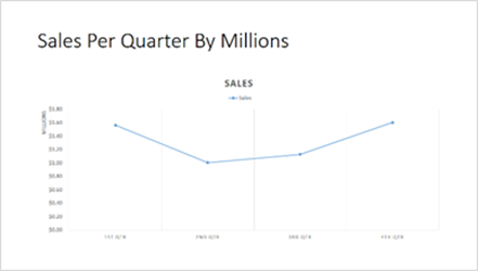
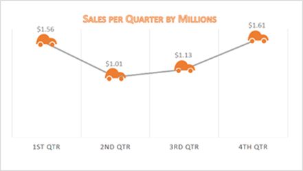
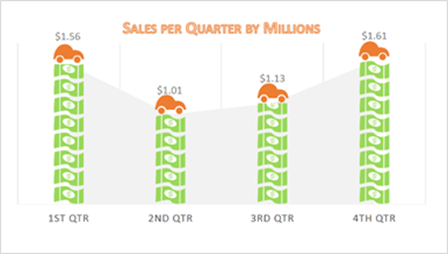
1. Put shapes on top of an existing chart. In this scenario, Shady Sam wants to include a slide showing quarterly sales for all cars for the past calendar year. In a typical presentation this would be displayed as a line chart. While accurate, it’s rather boring and the information doesn’t readily stand out to the audience since there’s little familiar context. We can improve the audience’s ability to easily consume the information by simply adding car shapes at the data points, removing the vertical axis and adding data labels. This immediately tells the audience the sales are about cars and shows only the values of interest in direct relation to their points on the timeline road. Notice I’m using orange cars in this instance. This is to avoid confusion with the slides from the previous article where we covered annual sales by car color. We can also make the chart much more legible by removing the slide title and using the chart title, resizing the chart and increasing the size of the text. To create your chart:
a. Use these values to create a line chart.
Sales |
|
1st Qtr |
$1,564,000.00 |
2nd Qtr |
$1,005,000.00 |
3rd Qtr |
$1,128,000.00 |
4th Qtr |
$1,605,000.00 |
b. Adjust to layout shown.
c. Add car graphics at each data point.
2. Use images for the fill of chart elements. While we’ve significantly improved the plain line chart, we still don’t have a good contextual element for the monetary values. We could place the dollar images directly on top of the graph, but there’s a better and more accurate method. Follow these steps:
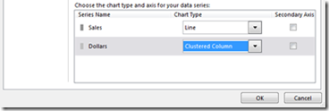
a. Add another data series with the same values and label it dollars.
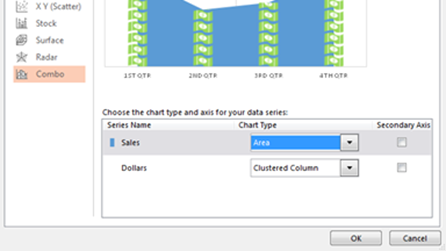
b. Change the chart type to a Combo Chart with the dollar series as a clustered column chart.
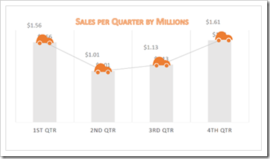
c. We now have a combo chart that looks like cars sitting on top of columns. Select the column data series by clicking on the columns and change the fill to the image of a dollar.
d. Change the fill from stretch to stack,
e. Adjust the gap width of the series to make it the same width as the cars,
f. Delete the extra data labels and
g. Center the car shapes over the columns of dollar bills.
We’ve now added the monetary contextual element, but the line no longer looks like a road. Instead the cars appear to be stuck on top of the columns of money and are connected by cables. We’ve lost the feeling of movement and the context of time. To remedy this:
h. Once again change the chart type to a combo chart.
i. Change the sales series to an area chart.
j. Finally, change the fill for the area data series to a light gray.
We’ve regained the sense of movement and the viewers can easily see that Shady Sam’s has a significant drop in car sales during the spring and summer months.
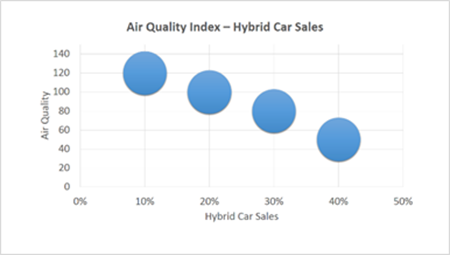
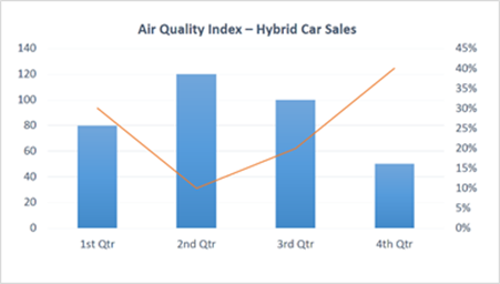
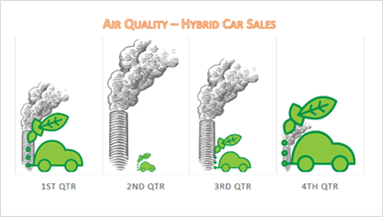
3. Adding elements on a chart background. This is very similar to adding shapes on top of a chart except, in this instance, we hide all the data series graphics and replace it with elements we create. For this scenario, Shady Sam (bless his heart) has decided he wants to see if there is any relationship between the local air quality index and hybrid car sales by quarter. Typically this would be graphed using a cluster or bubble chart. However, unless you’re a data geek, this is also a relatively hard chart to interpret. You can easily see there’s a trend, but you really have to do a bit of mental gymnastics to see that the higher the hybrid car sales, the lower the air quality index (a good thing) and you completely lose the context of time. Even using a line chart or combo chart, the information just isn’t readily grasped.
To clearly display the relationship between the elements, perform the following steps:
a. Convert the air quality index into percentages. To accomplish this we add all our values together and then divide each value by the total to get the percentage for that value.
b. Choose your images. For my example, I’m choosing smoke stacks to represent air quality and the green leaf car image I took apart to create my other car images in part 1.
c. Make the graph a blank canvas by setting the fill and line color for all our data series to No Fill and No Line.
d. Go to fellow MVP Dave Paradi’s Proportional Shape Comparison Diagram Calculation Tool.
e. Calculate the appropriate size for each of the quarterly elements and put them on top of the blank chart.
f. Remove the word index from the title in favor of the more easily understood Air Quality.
We now have a graph that shows us the direct relationship between air quality and hybrid car sales by quarter. Once again, we can readily see that car sales (even for hybrid cars) are lower during the spring and summer months and also that air quality is relationally poorer during those same months.
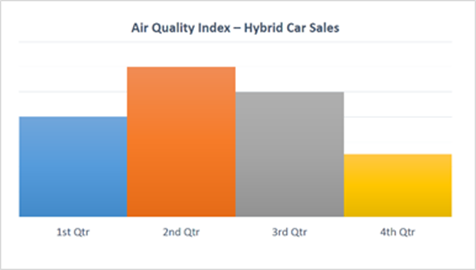
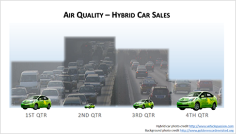
4. Use images as chart element backgrounds. So far we’ve effectively used shapes and graphical images for our infographics but for a more realistic interpretation we might want to use photographic images. You can easily use a photograph for the fill of elements of your graph like the background, the plot area or the data series elements such as bars, columns or area elements. You’ll just want to make sure to keep the aspect ratio of your photograph by adjusting the fill offsets otherwise your pictures will look distorted. For this example, we’re going to have the picture span the width of all the data series while still showing the individual series elements. To do this we’ll go back to the blank background column chart for the air quality index and make a few adjustments.
a. Change the fill for the air quality index series to Vary colors by point.
b. Adjust the gap width to zero so all the columns are touching.
c. Insert rectangle shapes on top of each of the data series columns.
d. Resize the shapes to be the same size as the series columns.
e. Fill each rectangle with a different shade of gray and set it at 75% transparency.
f. Apply a 5% soft edge to each rectangle.
g. Group the rectangles to be one shape (to enhance the smog effect).
h. Check the box in the format shape pane to maintain aspect ratio.
i. Change the chart’s data series back to no fill.
j. Copy/paste a duplicate of our transparent columns.
k. Ungroup the duplicate copy of our columns.
l. Merge the rectangles to become one custom shape.
m. Fill the newly created shape with a picture that’s in context with the data. For this example I’ve used a smoggy picture with a lot of cars.
n. Apply a 10 % soft edge to the custom shape.
o. Assemble the infographics by placing the custom shape on top of the chart background,
p. Place the transparent rectangles on top of the custom shape and
q. Place the hybrid cars on top of that.
To easily reorder the elements on your slide, click the home tab and click the selection pane in the editing group. I’ve used an image from the internet for my hybrid car and used the background removal tool to eliminate the background. I’ve also applied a gradient fill to the plot area of the chart to further emphasize the difference between the smog and blue sky. If you’re using images from the internet as I have, be sure to follow copyright laws. As you can see I’ve made sure to credit my photo sources in the lower right corner of the slide.
The result is a very polished and realistic infographic showing the air quality to hybrid car sales relationship.
This concludes part 2 of the series on Visualizations: Creating Data Infographics with Charts and Graphs. In part 3 we’ll discuss using SmartArt and Marketplace Apps to create infographics.
About the author

Glenna Shaw is a Most Valued Professional (MVP) for PowerPoint and the owner of the PPT Magic Web site and the Visualology blog. She is a Project Management Professional (PMP)
and holds certificates in Knowledge Management, Accessible InformationTechnology, Graphic Design, Cloud Computing and Professional TechnicalWriting. Follow her on Twitter.
About MVP Monday
The MVP Monday Series is created by Melissa Travers. In this series we work to provide readers with a guest post from an MVP every Monday. Melissa is a Community Program Manager, formerly known as MVP Lead, for Messaging and Collaboration (Exchange, Lync, Office 365 and SharePoint) and Microsoft Dynamics in the US. She began her career at Microsoft as an Exchange Support Engineer and has been working with the technical community in some capacity for almost a decade. In her spare time she enjoys going to the gym, shopping for handbags, watching period and fantasy dramas, and spending time with her children and miniature Dachshund. Melissa lives in North Carolina and works out of the Microsoft Charlotte office.
