PowerPoint 2013: Visualizations
PowerPoint 2013: Visualizations
Part 1: Creating Data Infographics with Shapes
We’ve all sat through presentations that contain slide after slide of charts and graphs. The chart may be well designed and clearly display the data, but still, all it’s displaying is the data in relational context. Either the speaker or the audience or both are required to perform the thought processes to turn that information into something meaningful.
In the hierarchy of knowledge, data moves to wisdom in three steps: 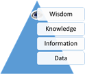
· From data to information by applying context
· From information to knowledge through analysis
· From knowledge to wisdom through action
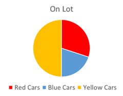
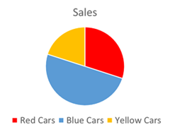
While charts apply relational context to your data, your audience is still required to perform the analysis of what they are seeing. Consider the following scenario: A car lot has 30% red cars, 20% blue cars and 50% yellow cars. In the last year, blue cars account for 50% of sales, red cars 30% and yellow cars 20%. In a typical presentation this data might be displayed like this:
While the data is accurate, this display of the information requires a lot of work on the viewer’s part to draw conclusions. In other words, turn the information into knowledge. They need to bounce back and forth between the charts comparing the data multiple times.
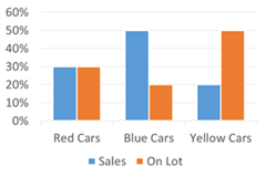
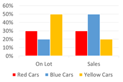
You could significantly improve the display of the information by simply combining them into a column chart. However, you’ll lose your color context in order to display the two series clearly. If you switch your data rows/columns in order to keep the color context, the comparison isn’t much better than the pie charts.
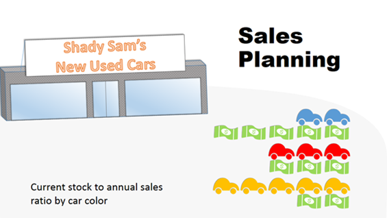
Prudent use of Infographics allows us to not only put the data in context but, through the use of the familiar, display some level of analysis that the audience can grasp in a glance. Rather than use traditional charts, by combining familiar car shapes and dollar images, we can display the data in a format that allows the audience to quickly analyze the information and make informed decisions for action (wisdom).
This Infographic immediately tells the viewer:
 · You’re understocked on blue cars by 30%
· You’re overstocked on yellow cars by 30%
· You’ve got the right amount of red cars
The viewer can easily determine the actions needed:
· Stock 30% more blue cars
· Take actions to increase sales of yellow cars
There are a six easy steps to create your own data infographics using shapes in PowerPoint 2013:
1. Find your graphics. In the example above, I simply inserted some clip art images and then ungrouped them to remove the parts I didn’t want. I then regrouped them and changed the colors to fit my information. If you cannot find a graphic, you can easily create your own in PowerPoint 2013 using the improved Merge Shapes feature on the Contextual Drawing Tools tab. You can learn how to merge shapes by reading this Office.com article. I also suggest checking out fellow MVP Julie Terberg’s article on Custom Shapes Made Easier with PowerPoint 2010. Although it is an earlier version of PowerPoint, she does a great job of walking you through the steps to create your own custom shape. If you don’t have the time or tolerance to create your own graphics, I recommend Get My Graphic. Other stock image companies are great for pictures and design, but Get My Graphic has an amazing library for infographics and the graphics are easily customized to meet your needs.
2. Figure out your ratios. In my example, it was pretty easy for me to use one car and one dollar to represent 10%, but real data is rarely that cleanly divided. If you don’t need to be exact and general values are ok, by all means do round up/down to make it easier to figure out your ratios. If however, you need to display more accurate values, check out MVP Dave Paradi’s Proportional Shape Comparison Diagram Calculation Tool. Yes, that’s a mouthful, but it does perfectly describe exactly what the tool does. While you may not choose to display your elements laid out as Dave has, use the tool to determine the sizes you need for your objects. If you find you need to display only a portion of a shape, you have two choices: save the shape as an image and crop it to size or use two colors on your shape and set one of the colors as your background color. See the next step for color coding.
3. Determine your color coding. In my example I used red, blue, yellow and green as my colors. This might be an issue for persons who are red/green color blind since red and green look like the same color for them. However, in my example, it’s the dollar signs that are green and the cars are red, clearly differentiating the information by shape as well as color. Additionally I was able to use a single color for each of my objects, but you may find you need to display your object with two or more colors to accurately represent your data. See this Office.com article for applying gradients to shapes. And MVP Echo Swinford has an excellent tutorial on Creating Gradients in PowerPoint 2007. Again, although it’s about an earlier version of PowerPoint, the gradient interface is essentially the same and Echo gives the best explanation on how to use it.
4. Determine placement of your shapes. Arrange your shapes so that they’ll clearly display the information but retain their familiarity for the viewer. In my example, I chose to use the dollar bills as a “road” metaphor for the cars. If I had stacked the bills next to the cars it wouldn’t have been as effective. I did toy with arranging them all in a straight line but, while it looked cool, the data wasn’t as clear as each set of cars/dollars arranged vertically. Smart Guides, introduced in PowerPoint 2010, make it easier than ever to align shapes. Read this PowerPoint 2013: Smarter Guides article to learn how much better they are in PowerPoint 2013 and how to use them.
5. Determine your background and slide placement. You want to be very careful with this step. You can easily obscure your information if your background is too busy. Your background should enhance and add context to your infographic as opposed to obscuring the information. Since most slide backgrounds are determined by your template, you’ll want to choose your template carefully or make your own. If you regularly create presentations, you should seriously consider getting the book:Building PowerPoint Templates Step by Step with the Experts. Placement on the slide is also important. As you can see in my example, I placed the primary infographic in the lower right quadrant. In most cases this is the weakest position on a slide. The upper right and center areas are the strongest positions on a slide for most languages because they are read left to right, top to bottom. I overcome this constraint through the use of vivid colors on my primary infographic and duller colors on my background graphics. When viewing the slide, your eye is immediately drawn to the infographic of the brightly colored cars.
6. Finally, follow the KISS principle. KISS stands for Keep It Simple, Stupid. Avoid over-cluttering your slides with text and elements that add no value. You want your audience to absorb the information at a glance, not have to visually wade through a bunch of junk to find it.
So that concludes this part on Visualizations: Creating Data Infographics with Shapes. In part 2 I’ll cover how to create Data Infographics by modifying charts and graphs.
About the author
Glenna Shaw is a Most Valued Professional (MVP) for PowerPoint and the owner of the PPT Magic Web site and the Visualology blog. She is a Project Management Professional (PMP)
and holds certificates in Knowledge Management, Accessible InformationTechnology, Graphic Design, Cloud Computing and Professional TechnicalWriting. Follow her on Twitter.
About MVP Monday
The MVP Monday Series is created by Melissa Travers. In this series we work to provide readers with a guest post from an MVP every Monday. Melissa is a Community Program Manager, formerly known as MVP Lead, for Messaging and Collaboration (Exchange, Lync, Office 365 and SharePoint) and Microsoft Dynamics in the US. She began her career at Microsoft as an Exchange Support Engineer and has been working with the technical community in some capacity for almost a decade. In her spare time she enjoys going to the gym, shopping for handbags, watching period and fantasy dramas, and spending time with her children and miniature Dachshund. Melissa lives in North Carolina and works out of the Microsoft Charlotte office.
