10 Days for Office 2010: Reviewing the Dow Jones Industrial with Excel 2010
Editor's Note: The following is a guest post by Excel MVP Nate Oliver as part of the MVP Award Program Blog's "10 Days for Office 2010" Series.
Excel 2010 presents traditional numerical analysts with new and old tools; today we’ll explore two of them. The difference is that the first shall be what we call qualitative, and the second, quantitative,
As a real-world example, on a really hot day, qualitative could mean hot, while quantitative could mean 100F. We shall explore both, with Excel 2010, with respect to the Dow Jones Industrial Average (DJIA).
From a qualitative stand-point of view, Excel 2010 gives us ‘Sparklines’.Let’s start with qualitative.
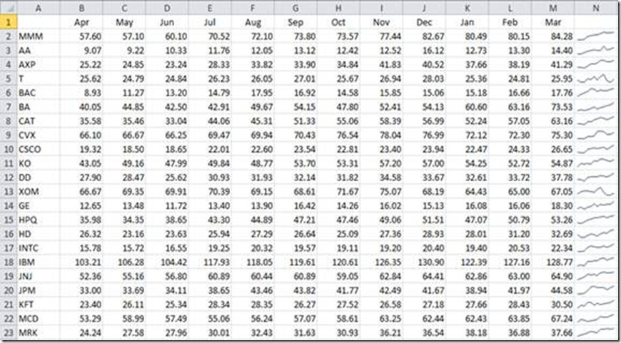
Sparklines are an in-cell mini charts, if you will, that will allow us to take numeric data that may seem incomparable to the naked eye, and make it comparable. Using the DJIA, for example
I’ve taken the DIJA’s monthly prices, and pivoted them, ticker price against month. If you stare at the numbers, they might not make sense, relatively, in terms of price-point or volatility; enter the Sparkline.
The Sparkline is a miniature graph located in Column N that allows us to look at trends irrespective of price-points; it is our qualitative glance. E.g., we can see that AT&T (T) is fairly volatile issue, (row 5) at this point, whereas 3M (MMM) is a fairly stable issue.
For quantitative types, we have not forgotten you. It’s quite normal in my experience to want to see a visual representation of data, and then there are those who want the numbers - let’s make some numbers.
With the same data-set, we’re going to take a little algorithm I rolled off the other day:
Public Function CAGRThresh( _
ByRef rngYears As Range, _
ByRef rngPrincipal As Range, _
ByVal curThresh As Currency) As String
Dim varYears() As Variant, varPrincipal() As Variant
Dim strRet() As String
Dim i As Long, j As Long, lngCount As Long
Dim lngUpper As Long
Dim curCAGR As Currency
Let varYears = rngYears.Value
Let varPrincipal = rngPrincipal.Value
Let lngUpper = UBound(varPrincipal, 2)
ReDim strRet(1 To (lngUpper ^ 2 * 0.5 + lngUpper * -0.5))
For i = LBound(varPrincipal, 2) To lngUpper - 1
For j = i + 1 To lngUpper
Let curCAGR = ((varPrincipal(1, j) / _
varPrincipal(1, i)) ^ (1 / (j - i))) - 1
If curCAGR >= curThresh Then
Let strRet(lngCount + 1) = varYears(1, i) & _
"-" & varYears(1, j) & ": " & _
Format$(curCAGR, "0.00%")
Let lngCount = lngCount + 1
End If
Next j
Next i
If lngCount > 0 Then
ReDim Preserve strRet(1 To lngCount)
Let CAGRThresh = Join$(strRet, ", ")
Else: Let CAGRThresh = "N/A"
End If
End Function
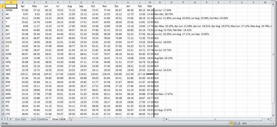
The DJIA now gives us an interesting perspective along the lines of the following:
As you can see, this type of quantitative review provides us with a slightly different perspective; we can extrapolate growth rates for each component of the DJIA that exceed our contingency, by month.
Typically, an issue with a Beta close to that of the S&P 500, returning 13% per annum is roughly par for the course, if you will. What this has done is extracted compounding growth rates greater than 15% per month, and at a glance, we have some interesting results. E.g., what’s going on with Bank of America (BAC)? Well, we now know what we want to look and figure out what happened at this point. It turns out BAC purchased Merrill Lynch, September 15, 2008, on the cheap, and it’s paying dividends, if you will.
In conclusion, Excel 2010 offers users many ways to review numerical data, some are new, and some are time-tested. While this presents two examples, the possibilities are expanding and there are many more to be found.
Happy Exceling,
Nate Oliver
Microsoft Excel MVP
----------------------------------------------------------------------
Cross Posted at The Office Blog

