RichEdit Clipped Text
This post describes three ways RichEdit may clip text along with possible solutions. Clipping can occur due to inadequate line height, lack of font vertical padding or insufficient painting of selected text. In some cases, improved rendering code could avoid clipping. Typographic compromises can avoid clipping in other cases.
Selection clipping
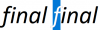
Acetate selection is discussed in RichEdit Colors. The principle is that the background color of the selected text is blended with the selection background color and the text is then painted on top with the regular text color. This differs from other selection methods, such as inverting the colors of the selected text, using different selection text and background colors, or enclosing selected text in rectangles. Office applications typically use acetate selection, whereas Windows apps such as Notepad use selection text and background colors. One advantage of acetate selection for RichEdit is that partial ligature selection doesn’t get clipped by the rectangular selection background. This is illustrated in the following image where the f of an fi ligature is selected

Since the f’ s text color doesn’t change when selected, the f’s underhang and overhang aren’t clipped. In contrast without acetate selection, RichEdit appears to select the whole fi ligature and clips the f’ s underhang since RichEdit doesn’t have the code to render the ligature glyph three times with appropriate text colors. You can try out acetate selection with an Arabic ligature too, e.g., type a lam aleph (لا – gh with an Arabic keyboard) and then shift+→ to select the lam alone. You’ll see the acetate highlight go half way thru the لا. Acetate selection in RichEdit works the same way as in Word.
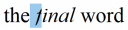
Without acetate selection as in Notepad, RichEdit can clip overhangs and underhangs. For example, with selection text and background colors and no ligatures, selecting the f alone renders as
Notepad displays this text without clipping. Acetate selection is used by default in RichEdit. To disable acetate selection, send EM_SETEDITSTYLEEX with wparam = lparam = SES_EX_NOACETATESELECTION.
Nevertheless, even with acetate selection, RichEdit will clip in some scenarios. If the character format of adjacent space differs from that of a character with an underhang, the selection can clip it. For example, selecting “f” in RichEdit where the f is in Times New Roman and the leading space is in Segoe UI looks like
The f overhang is also clipped if the character following the f is selected but not the f. For some scripts, RichEdit automatically formats spaces with the same font as the character that precedes it. But ideally the code should display such scenarios enough times to paint all parts of a glyph with the appropriate background. This problem doesn’t occur in Word or Notepad.
The source of the problem is that RichEdit handles one character-format run at a time, first painting the background and then the text. When the format background changes, the new background gets painted over any overhang from the preceding run. A fix would be to paint all the background colors for a line first and then paint the text on top. Alternatively, one could paint a glyph as many times as necessary to display the various parts of the glyph unclipped (as in Notepad).
Baseline alignment
In well-formed typography, the baselines between different fonts coincide. This increases the line height when fonts with different ascents and descents appear on the same line. This is particularly true when Latin and Japanese scripts appear together. No one font can cover all of Unicode; Version 10 has 136,755 characters and TrueType fonts are limited to a maximum of 65535 glyphs (16-bit glyph indices). So multiple fonts must be used in general. Notepad, too, uses multiple fonts to display such text. As such virtually any editor has to have some degree of rich-text capability as discussed more in RichEdit Plain-Text Controls.
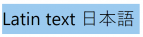
To illustrate how the line height increases when an East Asian font is used on the same line as a Latin font, we select text with a single font and then with a combination. The selection background color reveals the resulting line height


A way to avoid baseline alignment is to send the message EM_SETEDITSTYLEEX with wparam = lparam = SES_EX_DONTALIGNBASELINE (0x00000800). This flag isn’t currently defined in MSDN, but should be. For the example above, this choice produces
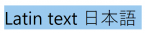
which fits in the same vertical space as the Latin text alone.
Southeast Asian fonts
Some Southeast Asian scripts can have glyph size or shaping that results in a large ascent and/or descent. This can make it hard to mix with other scripts and maintain the line height. Accordingly, font designers may leave little or no vertical padding for glyph clusters that push the limits. In single-line controls or when paragraph line-spacing-exactly is active, this may result in clipping. For example, consider the Thai character SARA AI MAIMUAN ใ (U+0E43). Enlarging it and showing the top and bottom glyph boundaries compared to the Latin letter A, we see that there’s no room for roundoff on the top
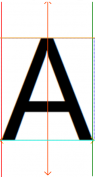
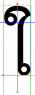
RichEdit clips the top of this letter unless there’s some paragraph space-before or line-spacing exactly with enough extra vertical space. While space before/after can eliminate such clipping for a single line, inside a multiline paragraph, one has to use a large enough line-spacing-exactly value. One could argue that the font designers made a mistake by eliminating all vertical padding for these large glyphs, but text renderers now need to deal with it. This font no-padding “feature” differs from the high fonts used in mathematics and in fancy fonts, which can have ascents and descents appreciably larger than those for standard glyphs.
Conclusions
While RichEdit provides a way to disable baseline alignment and to specify a larger line height to avoid Southeast Asian large glyph clipping, it doesn’t handle all kinds of selection clipping. It would be desirable to fix the remaining selection clipping scenarios and to offer a mode where the line height is automatically increased to avoid clipping of large Southeast Asian glyphs in fonts that provide inadequate vertical padding.