Silverlight Experiment: Create a PullDown Menu using Storyboards.
This is a basic example of how to create a "PullDown Menu" using Silverlight and Expression Blend.
The Objectives
- The GUI will have a PullDown Menu (UserControl) under the main outer chrome. It's intended that when a user clicks on the "MainMenu" it will not only change state, but animate down or up (depending on the previous state it was resting in - default being Up).
- The End User will need to have the ability to interrupt the animation should they decide to cancel the action, as a result the menu will react to the End User's intended action and reflect the direction change as well as state change.
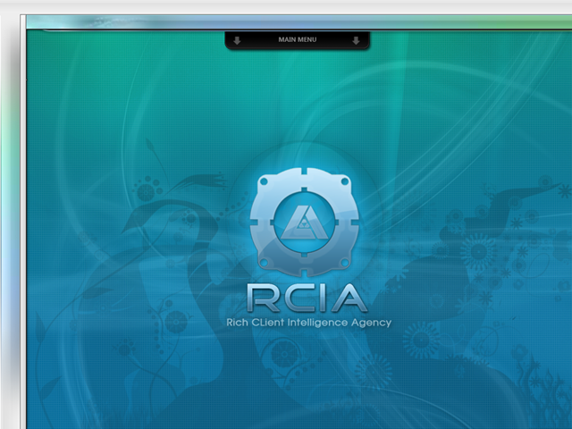
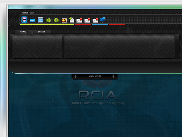
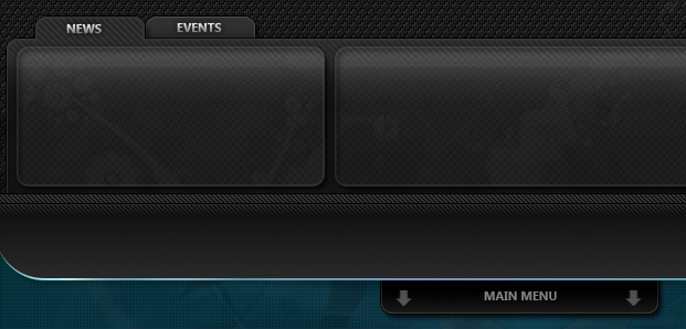
The Expected Outcome.
The Blueprints.
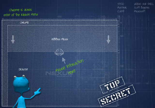
- 1x OuterChrome Control
- 1x TopLeft Corner Bitmap (Static)
- 1x Top Bitmap (Stretch Horizontally)
- 1x Left Bitmap (Stretch Vertically)
- 1x PullDownMenu Container
- 1x InnerMenu Control (NxsRibbon)
- 1x LowerBar Bitmap (Static)
- 1x PullDown Tab Bitmap (Static)
- 1x PullUp Tab Bitmap (static)
The Process
Create the the WireFrames.
Create a UserControl in Blend, call it NxsApplication.xaml (this will be your base)
Change its Metrics to be 1000px, 760px.
Change the NxsApplication.LayoutRoot from Grid to Canvas (as you want things to freely float).
NxsApplication.xaml
1: <UserControl x:Class="RCIA.Containers.NxsApplication"2: xmlns="https://schemas.microsoft.com/winfx/2006/xaml/presentation"3: xmlns:x="https://schemas.microsoft.com/winfx/2006/xaml"4: Width="1000" Height="760">5: <Canvas x:Name="LayoutRoot">6: <Canvas.Background>7: <LinearGradientBrush EndPoint="0.5,0" StartPoint="0.5,1">8: <GradientStop Color="#FF000000"/>9: <GradientStop Color="#FF131313" Offset="1"/>10: </LinearGradientBrush>11: </Canvas.Background>12: </Canvas>13: </UserControl>
Create a UserControl in Blend, call it NxsShell.xaml (this will be your Chrome)
Keep NxsShell.LayoutRoot type as Grid.
Inside NxShell, define the Grid Definition as having the below (you basically want to use the Grid to help you scale-9 the overall assets).
NxsShell.xaml
1: <UserControl x:Class="RCIA.Controls.NxsShell"2: xmlns="https://schemas.microsoft.com/winfx/2006/xaml/presentation"3: xmlns:x="https://schemas.microsoft.com/winfx/2006/xaml"4: Width="400" Height="300" xmlns:d="https://schemas.microsoft.com/expression/blend/2008" xmlns:mc="https://schemas.openxmlformats.org/markup-compatibility/2006" mc:Ignorable="d" xmlns:vsm="clr-namespace:System.Windows;assembly=System.Windows">5: <Grid x:Name="LayoutRoot">6: <Grid.RowDefinitions>7: <RowDefinition Height="30"/>8: <RowDefinition Height="*"/>9: </Grid.RowDefinitions>10: <Grid.ColumnDefinitions>11: <ColumnDefinition Width="30"/>12: <ColumnDefinition Width="*"/>13: <ColumnDefinition Width="30"/>14: </Grid.ColumnDefinitions>15: <Rectangle HorizontalAlignment="Stretch" Margin="0,0,0,0" VerticalAlignment="Stretch" Fill="#FFFE0000"/>16: <Rectangle HorizontalAlignment="Stretch" Margin="0,0,0,0" VerticalAlignment="Stretch" Grid.Column="1" Fill="#FF213986" Grid.ColumnSpan="1"/>17: <Rectangle HorizontalAlignment="Stretch" Margin="0,0,0,0" VerticalAlignment="Stretch" Grid.Row="1" Fill="#FFA42020"/>18: <Rectangle HorizontalAlignment="Stretch" Margin="0,0,0,0" VerticalAlignment="Stretch" Grid.Column="2" Fill="#FF0943FF"/>19: </Grid>20: </UserControl>
Create a UserControl in Blend, call it NxsRibbon.xaml (this will be the container you place your ribbon into).
NxsRibbon.xaml
1: <UserControl x:Class="RCIA.Controls.NxsRibbon"2: xmlns="https://schemas.microsoft.com/winfx/2006/xaml/presentation"3: xmlns:x="https://schemas.microsoft.com/winfx/2006/xaml"4: Width="1000" Height="180" xmlns:vsm="clr-namespace:System.Windows;assembly=System.Windows">5: <UserControl.Resources>6: <Storyboard x:Name="PullDown">7: <DoubleAnimationUsingKeyFrames BeginTime="00:00:00" Storyboard.TargetName="rectangle" Storyboard.TargetProperty="(UIElement.RenderTransform).(TransformGroup.Children)[3].(TranslateTransform.Y)">8: <SplineDoubleKeyFrame KeyTime="00:00:01" Value="130">9: <SplineDoubleKeyFrame.KeySpline>10: <KeySpline ControlPoint1="0,0" ControlPoint2="0,1"/>11: </SplineDoubleKeyFrame.KeySpline>12: </SplineDoubleKeyFrame>13: </DoubleAnimationUsingKeyFrames>14: </Storyboard>15: <Storyboard x:Name="PullUp">16: <DoubleAnimationUsingKeyFrames BeginTime="00:00:00" Storyboard.TargetName="rectangle" Storyboard.TargetProperty="(UIElement.RenderTransform).(TransformGroup.Children)[3].(TranslateTransform.Y)">17: <SplineDoubleKeyFrame KeyTime="00:00:01" Value="0">18: <SplineDoubleKeyFrame.KeySpline>19: <KeySpline ControlPoint1="0,1" ControlPoint2="1,1"/>20: </SplineDoubleKeyFrame.KeySpline>21: </SplineDoubleKeyFrame>22: </DoubleAnimationUsingKeyFrames>23: </Storyboard>24: </UserControl.Resources>25:26: <Canvas x:Name="LayoutRoot" Background="#FF0D0D0D">27:28: <Rectangle Height="160" Width="962" Canvas.Left="30" Canvas.Top="-115" Fill="#FF35E50C" Stroke="#FF000000" x:Name="rectangle">29: <Rectangle.RenderTransform>30: <TransformGroup>31: <ScaleTransform/>32: <SkewTransform/>33: <RotateTransform/>34: <TranslateTransform/>35: </TransformGroup>36: </Rectangle.RenderTransform>37: </Rectangle>38: <Button Height="23" Width="81" Canvas.Left="911" Canvas.Top="149" Content="Open..." x:Name="btnTest"/>39: </Canvas>40: </UserControl>Inside NxsRibbon.LayoutRoot, create a rectangle and a button.
Name the button "btnTest".
In NxsAplication instantiate the GUI assets.
In NxsApplication.xaml.cs instantiate NxsRibbonMenu UserControl. As this will ensure it has the lowest z index.
In NxsApplication.xaml.cs instantiate NxsShell UserControl. As this will ensure it has the highest z index.
NxsApplication.xaml.cs
1: public partial class NxsApplication : UserControl2: {3: public NxsShell NXS_SHELL;4: public NxsRibbon NXS_RIBBON;5:6: public NxsApplication()7: {8: InitializeComponent();9:10: // Add the Nexus Ribbon11: NXS_RIBBON = new NxsRibbon();12: this.LayoutRoot.Children.Add(NXS_RIBBON);13:14: // Add in the Nexus Chrome.15: NXS_SHELL = new NxsShell();16: NXS_SHELL.Width = Width;17: NXS_SHELL.Height = Height;18: this.LayoutRoot.Children.Add(NXS_SHELL);19: }20: }
In NxsRibbon.xaml.cs register the btnTest to initiate the PullDown and PullUp Animations.
In NxsRibbon.xaml.cs register the Animation state to ensure that if the user wishes to interrupt either the PullDown/PullUp animations that they react in a way that halts the current storyboard, switches to the opposite storyboard and then continues to play.
NxsRibbon.xaml.cs
1: public partial class NxsRibbon : UserControl2: {3: Boolean CURRENT_PULLDOWN_STATE;4: Boolean IN_MOTION;5:6: public NxsRibbon()7: {8: InitializeComponent();9: this.btnTest.Click += new RoutedEventHandler(onButtonTestClick);10: this.PullDown.Completed += new EventHandler(PullDown_Completed);11: this.PullUp.Completed += new EventHandler(PullUp_Completed);12:13: CURRENT_PULLDOWN_STATE = false;14: IN_MOTION = false;15: }16:17: void PullUp_Completed(object sender, EventArgs e)18: {19: CURRENT_PULLDOWN_STATE = false;20: IN_MOTION = false;21: }22:23:24: void PullDown_Completed(object sender, EventArgs e)25: {26: CURRENT_PULLDOWN_STATE = true;27: IN_MOTION = false;28: }29:30:31: void onButtonTestClick(object sender, RoutedEventArgs e) {32:33: if (IN_MOTION)34: {35: if (!CURRENT_PULLDOWN_STATE)36: {37: IN_MOTION = true;38: CURRENT_PULLDOWN_STATE = true;39: PullDown.Pause();40: PullUp.SeekAlignedToLastTick(PullDown.GetCurrentTime());41: PullUp.Begin();42: }43: else44: {45: IN_MOTION = true;46: CURRENT_PULLDOWN_STATE = false;47: PullUp.Pause();48: PullDown.SeekAlignedToLastTick(PullUp.GetCurrentTime());49: PullDown.Begin();50: }51: return;52: }53:54: if (!CURRENT_PULLDOWN_STATE)55: {56: IN_MOTION = true;57: PullDown.Begin();58: }59: else60: {61: IN_MOTION = true;62: PullUp.Begin();63: }64: }65: }
The Conclusion
I found that it was faster to create the initial StoryBoard for PullDown. Once I was happy with the way it animated in/out, I then Duplicated the StoryBoard (via this
 ). I renamed the PullDown_Copy to PullUp and under the same icon () I "Reversed" it. This basically figured out how to revert the various properties that are being changed to the appropriate state.
Keeping track of the IN_MOTION and CURRENT_PULLDOWN_STATE was relatively easy, and although I have a few ideas on how we can improve this concept going forward, it's pretty trivial to setup.
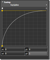
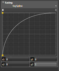
Adjusting the animation Easing via the KeySpline editor can attract various results on both Up/Down. It pays to think more about how this will affect the End User firstly, but also the fundamental question you will need to answer going forward "Is this going to annoy them?" if the answer is yes, look to shorten the animation duration or adjust the Easing.
The Outcome.

This took me less then 30mins to complete. You will also note that I used only basic elements found within XAML to setup the wire frames. I did this as this illustrates that an Interactive Persona can setup the various pieces required to ensure the animation and basic events are ready for the next step in the workflow.
This means that you could have someone sitting designing the textures and detailed composition of the artwork in their nominated Art Tool. At the same time you could have an Engineer writing the actual NxsRibbonMenu so that it mimics the Office Ribbon concept.
Once all three have completed their individual contribution to the GUI, they are then able to meet for a "Happy meeting" where they basically look at how they are going integrate the pieces into the GUI.
In this case, the Interactive Persona is able to swap out the rectangle placeholders and apply specific bitmap textures or whatever it is that is required to execute on the visual finish.
Once that's completed, the same persona is also then able to swap out the dummy NxsRibbonMenu place holder and implant the real Control, with it's own black boxed composition.
This could highlight that using Expression Blend, Visual Studio and Silverlight that three individual personas are quite able to build, design and animate independent of one another. It does however also indicate that there needs to be a Interactive Architect in the room to ensure all the various placeholders and external pieces fit into their respective places within the overall Application composition.
Special Notes
- Nexus is a home grown Silverlight framework being written by a few friends / co-workers of mine (we decided to collaborate on an idea to test some best practices out). This framework isn't likely to be publicly available but should it do so, I'll let you folks know at that appropriate point in time.
- All visual assets are copyright to me. Basically if I see you stealing my art, I'll hunt you down as don't be that guy/gal whom does that. Ask though should you wish to use it, as I'm pretty open.
- This was fun and that's what this whole RIA conversation is about, having fun.