RIA User Interfaces, how much space do you waste?
The Story (Context)
I used to work for a Rail company, and outside my office was the main concourse for our "Central" station. On this platform was a coffee shop, which basically takes up around 10m x 6m of real-estate right next to the exit gates (i.e. its half-inside the gate and half-outside the gate).
Right across from it is also a McDonalds which once all cooking devices are installed etc takes up pretty much similar space.
The McDonalds is constantly busy, as approx 100k people a day move in and out of the gates so one can imagine the general population that love their McDee's.
The coffee shop however, not only sells coffee but is also part of another company that sells sandwiches and all sorts of "fresh' food. Overall, they take up twice the space as McDonalds and have a fraction of the customers.
To be blunt, they are a waste of space.
Reason being was I visited it every morning to get my Coffee and Toasted Raison toast, I'd have to line-up every morning, wait approx 10mins (on a good morning) and then began a walk of shame back to my office. I kept chastising myself for giving these folks money as I felt they weren't earning it.
They were taking up prime real-estate and not even making an effort to entice customers away from McDonalds, something which is hard but yet most would do if given a reason, given they *could* provide a healthier alternative?
So how does this all relate to RIA & UI?
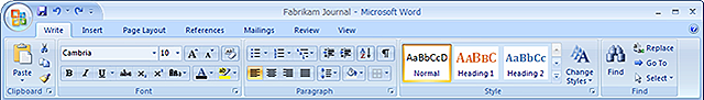
Well simply put I often wonder a lot as to why most software these days have so much screen real-estate either wasted or simply overcrowded? As more and more people are adopting windscreens, the ratio of UI usability is changing, and concepts like Microsoft Office's Ribbon were born to cope with managing such real estate.
It's about maximizing someone's work efficiency through software, not conforming to everyone else's take on how information / control is to be presented? There are obviously talented usability experts (much like my co-worker Shanemo), but not all have the budget and access to guys like him. What to do? how does one ensure the UI is within context of the end user and empowers them to gain various levels of access to content buried within such an application as a RIA (Rich Interactive/Internet Application).
Context will be keep you focused.
Using the above Coffee Shop example, my ideal world would be to subdivide the coffee shops, put in more attractive businesses that "value add" to the 100k people walking past each day and hope that someone's busy life is that much easier. Same goes with UI, I'd prefer if software had UI built to suite a persons actual Position Description, rather then hunt for the Universal approach.
Think back to the software you use daily, and ask yourself on a % scale? How much do you actually use? What if someone were to aggregate all these disparate software UI's and provided you with a central one-stop shop that suites your Position Description (not just your personal context)?
Instead, its put on the "too hard" pile or "not my job" pile, much like the Eftpos/POS machines located in most stores (the ATM style side swipe ones). Has it not occurred to the Eftpos industry that a universal "side" would be great? Instead you always fumble around with it going "oops, wrong side", flip your card and try again. Think about the context in which a user is going to use your product, what are their roles within such product and lastly be bold and take risks where you can get away with it (my colleagues in the UXE's division will hunt me down for saying that) - but - seriously put together a risk matrix (likelihood / consequences) of shifting how features within the UI are to be positioned, whom knows you may accidentally come across your own Microsoft Office Ribbon success story.