RIA, building your control framework.
Silverlight 1.0 is around the corner, and it won't have controls assigned to it upon official release. Yet, this is something very important to the success of Silverlight going forward, as without a control framework there is really no point right?
This is where Silverlight 1.1 will come through strong, and win over some folks with its upcoming new pieces to the first iteration puzzle. Yet, already 3rd Party vendors are producing controls today and automatically folks whom have been waiting impatiently for controls in Silverlight are likely to flock to these vendors.
Is this bad? not really, people want to build today, not tomorrow and so it's understandable. Yet, you can also build your own framework today should you wish to. The primitives in Silverlight have been in place for quite some time, and they will be available for 1.0 (with some extra benefits thrown in 1.1 of course).
The key ingredients to a framework are simply the following:
- Text Input
- Mouse Events
- Support for External Media / Graphic elements
- Animation / Threaded timed looping.
Armed with these, you could produce an entire framework ranging from a button all the way up to a tabbed layout. In fact, I've seen some folks produce Accordion Panels already. Yet, their is a lot to take on and namely it's most difficult piece to overcoming complexity is how do you not only make the framework work, but also for developers & designers at the same time?
Here are some considerations you should undertake if you decide to build a control / application framework tomorrow in Silverlight or Windows Presentation Foundation (WPF).
Part 1 - Skinning
Skinning and styling are somewhat confused with one another at times. In that changing a Font Color for a button label is not skinning. Adding your own custom texture to the surface of the button is skinning. It's can be both an easy and complex task to achieve, as when you think about a Button for example, it initially has 4 states associated to it.
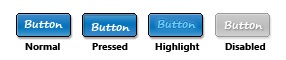
Each state represents how the button will be displayed. Typically the default state shown when a user first see's a button is that of either "Normal" or "Disabled" depending on the context of use. This is basic skinning 101 style stuff, and the approach of a RIA Producer is to look at ways of injecting their own style of button without having to bust open lines of code to do so. Ideally the best option would be to see the button state in a tree format, then when you click on the "Normal" node, you are asked a bunch of questions around how you would like to apply skinning techniques to produce an expected result. This can either be done as part of an XML Editor of your own (which in turn spits out say XAML) or it can be done via a design tool (Expression Design / Blend ).
This is basic skinning, yet the more creative souls you work with, the more control they wish to rule over the skins. An example would be a design in which I want a Modal window to display. 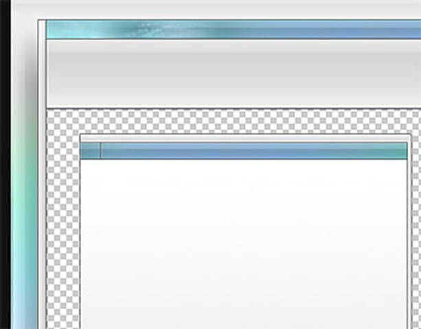
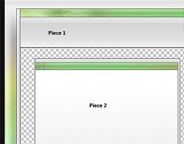
In the Diagram to the Right, there are two pieces that are to be displayed inside a RIA (Rich Interactive Application) application (wrote many moons ago in Adobe Flex).
The first piece, represents the outer shell, in that this was to be the "overall" window in which I would dock my graphical interface into.
The second piece (smaller window) represented how my Modal/Non-Modal windows would be displayed.
Each of these pieces had a variety of display states, and the objective for me was to change the colors depending on how the user interacted with the application in question. In that they were not only context aware but also stretched according to screen real-estate.
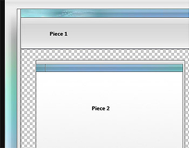
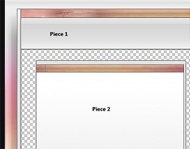
As you can imagine the complexity of skinning just went up a few points, and doing this inside Adobe Flex at the time was quite hard (in fact I had to re-write a lot of the framework to adhere to specific skinning principals of my own). Yet, all I was doing was inserting an array of skin states to the equation?
It comes back to Skinning is something which is quite fluid and needs to be looked at from all sorts of angles. You're dealing with both a designer - and - a developer in one hit, so you need to provide turn-keys if you will to empower them in choosing multiple states, with multiple stretching techniques that can be bolted on via an array of modes - which in turn are flipped on/off through different event contexts.
In looking at the above graphic, you'll also note that there is a lot of static gray in the design? Should this change per state change or should this stay static. We could easily argue that the colored gradients are realistically the changing pieces and therefore can be adjusted by swapping in respective PNG files (alpha transparency remaining per color context). This the smart approach, and probably the least expensive (given there will need to be an entire update to the overall UI should one chose to repaint the gray bits every time).
Overall, the point is there are many variables at play and to approach skinning through a "4-state" update sequence for example, is quite immature and not realistically helpful to the RIA Producer of tomorrow.
The way forward is simple, there needs to be a GUIStateManager Class, in which has nodes. Think of these nodes as you would a tree control. Each node has a cluster of elements associated to it, yet each node can be shared or duplicated (duplication is much easier but can be expensive for memory). A Designer needs to assign these nodes to a control / layout of their respective choosing (in my case, a Window). The trick is you need to think of ways in which you can empower your developers & designers of tomorrow in making this happen, as it's not good enough to build a prescribed skinned control framework like many others have done in the past.
As this defeats the whole purpose of why Silverlight and WPF exist, and using Expression Design + Expression Blend there are strong hints to a more streamlined approach to building a complex hierarchy of skin states, whilst providing flexibility in choosing how each state should be displayed per control.
You can view a more structured example of the Window via:
https://www.mossyblog.com/archives/614.cfm
(My Originating blog post back in my Adobe Flex days)
https://www.mossyblog.com/SynergyFLEX/v2_0_1/SynergyFLEX.html
(See the above GUI inside Adobe FLEX, scaling according to your screen resolution)
Next... Part 2 - Stretching...