MSDN & TechNet Subscriptions 2.0 Experience Preview
Mark Curphey here (@curphey on Twitter and https://www.curphey.com on the web) I am the Group Program Manager for the Subscriptions team here at Microsoft looking after the talented and hard working Program Managers, Developers and Testers that bring you our Subscriptions services. Today we will start to gradually roll out a complete new site experience for MSDN, TechNet, BizSpark and Website Spark subscribers that we have been working on for the last nine months starting today with an option to preview the new experience for some subscribers. We have invested in a lot of energy in behind the scenes infrastructure changes and very visible user experience changes so that you can find and use your software and benefits faster and easier. The significant changes that most users will immediately notice will be the vastly improved web site design and the super fast and reliable new download systems based on Azure.
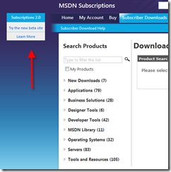
Over the next few months we will be beta testing the updates and subscribers will start to see an “Opt In” link a the top left hand corner of the browser. Opting in will activate the 2.0 UX, with an option to go back to the 1.0 (current) UX during the beta period at any point. We are releasing incremental builds on a very regular basis so don’t expect all pages to be 100% complete (especially static content) from day one.
Both the 1.0 UX and the 2.0 UX users will start to see products from the 15,000 + product catalog moved to the new Azure download infrastructure. For these products you will be promoted to install a new Azure Download Manager (DLM) and will download your files from the closest Azure node to your logical location around the world. For most users the speed limitation will now be your local Internet connection and not our data center pipes. We expect to retire the current download manger within a short period of time as soon as we are 100% sure we don’t have any kinks in the system. There is no place like production!
There are literally hundreds of improvements to the web site, all framed within a nice new “metro” look and feel, far too many to list but here are a few of my personal favorites.
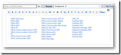
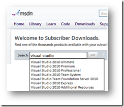
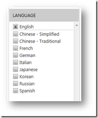
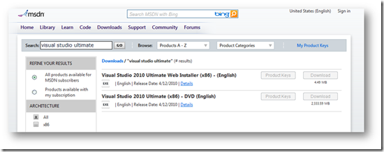
With so much software available in the product library we know that search is critical to get right and so we have completely re-written the way we do search from the ground up. We have changed the data model enabling us to have much beta meta-data to find what you want. You can now browse the catalog alphabetically. If you know what you want we have a new auto-complete enabled search so typing the first few letters will quickly give you options of what's available and save you time. When you get shown a list of options (maybe you wanted to see all Windows files) we present you with a set of filters for language and architecture with only options for what’s available. If there is no Dutch version of a product we won’t waste your time letting you try and filter for no results!
The product results page is significantly better, especially when your search query returns a lot of results. We’ve de-emphasized a lot of details that weren’t used by the vast majority of users and simplified the language and taxonomies significantly.
If the experience is made available to you we hope you choose to try it and would love your feedback so we know what you like and can improve things you don’t. You can submit comments here, tweet me personally @curphey or send me an email mark dot curphey at microsoft.com. I promise to follow-up with everyone.
Andrew Brenner our User Experience PM will start a series of blog posts soon walking through details of how to use each feature as its rolled out or updated.
Enjoy and thanks again to my team who rock hard each and every day to bring you the service !
-Mark
