Creating Usage Analytics Reports using Excel
This post is a part of the nine-part “ What’s New in Windows Server & System Center 2012 R2 ” series that is featured on Brad Anderson’s In the Cloud blog. Today’s blog post covers Service Administration and how it applies to the larger topic of “Transform the Datacenter.” To read that post and see the other technologies discussed, read today’s post: “ What’s New in 2012 R2: Service Provider & Tenant IaaS Experience.”
As described in that blog post, enabling usage analytics scenarios for service providers is a key investment area for this release. Service providers cannot successfully monetize their services in the absence of a system that tracks and provides analytics on tenant resource usage.
Overview of Service Reporting
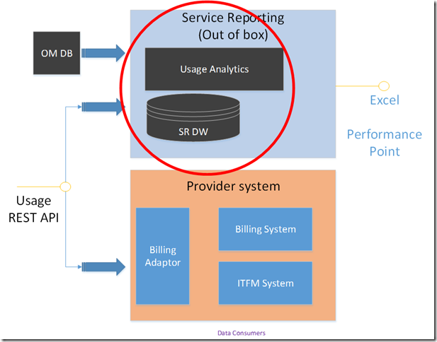
The “How to Integrate Your Billing System with the Usage Metering System” blog post provided an overview of the Usage Metering System. This blog post will focus on how we extract the same data and provide analytics on tenant resource VM utilization and make them available in Excel pivot tables. (analysis via Performance Point is covered in a subsequent blog post). As shown in the figure below, the Service Reporting component extracts the data from the Usage REST API and transforms them into OLAP cubes for analytics, as shown in the picture below.
Service Reporting is a data warehousing solution developed on top of the Microsoft Business Intelligence (BI) stack.
In the 2012 R2 release, data is correlated from two sources
- Windows Azure Pack Usage (Tenant Resource Utilization data)
- Operations Manager (Fabric data such as Servers, VM Instances etc..)
Service Reporting is designed for the service administrator to create reports using Excel pivot tables to obtain the insights that help them in their capacity planning needs and show-back situations.
VM Usage Data Pipeline
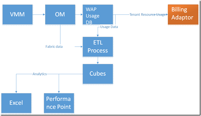
In the figure below, the VM usage data source is VMM (Virtual Machine Manager). This data is periodically collected and stored in the OM (Operations Manager) database. This data is collected and stored in the WAP (Windows Azure Pack) Usage Database along with usage data of other resources. As mentioned earlier, the details of WAP Usage system was detailed in the blog How to Integrate Your Billing System with the Usage Metering System.
The Service Reporting component reads data from the Usage Database and then transforms the raw usage data into OLAP cubes for analytics. The data in these OLAP cubes are available for visualization and for drill down analytics using Excel and Performance Point.
Scenarios
For the 2012 R2 release we targeted the following usage analysis scenarios:
- Usage trends across different time dimensions (hourly, daily, monthly, quarterly, yearly) to provide critical trending patterns
- Pivoting by subscriptions to understand which subscribers are impacting the business
- Pivoting by clouds/plans to understand which plans are used the most
- Side-by-side comparison between allocated capacity for tenants and their usage to help understand utilization ratios
These scenarios can be visualized in Excel and in Performance Point. Excel is a very popular tool for most reporting needs, and has pivot table capabilities that come in very handy for ad-hoc analytics. Excel workbooks can contain data to be analyzed even when disconnected from the SQL Server Analysis Server.
Configuring Usage Reports
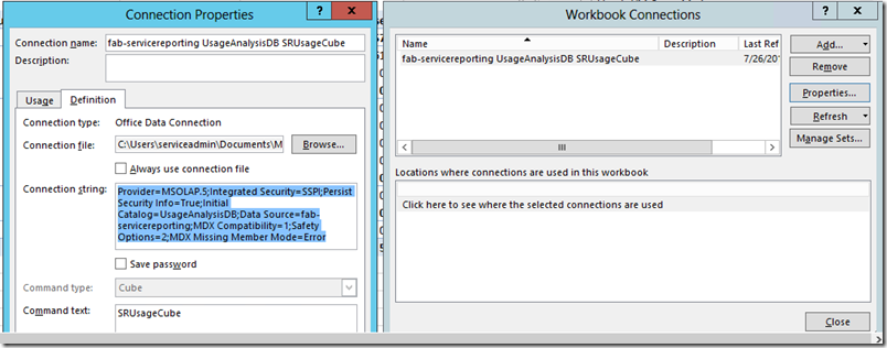
The prerequisites for Usage Reports to work are that the Service Reporting component must be working correctly and usage data must be flowing into the system. This blog does not address the installation and deployment of the Service Reporting component. The Excel Usage Reports shipped out of the box in 2012 R2 need to be connected to the Analysis Server that holds the Usage Data Cube. This can be easily done by opening the Usage Report from the Reports folder in the install directory of the Service Reporting component. Navigate to the Data->Connections menu in Excel and open up the default connection that is shipped out of the box and edit it. As you can see in the figure below, you can navigate to the Definition tab in the Connection properties.
The connection string to use here is highlighted below.
Ensure you add the correct connection properties and save. The only property you should be changing is the source (highlighted in red) below.
Provider=MSOLAP.5;Integrated Security=SSPI;Persist Security Info=True;Initial Catalog=UsageAnalysisDB;Data Source=fab-servicereporting;MDX Compatibility=1;Safety Options=2;MDX Missing Member Mode=Error
Make sure, the command text has SRUsageCube in the text.
Once these connection properties are saved, the Excel report can now be populated with data from the Usage Data Cube and its capabilities.
To test it out, you can create a brand new worksheet and then create a pivot table using the connection you just created.
Step 1: Open a new worksheet
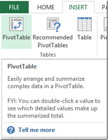
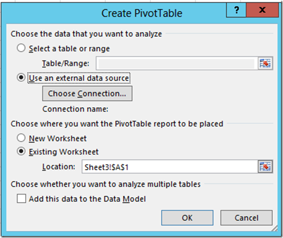
Step 2: Click on Insert->Pivot Table
- Step 3: Make sure you have External data source selected
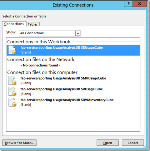
- Step 4: Click on Choose Connection and select the data connection configured in the previous step.
- Step 5: Save the changes and close the dialog to go back to the Excel worksheet.
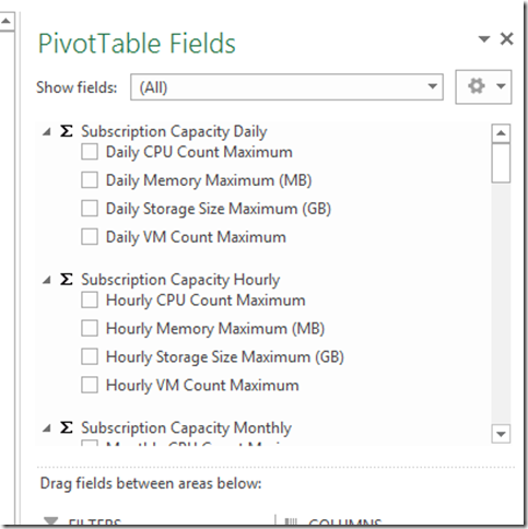
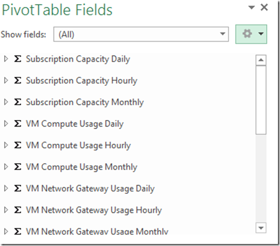
If the data connection is configured correctly, you should be seeing this form on the right side of your worksheet.
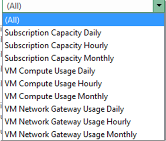
Click on “All” and you will see a drop down with the following items.
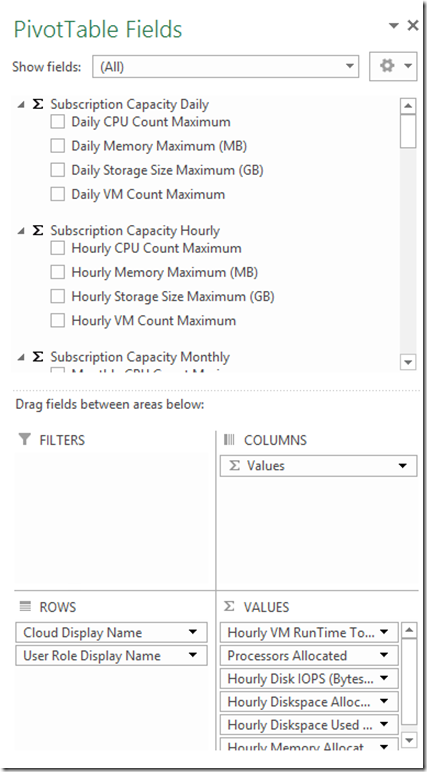
Click on the Settings icon (the round sprocket) and collapse all the fields.
You will see all the 19 “measures” that are available out of the box for reporting different utilization data points.
At this point, you are ready to create your own report that is provided in the sample Usage Report.
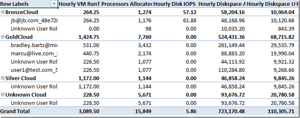
Explore the Pivot Table fields and try to compose the report similar to the one in the figure below by dragging and dropping the different fields to the appropriate areas (Filters, Columns, Rows, Values).
As you add the rows and columns, you will start to see the report shape up to look like the figure below.
Slicers
Once you have a report that looks like this you can augment this report by adding slicers to give you filtering options.
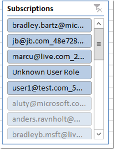
Go to Insert->Slicer and choose the same connection that the pivot table is using. This will provide you with options to choose the necessary filter. Select VMM User Role (which is the same as Subscriptions) and you can see list of subscribers in the system and selecting one gives you the ability to scope the results.
In this instance, I have created a slicer with “VMM User Role” but changed the Display name to “Subscriptions” to make it more intuitive. All the available “Subscriptions” are shown in this list and all of them are in scope.
Now, if you select just one of them, say “Unknown User Role” you will see the report change to just display the records related to just that subscription as shown the table below.
As you can see, all the values, instantly change to the selected filter, thus giving the administrator great ability to look at subscribers and compare them side by side. One can multi-select within the same slicer and chain other slicers to provide richer analytics.
Conclusion
While Excel is super powerful and ubiquitous, Performance Point allows greater collaboration by enabling dashboards . By connecting to the Analysis Server of Service Reporting, one can take advantage of all the key fields that are available in Service Reporting to create powerful dashboards that can help the service administrator see the key metrics of the business is a single location.
Subsequent blog posts will go into the details of configuring Performance Point dashboards.
To see all of the posts in this series, check out the What’s New in Windows Server & System Center 2012 R2 archive.
