Turning Off ClearType Font Smoothing
As a follow-up to Amy’s post on font smoothing, here’s a quick explanation of how you can turn off ClearType font smoothing before taking a screen capture in Windows Vista. Note that this really only applies to screens that will be used for print publication – such as any article submissions for MSDN Magazine or TechNet Magazine. For desktop or Web use, you’re probably OK leaving ClearType on, but I’d suggest checking with your editor or publishing partner for details.
The first thing you want to do is open the personalization options in Windows Vista. The easiest way is to simply right-click the desktop, then click Personalize.
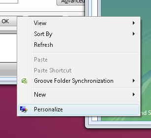
You can also click the pearl, click Control Panel, then click Personalization. This route requires an extra click, but only one finger. Either way, the next thing you should see is the Personalization control panel.
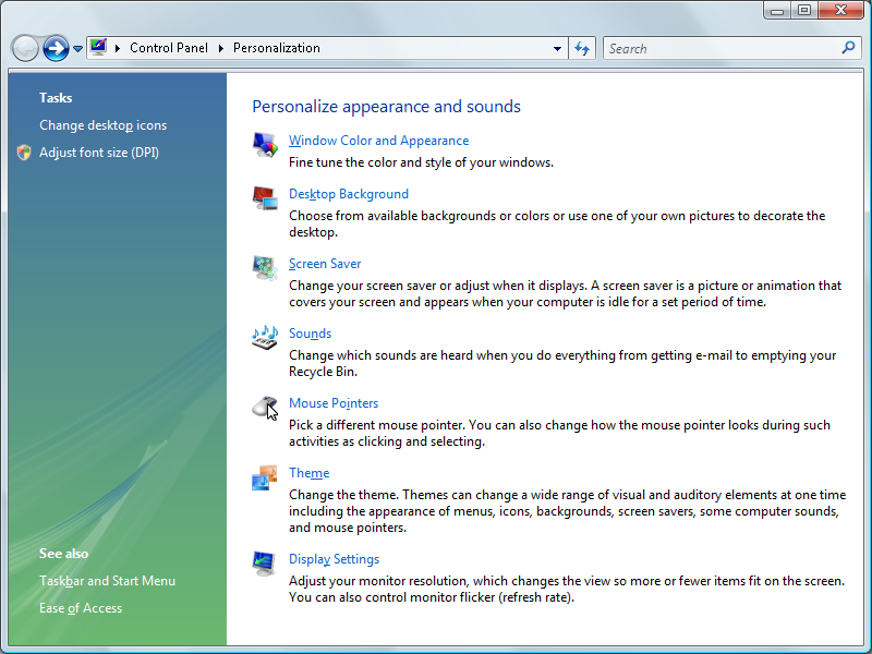
Something to note here: I’d already turned off ClearType before taking this screen, and obviously some of the text is less smoothy than other text. The address bar, for example, clearly has no font smoothing (excuse the pun). The rest of the dialog contains ClearTyped fonts. That’s just the way it is, folks. Some elements of the Windows Vista UI honor the ClearType setting, and others don’t. The reason has something to do with the new Segoe font for Windows Vista and the way it was specifically designed to look good with font smoothing. You can read more about Segoe in Jensen Harris’s blog.Why Windows Vista refuses to honor the ClearType setting, however, is a question for the ages.
Anyway, we were about to change the ClearType setting. Back in the Personalization control panel, click the first item, Window Color and Appearance. You’ll see this wonderful collection of options:
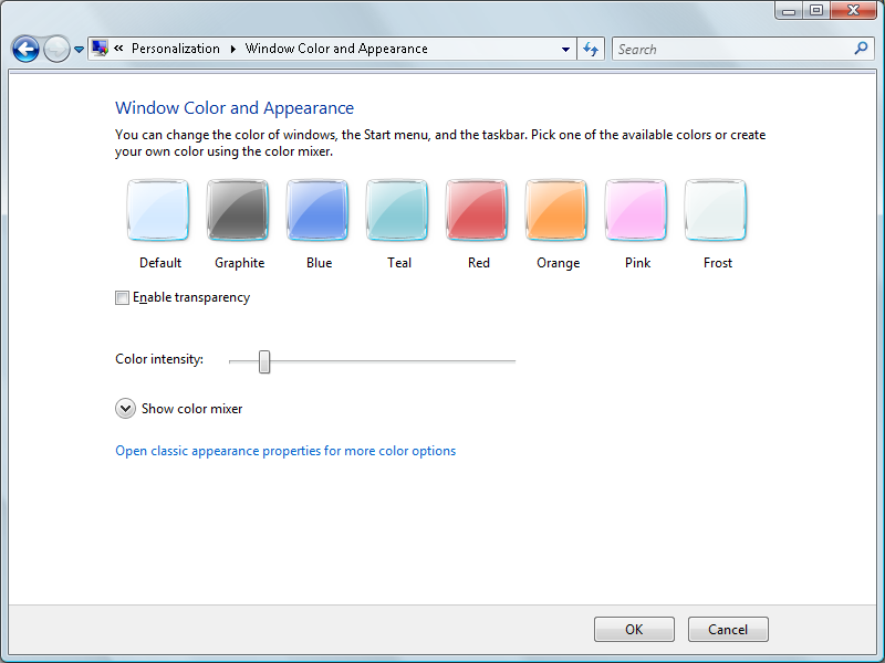
The “Enable transparency” option will probably be checked if Aero is enabled on your system. For consistency in capturing screen shots I like to turn transparency off, as you can see in this screen. This ensures that you’ll get nice, clean window frames without having to worry about what’s showing through beneath the glass. The Default color is fine and, again, just makes for consistency between screens.
Next, click “Open classic appearance properties for more color options.” This long-winded link just opens the old Appearance tab you’re probably familiar with from Windows XP, only this time in its very own dialog box. Look, the tab’s still there even.
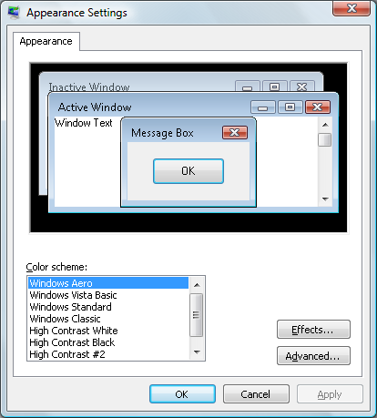
I don’t make any changes here, preferring to leave settings as out-of-the-box standard as possible. That consistency thing again. Instead, click Effects.
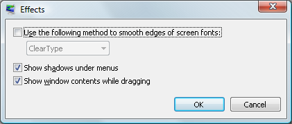
This is where you turn ClearType on or off. In this case I’ve disabled ClearType by making sure the aptly named “Use the following method to smooth edges of screen fonts” setting is not checked. I suppose they could have put a None option in the dropdown menu and lost the checkbox, but what do I know about UI design?
Now just click OK to save this setting, and click Apply in the Appearance Settings dialog. If the fonts in window titles become blocky, you’ve succeeded in turning off ClearType. Note that some windows need to be redrawn before the change is apparent. Generally, minimizing the window and then opening it again is sufficient.
If you configure these simple settings prior to taking screen shots for MSDN Magazine and TechNet Magazine articles, you’ll gain the heartfelt appreciation of the editors and production staff. Plus, you won’t get e-mail from us nagging you to retake the screens.
Terry
p.s. Internet Explorer has its own settings for font smoothing in the rendering area. I’ll cover that in a future blog post.