Feature Design and Simplicity- Part 3
I have gotten some emails by readers about this series so I thought to continue the momentum and talk about the next law: Time .
It is no secret that "Thin is in" with customers and that there is nothing more frustrating and at times upsetting than waiting for an application to do some task. TFS has worked a lot on server performance in order to minimize this wait time for our customers and we continually get better. Just recently, we discover a way to improve unshelve and we think we can get a pretty big boost on performance which has us really excited.
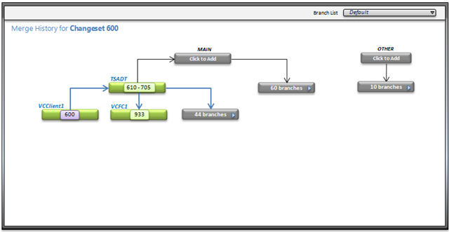
On the other hand, sometimes doing back end work is not enough to improve the perception of time and you really have to spend time on the design to make the experience better for our users. Take for example the branch visualization work that we are doing (specs will be publish soon enough for you guys to enjoy).
In Branch Visualization we try our hardest to remove all of the information we don't need and also minimize the experience to excel at the scenario the user is leveraging the visualization for. This allows us to remain very thin and reduce any wait time the user will experience. In the first phase this is not implemented but our second phase will bring those design elements in. The solution in this case was simple, take the navigation of the branches and marry it with the target selection so the user discovers the answer one at a time, to the best of approximations. That is a lot better than sending the server 20 targets, which you may not need, and waiting for the server to come back with the answers.
Here is a screenshot of what it might look like:
So always remember to optimize for time because at the end "savings in time feel like simplicity" for the end user.
- mario