Using standard icons in a rehosted Workflow Designer
In this post I’ll show how you can easily use appropriate icons within the Workflow Designer toolbox. There are a number of posts out on the web that show varying ways to do this, however the method I’m proposing is most probably the easiest and most flexible.
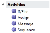
In days of yore you would simply use the [ToolboxBitmap] attribute and define a bitmap for your custom tools (an activity is just another tool in this instance), and when adding a tool to the toolbox you can optionally specify an icon – however if you don’t then you get the standard ‘cog’ on screen…
If you want however to display the correct icon for a given activity you’ll need to do a bit more work and that’s where the fun starts. The images for the inbuilt activities are held in a couple of places – one is inside the Microsoft.VisualStudio.Activities.dll (which you’ll typically find in C:\Program Files (x86)\Microsoft Visual Studio 10.0\Common7\IDE) however that’s not redistributable – but it does include bitmap images of each activity and these are what’s used within Visual Studio.
The other is within the System.Activities.Presentation.dll which is redistributable, however this contains XAML resources and not standard bitmaps – and [ToolboxBitmap] expects an image resource not a slab of XAML.
Now, we’re in the world of XAML so using a bitmap resource seems a bit old hat – I’d much rather use a scalable vector icon representation so this post will show how to do this. The following steps will guide you through the process.
Step One: Add the workflow resources to your application
Edit your App.xaml.cs (or anywhere else you wish for that matter) and insert the following code – this will add the standard icon resources from System.Activities.Presentation.dll into your applications resource directory…
 ResourceDictionary dict = new ResourceDictionary { Source =
  new Uri("pack://application:,,,/System.Activities.Presentation;V4.0.0.0;31bf3856ad364e35;component/themes/icons.xaml") };
this.Resources.MergedDictionaries.Add(dict);
Note here that I have included the full pack: specification for the assembly, including the version number and public key token. In my application it would work fine without these whilst debugging, however if the debugger wasn’t attached this would fail without the fully qualified assembly information.
Step Two: Create a converter
We’ll use this converter to lookup the appropriate icon resource from the above resource dictionary at runtime, in order to present this on screen. If you disassemble System.Activities.Presentation.dll in Reflector and look at the resources (using the BamlViewer add-in) then you’ll see the naming scheme is just the activity name + ‘Icon’…
This is just a snippet of the themes/icons.baml resource, and you can see from the above there are some other things in there that aren’t necessarily activities (and interestingly enough there are some resources for activities no longer in WF4).
So, all our converter needs to do is lookup the typename of the activity, then append ‘Icon’, then go hunting in the resource dictionary and finally return the content of the DrawingBrush…
 public class ToolboxItemWrapperIconConverter : IValueConverter
{
    public object Convert(object value, Type targetType, object parameter, CultureInfo culture)
    {
        ToolboxItemWrapper wrapper = value as ToolboxItemWrapper;

        if (null == wrapper)
            throw new ArgumentException("Expecting a ToolboxItemWrapper as the converter parameter", "value");

        // Generate the resource name
        string resourceName = string.Concat(wrapper.Type.Name, "Icon");

        // And lookup in app resources
        DrawingBrush icon = App.Current.Resources[resourceName] as DrawingBrush;

        if (null != icon)
            return icon.Drawing;
        else
            return null;
    }

    public object ConvertBack(object value, Type targetType, object parameter, CultureInfo culture)
    {
        throw new NotImplementedException();
    }
}
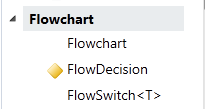
This converter isn’t quite finished yet – if you happen to add on an activity to the toolbox such as FlowSwitch<T>, you won’t get an icon for that as shown below…
And you might notice that Flowchart is missing it’s icon too. That’s easy to sort – the actual name in the resources is FlowChartIcon (notice the capitalisation) – so I’ll special case that one in my converter. If you happen to care, TransactedReceiveScope is also one that I’ve special cased as its name doesn’t match the pattern either. As for the generic types, their icons are simply named without the generic parameter – so in the case of FlowSwitch<> this would be FlowSwitchIcon. Another bit of code is needed in the converter to deal with these generic activities.
Step 3: Re-style the toolbox
In order to display your XAML icons in the toolbox you need to re-style the toolbox and use the converter to provide the correct icon for the activities. Here’s some XAML to get you going…
 <Style TargetType="{x:Type sapt:ToolboxControl}">
    <Style.Resources>
        <local:ToolboxItemWrapperIconConverter x:Key="iconConverter" DefaultResource="GenericLeafActivityIcon"/>
    </Style.Resources>
    <Setter Property="ToolTemplate">
        <Setter.Value>
            <DataTemplate DataType="{x:Type sapt:ToolboxItemWrapper}">
                <Grid>
                    <Grid.ColumnDefinitions>
                        <ColumnDefinition Width="Auto"/>
                        <ColumnDefinition Width="*" SharedSizeGroup="toolLabel"/>
                    </Grid.ColumnDefinitions>

                    <Rectangle Width="16" Height="16" Margin="4">
                        <Rectangle.Fill>
                            <DrawingBrush Drawing="{Binding Converter={StaticResource iconConverter}}"/>
                        </Rectangle.Fill>
                    </Rectangle>

                    <TextBlock Text="{Binding DisplayName}" Grid.Column="1" VerticalAlignment="Center"/>
                </Grid>
            </DataTemplate>
        </Setter.Value>
    </Setter>
</Style>
This style defines a couple of grid. columns, one for the icon and another for the name of the activity. I’ve set a size of 16 * 16 for the icon size however as this is your XAML you could change this for something larger if you so desired. You might also want to define a nice looking tooltip and, again, as it’s XAML you could go mad!
In the above I’ve set the default activity icon to “GenericLeafActivityIcon” which is the default that Workflow uses when displaying activities with no icons defined. You' may wish to change this for something else – but it’s also the default used in the workflow designer too so it’s not a bad choice.
Step 4: Icons for your custom activities
OK, that’s all the standard activities dealt with – what about your own? There are two things you need to do in order to get your custom activities to play nicely with the toolbox and also the designer surface. First off you’ll need to design an icon for your activity – I can’t help with that other than suggesting you have a play with Expression Design.
Then you can do one of two things – either alter your activity designer and specify an Icon for it there, or ensure that you have an icon resource using the same naming convention used above – i.e. “TheNameOfYourActivity” + “Icon”. I’d suggest you do both – my converter will look for a resource following the naming pattern convention first, and if that’s not found it then looks for the icon on the associated designer. In order to do this however it has to construct an instance of the designer which isn’t really that good an idea, so I’d recommend the naming convention approach first.
To change the icon for the designer, all you do is specify it in the XAML for the designer…
 <sap:ActivityDesigner
    <snip>
    Icon="{StaticResource IfIcon}">
Naming the icon in your custom designer isn’t really an optional step as if you don’t do this your activity will show the default image on the design surface.
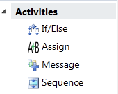
With all that done you can now see the appropriate icons in the designer…
Now that’s looking much better! The full source code for the converter is available here.
Last but not least, if you’re wondering why I didn’t choose the cog icon in the toolbox it’s not a XAML resource so I went with the default XAML one instead.
Cogs banished. ![]()


