Brief anatomy of a ListBox
ListBox has properties on it that allow you to control how the items in the list box get displayed. Those properties make sense if you understand some basic concepts of the ListBox, but sometimes I forget, so I wanted to post a picture on my wall. Except I’m trying to live a paper-free life, and posting it here is more fun. Most of this functionality actually comes from ListBox’s base class, the ItemsControl, but for simplicity I’ll just talk about ListBox here.
Say you have this markup:
<ListBox >
<Button>Click</Button>
<Button>Clack</Button>
</ListBox>
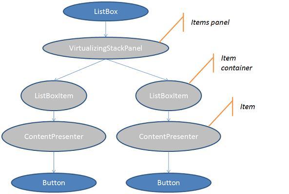
What gets created for you by the ListBox’s template, is a tree of Visual objects. But ListBox exposes three interesting properties that lets you configure the visuals created by that template, without you having to actually rewrite the template. The properties are ItemsPanel, ItemContainerStyle, and ItemTemplate. Those properties make more sense if you know what a “items panel”, “container”, and “item” are, though. Towards that end, here’s a simplified picture of the visual tree you get from the above ListBox (the objects in gray are created automatically):
There’s three generated objects here that you can have some control over:
· The “items panel” is some kind of Panel that will lay out the items. By default it’s a VirtualizingStackPanel, but you can change that using the ListBox.ItemsPanel property.
· The “item container” is a ListBoxItem, at least in the case of a ListBox (for a TreeView, this would be a TreeViewItem). You can set a Style on this using the ListBox.ItemContainerStyle property. That is, whatever Style you set to ListBox.ItemContainerStyle will get propagated to each ListBoxItem.Style. You can get more creative with this using the ItemContainerStyleSelector property.
· The “item” is a ContentPresenter. ContentPresenter is this great element that figures out a way to create a template to display whatever content you give it. But if you want to specify exactly what template it should use, you can set the ListBox.ItemTemplate property; whatever you put there will get propagated to the ContentPresenter.ContentTemplate property. You can get more creative with this too, using the ItemTemplateSelector property.
So for fun, here’s an example where all three of these have been used – the items panel is a WrapPanel, the item container style sets a margin on the ListBoxItem, and the item template wraps the content in a border:
<ListBox ScrollViewer.HorizontalScrollBarVisibility="Disabled">
<ListBox.ItemsPanel>
<ItemsPanelTemplate>
<WrapPanel />
</ItemsPanelTemplate>
</ListBox.ItemsPanel>
<ListBox.ItemContainerStyle>
<Style TargetType="ListBoxItem">
<Setter Property="Margin" Value="10" />
</Style>
</ListBox.ItemContainerStyle>
<ListBox.ItemTemplate>
<DataTemplate>
<Border Padding="20" Background="Red">
<ContentPresenter Content="{TemplateBinding Content}"/>
</Border>
</DataTemplate>
</ListBox.ItemTemplate>
<Button>Click</Button>
<Button>Clack</Button>
</ListBox>