Compact CheckBox Sample
I was creating a view of an object that had a bunch of boolean properties, but I wanted to keep the visual representation small. So I created a look for a compact CheckBox that I liked enough to post.
As an example scenario, say I’m visualizing a the attributes of a file (hidden, system, archive, and read-only). I could do it with a TextBlock and some CheckBoxes easy enough, to create a look like this:

… but I want it more compact. I want just a letter for each attribute, and I just want the letter to change when it’s checked. That got me this:
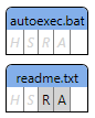
Here, the light gray italicized boxes are un-checked, and the un-italicized black letters with a gray background are checked. (So before capturing this screenshot, I had checked the read-only and archive bits on the “readme.txt” file.) This image doesn’t show it, but there’s also a tooltip for each CheckBox that shows the full name of the attribute.
Here’s the ControlTemplate for the CheckBox:
<ControlTemplate TargetType="CheckBox">
<Border BorderThickness="{TemplateBinding BorderThickness}"
BorderBrush="Gray" Background="LightGray" Padding="2"
Name="_border" >
<Grid Margin="1">
<TextBlock Text="{TemplateBinding Content}"
FontStyle="Italic"
Foreground="LightGray"/>
<TextBlock Text="{TemplateBinding Content}"
Name="_checkedTextBlock" />
</Grid>
</Border>
<ControlTemplate.Triggers>
<Trigger Property="IsChecked" Value="False">
<Setter TargetName="_checkedTextBlock"
Property="Opacity" Value="0" />
<Setter TargetName="_border"
Property="Background" Value="Transparent" />
</Trigger>
</ControlTemplate.Triggers>
</ControlTemplate>
The interesting thing here is that I created two TextBlocks to show the content of the CheckBox (e.g. the “R” for the read-only attribute CheckBox). The first one shows the content in “unchecked” form, and the second one shows it in “checked” form. The Trigger then picks which one shows up. I had started with a single TextBlock, and had the Trigger set the FontStyle and Foreground. The problem with this is that the italicized text is slightly wider than the normal text, and that caused the checkboxes to jiggle a little bit when you click on them. There’s probably other ways to solve this, but a simple solution was to have both TextBlocks there and taking up space in layout, and then let the Trigger decide which one wins for render.
And here’s a full template with sample usage, again with some of the more interesting parts highlighted. (I changed the trigger so that instead of a Setter to update the Background when IsChecked changes, it animates the change.)
<Page
xmlns="https://schemas.microsoft.com/winfx/2006/xaml/presentation"
xmlns:x="https://schemas.microsoft.com/winfx/2006/xaml">
<Grid>
<Grid.ColumnDefinitions>
<ColumnDefinition Width="Auto" />
</Grid.ColumnDefinitions>
<Grid.Resources>
<!-- Implicit style to be applied to all CheckBoxs in this Window
(this sets the new template) -->
<Style TargetType="CheckBox">
<Setter Property="BorderThickness" Value="1,0,0,0" />
<Setter Property="Template">
<Setter.Value>
<ControlTemplate TargetType="CheckBox">
<Border BorderThickness="{TemplateBinding BorderThickness}"
BorderBrush="Gray" Background="LightGray" Padding="2"
Name="_border" >
<Grid Margin="1">
<TextBlock Text="{TemplateBinding Content}"
FontStyle="Italic"
Foreground="LightGray"/>
<TextBlock Text="{TemplateBinding Content}"
Name="_checkedTextBlock" />
</Grid>
</Border>
<ControlTemplate.Triggers>
<Trigger Property="IsChecked" Value="False">
<Setter TargetName="_checkedTextBlock"
Property="Opacity" Value="0" />
<!-- Instead of a Setter to update the background color,
use Trigger.EnterActions/ExitActions to animate it
<Setter TargetName="_border"
Property="Background" Value="Transparent" /> -->
<Trigger.EnterActions>
<BeginStoryboard>
<Storyboard TargetName="_border" TargetProperty="Background.Color">
<ColorAnimation Duration="0:0:0.5" To="Transparent" />
</Storyboard>
</BeginStoryboard>
</Trigger.EnterActions>
<Trigger.ExitActions>
<BeginStoryboard>
<Storyboard TargetName="_border" TargetProperty="Background.Color">
<ColorAnimation Duration="0:0:0.5" />
</Storyboard>
</BeginStoryboard>
</Trigger.ExitActions>
</Trigger>
</ControlTemplate.Triggers>
</ControlTemplate>
</Setter.Value>
</Setter>
</Style>
<!-- This DataTemplate is used to display attributes for one file -->
<DataTemplate x:Key="FileTemplate">
<Border BorderThickness="1" BorderBrush="Black"
Margin="4" CornerRadius="5,5,0,0" Background="#FF83AFEA">
<StackPanel >
<!-- Show the file name -->
<Border Padding="2,2,2,0" >
<TextBlock Text="{Binding XPath=@Name}" HorizontalAlignment="Center" Margin="1"/>
</Border>
<!-- Show the attributes in a row -->
<StackPanel Orientation="Horizontal" Background="White">
<CheckBox BorderThickness="0" ToolTip="Hidden"
IsChecked="{Binding XPath=@Hidden, Mode=TwoWay}">
H</CheckBox>
<CheckBox ToolTip="System"
IsChecked="{Binding XPath=@System, Mode=TwoWay}">
S</CheckBox>
<CheckBox ToolTip="Read only"
IsChecked="{Binding XPath=@ReadOnly, Mode=TwoWay}">
R</CheckBox>
<CheckBox BorderThickness="1,0,1,0" ToolTip="Archive"
IsChecked="{Binding XPath=@Archive, Mode=TwoWay}">
A</CheckBox>
</StackPanel>
</StackPanel>
</Border>
</DataTemplate>
<!-- Sample data -->
<XmlDataProvider x:Key="SampleData" XPath="Files">
<x:XData >
<Files xmlns="">
<File Name="autoexec.bat" Archive="False" System="False"
ReadOnly="True" Hidden="True" />
<File Name="readme.txt" Archive="False" System="True"
ReadOnly="False" Hidden="False" />
</Files>
</x:XData>
</XmlDataProvider>
</Grid.Resources>
<!-- To test it out, show the sample data -->
<ItemsControl ItemsSource="{Binding XPath=File, Source={StaticResource SampleData}}"
ItemTemplate="{StaticResource FileTemplate}" />
</Grid>
</Page>