Two ProgressBar Tricks
Here’s a couple of handy ProgressBar tricks …
The first trick is to use a negative Minimum value, so that as soon as a ProgressBar starts, you give the user the visual feel that the progress has already begun. This is especially useful if, in your scenario, it takes a couple of seconds to get the Value moving. So simply:
<ProgressBar Minimum='-10' />
The second trick allows you to get text or other content overlaid on top of a ProgressBar, which is a look you see a lot of nowadays. All you need to do is put the ProgressBar and text in the same cell of a Grid, causing them to render on top of each other. And if you put the text in a ViewBox to stretch it as necessary, everyone will size appropriately to whatever size the Grid is.
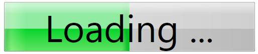
For example, this markup:
<Page xmlns="https://schemas.microsoft.com/winfx/2006/xaml/presentation"
xmlns:x="https://schemas.microsoft.com/winfx/2006/xaml" >
<Grid Height="100" Width="500">
<!-- Hard-code the Value to 50 for demonstration -->
<ProgressBar Value='50' />
<Viewbox>
<TextBlock Text='Loading ...'/>
</Viewbox>
</Grid>
</Page>
… produces this look:
[ImageAttachment]
With a little more work, you can modify this so that the text changes itself when progress is complete. E.g., make the ProgressBar show “Loading …” until it’s finished, then change the text to “Complete”. Here's an example. (For convenience of trying this out, I also added a Loaded animation on the ProgressBar.Value, so that you can simply load it into IE or XamlPad and see it run.):
<Page xmlns="https://schemas.microsoft.com/winfx/2006/xaml/presentation"
xmlns:x="https://schemas.microsoft.com/winfx/2006/xaml" >
<!-- For demonstration purposes, animate ProgressBar.Value -->
<Page.Triggers>
<EventTrigger RoutedEvent='Page.Loaded'>
<BeginStoryboard>
<Storyboard TargetName='ProgressBar' TargetProperty='Value'>
<DoubleAnimation From='0' To='100' Duration='0:0:1' />
</Storyboard>
</BeginStoryboard>
</EventTrigger>
</Page.Triggers>
<Grid >
<ProgressBar Name='ProgressBar' />
<Viewbox>
<TextBlock>
<TextBlock.Style>
<Style TargetType='TextBlock'>
<!-- Make the text "Loading ..." by default-->
<Setter Property='Text' Value='Loading ...' />
<!-- But when ProgressBar.Value is 100, change the text to "Complete" -->
<Style.Triggers>
<DataTrigger Binding='{Binding Value, ElementName=ProgressBar}' Value='100'>
<Setter Property='Text' Value='Complete' />
</DataTrigger>
</Style.Triggers>
</Style>
</TextBlock.Style>
</TextBlock>
</Viewbox>
</Grid>
</Page>