Parameterized templates; and how to create reusable, custom-looking buttons without code
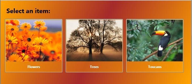
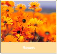
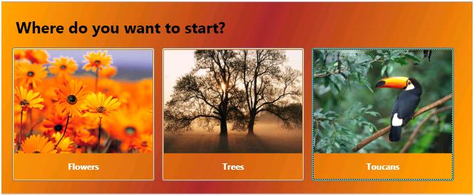
I’ve talked to a few people recently about parameterized templates, and so I wanted to write some of it down. Here’s the scenario … I want to create an application that has a main window with several buttons on it. Clicking one of the buttons navigates you to part of an app. For example, in this picture, you can click on either Flower, Trees, or Toucans:
The question is, how do you create those buttons? By the time we’re done, the markup for the buttons is going to look like this, and we won’t have to write any code:
<Button Tag="Garden.jpg" Content="Flowers" />
<Button Tag="Tree.jpg" Content="Trees" />
<Button Tag="Toco Toucan.jpg" Content="Toucans" />
(“Tag” is a funny name for a property. If you want to write a little code, you can give it a better name, but I’m just going to use Tag for simplicity, as it already exists.)
The key here is that we can now just plop down buttons with a reference to the image/text, and they automatically get the custom look. Also notice that these are real buttons, and are still getting the standard button behavior and chrome. For example, the Toucan button above is the current keyboard focus, so it has a slight dotted outline, like any other button.
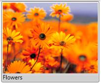
But let’s back up. For starters, the easiest way to create one of those buttons is to simply make the text and image part of the button’s content, such as:
<Button Width="200" > <StackPanel> <Image Source="Garden.jpg" /> <TextBlock Text="Flowers" /> </StackPanel> </Button> |
|
To fill in more of the overall look of the button (with some colors, fonts, etc.) we expand this to:
<Button Margin="5" Width="200" Foreground="White" > <Button.Background> <SolidColorBrush Color="Orange" Opacity="0.4" /> </Button.Background> <StackPanel> <Image Source="Garden.jpg" /> <TextBlock Text="Flowers" FontWeight="Bold" HorizontalAlignment="Center" Margin="10" /> </StackPanel> </Button> |
|
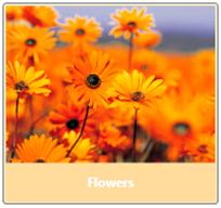
(Note that the button’s background has some opacity, so it looks slightly different here than in the original picture, where it was composited on top of a panel that itself had a background color.)
But you don’t want to repeat all of that button content for every button; you’d like to define it once, and just change the text and image for each button instance. One way to share the common look of the buttons is to create a custom Button template, and put the StackPanel, Image, and TextBlock within. That might look like this:
<Style TargetType="Button">
<Setter Property="Width" Value="200" />
<Setter Property="Margin" Value="5" />
<Setter Property="Foreground" Value="White" />
<Setter Property="Background" >
<Setter.Value>
<SolidColorBrush Color="Orange" Opacity="0.4" />
</Setter.Value>
</Setter>
<Setter Property="Template">
<Setter.Value>
<ControlTemplate TargetType="Button">
<StackPanel Margin="2">
<Image Source="Garden.jpg" />
<TextBlock
Text="Flowers"
FontWeight="Bold"
HorizontalAlignment="Center" Margin="10" />
</StackPanel>
</ControlTemplate>
</Setter.Value>
</Setter>
</Style>
Note here that in addition to creating a ControlTemplate for the button, I put some of the common properties in a Style.
And since this is defined as the default button style, my “Flowers” button markup just looks like this:
<Button />
That’s a good start, but this template isn’t really re-usable, because it has the image source and text content (“Flowers”) hard-coded. To solve that, we can parameterize the template using data binding. So update the ControlTemplate like this:
<ControlTemplate TargetType="Button">
<StackPanel>
<Image Source="{Binding
Tag,
RelativeSource={RelativeSource
FindAncestor,
AncestorType=Button}}" />
<TextBlock Text="{Binding
Content,
RelativeSource={RelativeSource
FindAncestor,
AncestorType=Button}}"
FontWeight="Bold"
HorizontalAlignment="Center"
Margin="10" />
</StackPanel>
</ControlTemplate>
The bindings just bind a property on the Image and TextBlock to properties on the Button to which the template is applied. That is, the TextBlock.Text is bound to the Button.Content, and the Image.Source is bound to the Button.Tag. That “Tag” property is a funny name, but is just an un-used property that’s defined on all elements, and that isn’t used by WPF internally; it’s just there as a place for you to store random values, like the Tag property in VB.
(Note that these bindings find the Button to which the template is applied using a RelativeSource of FindAncestor. You could also using a RelativeSource of TemplatedParent, or you could use a TemplateBinding in this case. But the FindAncestor approach is simpler here because it will continue to work in the next step below when we make some changes to the template.)
And now we can do an easier button, passing arguments to customize the template instance:
<Button Content="Flowers" Tag="Garden.jpg" />
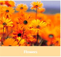
So that’s more usable, but the button doesn’t look the same any more. For one thing, the orange background isn’t showing up. That’s because that is normally the button template’s responsibility, and we didn’t fill it in. That seems easy enough to fix by putting the background color on the template’s StackPanel. That gives us this:
<Style TargetType="Button"> <Setter Property="Width" Value="200" /> <Setter Property="Margin" Value="5" /> <Setter Property="Foreground" Value="White" /> <Setter Property="Template"> <Setter.Value> <ControlTemplate TargetType="Button"> <StackPanel Margin="2"> <StackPanel.Background> <SolidColorBrush Color="Orange" Opacity="0.4" /> </StackPanel.Background> <Image Source="Garden.jpg" /> <TextBlock Text="Flowers" FontWeight="Bold" HorizontalAlignment="Center" Margin="10" /> </StackPanel> </ControlTemplate> </Setter.Value> </Setter> </Style> ... <Button Content="Flowers" Tag="Garden.jpg" /> |
|
But that still doesn’t look quite right. For example, the corners and border don’t look the same. And if you look at this in a real app (or XamlPad), you’ll see that it doesn’t change its look correctly when the mouse is over it, when it is clicked, etc. That’s because we aren’t just filling in the content of the button with our StackPanel/Image/TextBlock, we’re replacing the whole Button template.
We could fix all of these problems, but there is a way we can let the Button keep it’s normal “chrome” template, and use our template just for the content of the Button – Instead of setting the Button’s Template property, we set the ContentTemplate property.
So make two changes. First, set the ContentTemplate property rather than the Template property. Second, use a DataTemplate rather than a ControlTemplate (otherwise you’ll get a compiler error). There are some differences between a DataTemplate and a ContentTemplate, but none that show up here, it’s just a rename.
That gives us; this:
<Style TargetType="Button"> <Setter Property="Width" Value="200" /> <Setter Property="Foreground" Value="White" /> <Setter Property="Background" > <Setter.Value> <SolidColorBrush Color="Orange" Opacity="0.4" /> </Setter.Value> </Setter> <Setter Property="ContentTemplate"> <Setter.Value> <DataTemplate DataType="Button"> <StackPanel> <Image Source="{Binding Tag, RelativeSource= {RelativeSource FindAncestor, AncestorType=Button}}" /> <TextBlock Text="{Binding Content, RelativeSource= {RelativeSource FindAncestor, AncestorType=Button}}" FontWeight="Bold" HorizontalAlignment="Center" Margin="10" /> </StackPanel> </DataTemplate> </Setter.Value> </Setter> </Style> ... <Button Content="Flowers" Tag="Garden.jpg" /> |
|
And now we’ve accomplished the original goal; defining the look for the buttons in one template, and parameterizing that template so that each instance of the button can set the image and text.
Here’s the end-result sample that runs in XamlPad (you might need to update the Image URIs to point to images you have, although on Windows Vista this will likely just work):
<Page xmlns="https://schemas.microsoft.com/winfx/2006/xaml/presentation" >
<Page.Resources>
<Style TargetType="Button">
<Setter Property="Width" Value="200" />
<Setter Property="Margin" Value="5" />
<Setter Property="FontWeight" Value="Bold" />
<Setter Property="Foreground" Value="White" />
<Setter Property="Background" >
<Setter.Value>
<SolidColorBrush Color="Orange" Opacity="0.4" />
</Setter.Value>
</Setter>
<Setter Property="ContentTemplate">
<Setter.Value>
<DataTemplate >
<StackPanel>
<Image Source="{Binding Tag,
RelativeSource={RelativeSource
FindAncestor,
AncestorType='Button'}}" />
<TextBlock Margin="10"
HorizontalAlignment="Center"
Text="{Binding Content,
RelativeSource={RelativeSource
FindAncestor,
AncestorType='Button'}}" />
</StackPanel>
</DataTemplate>
</Setter.Value>
</Setter>
</Style>
</Page.Resources>
<Page.Background>
<LinearGradientBrush>
<GradientStop Color="Orange" />
<GradientStop Color="Brown" Offset="0.5" />
<GradientStop Color="Orange" Offset="1" />
</LinearGradientBrush>
</Page.Background>
<StackPanel Margin="10">
<TextBlock FontWeight='Bold' FontSize='22' Margin="10">
Select an item:
</TextBlock>
<WrapPanel>
<Button Tag="c:\users\public\pictures\sample pictures\Garden.jpg" Content="Flowers" />
<Button Tag="c:\users\public\pictures\sample pictures\Tree.jpg" Content="Trees" />
<Button Tag="c:\users\public\pictures\sample pictures\Toco Toucan.jpg" Content="Toucans" />
</WrapPanel>
</StackPanel>
</Page>