New book: Introducing Microsoft Silverlight 3
 Hello! We’re pleased to announce that the third edition of Laurence Moroney’s Microsoft Silverlight book is now available: Introducing Microsoft Silverlight 3 (Microsoft Press, 2009; ISBN: 9780735625730; 384 pages). (The book shipped to the printer in late May.)
In line with the speedy development of Silverlight, the book follows Laurence’s Introducing Microsoft Silverlight 1.0 in 2007 and Introducing Microsoft Silverlight 2, Second Edition in 2008. The book is based on the Silverlight 3 beta, and when the product is final Laurence will provide updates for the book at his blog.
In this post we’ll share the book’s Content at a Glance, its Introduction, and a stretch of sample text from Chapter 4, “Silverlight XAML Basics.”
The full Table of Contents for Laurence’s book is available here:
https://cid-5a051e94bda12163.skydrive.live.com/self.aspx/.Public/9780735625730%7C_TOC.pdf.
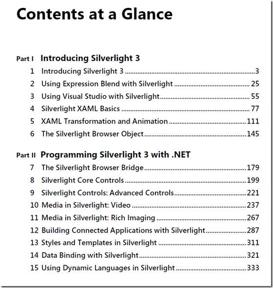
OK, first the Contents at Glance:
And here’s the book’s Introduction:
Introduction
Why Microsoft Silverlight?
As the Web grows and evolves, so do the expectations of the Web user. When the first
Web browser was developed, it was created to provide a relatively simple way to allow
hyperlinking between documents. Then these early browsers were coupled with the
cross-machine protocols encompassing the Internet, and suddenly documents stored on
computer servers anywhere in the world could be hyperlinked to each other.
Over time, the people who were using the Internet changed—the user base expanded
from a small group of people associated with universities and computational research to
encompass the general population. And what had been an acceptable user interface for
experts in the field was greatly lacking for commercial applications. People now want
high-quality user interfaces that are simple to use—and as more types of information,
including many kinds of media files, are available on the Internet, it becomes more difficult
to satisfy users’ expectations about how easy it should be to access the information
they want.
The need to supply users with sophisticated methods of accessing Internet resources that
were easy to use led to advanced application technologies. One type of technology, for
example, created “plug-in” browser tools that allowed the browser to use some of the
user’s local computational horsepower.
ActiveX controls, Java Applets, and Flash applications are examples of plug-in
technology. Asynchronous JavaScript and XML (AJAX) is another tool that has been
introduced to develop new and exciting user interfaces that benefit from immediate
partial updates. Using AJAX, the browser’s screen area doesn’t flash or lock up since the
need for full-page refreshes is reduced.
Although AJAX provides technology to enable developers to build Web sites that
contain more complex content and are more dynamic than HTML alone could provide,
AJAX does have its limitations. For example, it allows asynchronous communication with
the server, which means that applications can update themselves using background
threads, eliminating the screen flicker so often seen with complex Web user interfaces.
But AJAX is strictly a browser-to-server communications mechanism. It lacks graphics,
animation, video, and other capabilities that are necessary to provide for truly
multimedia user interfaces.
Microsoft has built a Web user experience (UX) strategy to address these limitations by
identifying three levels of desired user experience—“good,” “great,” and “ultimate,”
which are mapped to development and run-time technologies. These are combined in
this book with a term you may find that I use a lot—“rich” or “richness.” When I say
“rich,” I’m trying to describe a concept that’s hard to put into words. It’s the feeling you
get when you use a traditional Web application, with the limitations built into the
browser and HTML, versus a desktop application that has the entire operating system to
call on for services and capability. The Web applications of today just don’t have the
same feeling and capability as desktop applications, and the user generally realizes that
they are limited by the technology. With Silverlight (and AJAX), the goal is to create Web
applications that are much more like desktop applications, and ultimately, to create
applications that are indistinguishable from desktop applications.
The lowest level of user experience, the “good” level, can be achieved with the browser
enhanced by AJAX. This level identifies the baseline UX expectation moving forward
from today—the type of asynchronous, dynamic, browser application empowered by
AJAX.
The top or “ultimate” level is the rich client desktop running Windows Vista and using
the Windows Presentation Foundation (WPF) and the .NET Framework. These offer a run
time that allows developers to create extremely rich applications that are easily deployed
and maintained. Broadcast quality graphics, video, and animation are available at this
level, as well as application services such as file-based persistence and integration with
other desktop applications. In addition, WPF separates design and development technologies
so that user interfaces are designed and expressed in a new language called
XML Application Markup Language (XAML). Design tools such as the Microsoft
Expression series were aimed at designers who are now able to produce their work as
XAML documents. Developers then use the resulting XAML to bring the designers’
dreams to reality more easily by activating the XAML with code.
I mentioned that there are three levels in the UX strategy because as AJAX and
.NET/WPF evolved, it became obvious that there was room in the middle for a new technology
that effectively combines the best of both worlds—the global scalability of the
Internet application coupled with the richness of the desktop application. This level was
named the “great” experience and represents the browser enhanced by AJAX with a new
technology: Silverlight.
Silverlight is a plug-in for the browser that renders XAML and exposes a programming
interface. Thus, it allows designers and developers to collaborate when building Internet
applications that provide the richness of desktop applications.
The first release of Silverlight exposed a JavaScript-oriented programming model that
provided powerful scripting of XAML elements within the browser. Silverlight 2 added to
this greatly by including a .NET runtime that allows you to use .NET programming languages
to go beyond this, manipulating XAML, providing a control base, networking
support, powerful data libraries, extensibility and greatly improved performance.
Now with the release of Silverlight 3, your tools have gotten broader and more powerful.
In this book, you’ll be looking at Silverlight and how to use it to enhance Web user
experience. You’ll take a broad look at the platform, and how to build applications, media
experiences, rich imaging and more.
Silverlight 3 can and will change the way you think about building applications for the
Web. Instead of Web sites, you will build Web experiences. At the heart of a great
experience is great design, and with Silverlight, designers and developers can come
together like never before through XAML and the Microsoft Expression line of tools.
In this book, my goal is to help you understand the technologies that work together to
develop and deploy Silverlight Web applications, from writing basic code that uses
Silverlight to using advanced tools to create and deliver Silverlight content. When you
have finished reading this book and have worked the examples, you should be ready to
use what you’ve learned to enhance the Web applications you’re developing right now.
Imagine what you’ll be able to do tomorrow!
Who This Book Is For
This book is written for developers who are already working every day to bring new and
better Web applications to Internet users and who are interested in adding this cutting edge
Microsoft technology to their store of knowledge—to find out how it can be applied
as a tool to bring users more interesting, more capable, and more effective user
interfaces. Development managers may also find the easy-to-read style useful for understanding
how Silverlight fits into the bigger Microsoft Web technology picture. With
luck, this book will provide managers with the technological background they need so
that when their developers come to them to talk about Silverlight—with excited looks on
their faces—they will understand what the excitement is about!
What This Book Is About
This book is broken into two parts. Part I, “Introducing Silverlight 3,” takes you through the
basics of Silverlight. It looks at what Silverlight is and what tools are used to create and
maintain Silverlight experiences, including Microsoft Expression Blend and Microsoft
Visual Studio.
Part I also looks into the XAML technology and how it uses XML to define your entire
user experience, from layout to controls to animation and more. Finally, this part delves
into the Silverlight plug-in itself and how it can be used to interface with the browser so
that your applications become first-class browser citizens.
Part II, “Programming Silverlight 3 with .NET,” takes you into some more detail on the
high-level concepts of Silverlight. It’s not an exhaustive reference by any means, but it is
designed as a straightforward, no-nonsense introduction to the major things that you’ll
be doing as a Silverlight developer. You’ll take a two-chapter tour of the built-in controls
before looking at how easy it is to build your own controls. You’ll then look at data,
communications, programming for animation as well as some of the advanced controls
for managing media, ink, and the new DeepZoom and Photosynth components that provide
eye-popping presentation of images. The book wraps up with a look at the exciting
new Dynamic Languages support in Silverlight.
System Requirements
To develop Silverlight applications as used in this book, you will need the following,
available at https://silverlight.net/GetStarted:
- Microsoft Visual Studio 2008
- Microsoft Expression Design
- Microsoft Expression Blend
- Microsoft Silverlight Software Development Kit
For Microsoft Silverlight, the recommended system configuration is 128 MB of RAM and
450 MHz or faster processor on Windows and 1 GB of RAM on Intel 1.83 GHz or faster
processor on Mac OSX.
For Microsoft Visual Studio 2008, the recommended configuration is 2.2 GHz or higher
CPU, 1024 MB or more RAM, 1280 x 1024 display, 7200 RPM or higher hard disk. (The
minimum requirements are 1.6 GHz CPU, 384 MB RAM, 1024 x 768 display, 5400 RPM
hard disk.) For Windows Vista, the following is recommended: 2.4 GHz CPU, 768 MB
RAM.
Finally, here’s the stretch of sample text from Chapter 4:
XAML Visual Properties
Beyond brushes and location settings, XAML provides a number of other properties to help
you to control the appearance of your object. By using these properties, you can set an
object’s dimensions, opacity, cursor behavior, and stroke.
Using XAML Dimension and Position Properties
XAML dimensions are set using the Height and Width properties, each of which takes a double
value. To create a rectangle that is 100 pixels wide and 200 pixels high, for example, you
would define the XAML as follows:
<Rectangle Fill="Black" Width="100" Height="200" />
In addition, keep in mind that the Top and Left properties attached to the parent canvas are
used to specify the relative position of the object.
Consider the following XAML:
<Canvas>
<Canvas Canvas.Top="40" Canvas.Left="40">
<Rectangle Canvas.Top="40" Fill="Black" Width="100" Height="200" />
</Canvas>
</Canvas>
Assume the outmost Canvas is the root canvas for the page. The Rectangle will be drawn 80
pixels down from the top of the page as a result. Its parent canvas is 40 pixels down, and the
Rectangle is 40 pixels down from its parent, for a total of 80 pixels.
Using Opacity
You can set the opacity of an object in two ways. The first is to use the alpha channel in the
brush that is used to fill the object. The following XAML creates a black rectangle on top of an
image:
<Image Source="smily.jpg" />
<Rectangle Fill="#FF000000" Width="100" Height="200" />
The Fill is set to black (because the red, green, and blue channels are all set to zero), and the
alpha is set to opaque (filled with #FF). You can make the rectangle semitransparent by
changing the alpha channel value:
<Image Source="smily.jpg" />
<Rectangle Fill="#77000000" Width="100" Height="200" />
You’ll see that the rectangle now appears gray, and the image is visible underneath it.
The second method is to use the Opacity property, which takes a value from 0 (totally
transparent) through 1 (totally opaque). This property is used in conjunction with the alpha
channel in the brush. If you use the brush color #77000000 to fill the shape, for example, and
then set Opacity to 1, the rectangle will still be somewhat opaque. If you set it to 0, the
rectangle will be totally transparent.
Using the Opacity property is useful when it comes to animating the opacity of an object. It
makes it easy to fade an object in or out using a DoubleAnimation. You can learn more about
animation in Chapter 5, “XAML Transformation and Animation.”
Cursor Behavior
With most XAML elements, you can use the Cursor property to specify how the mouse will appear
when it hovers over an item. This property is set to a value from the MouseCursor enumeration.
Here are a number of the most commonly used enumerations:
- Arrow Displays the typical default arrow cursor
- Default No cursor preference; uses the parent’s cursor if it is specified
- Hand Displays a pointing hand cursor, usually used for a link
- IBeam Specifies an I-beam cursor; typically used for text selection
- None No cursor
- Wait Specifies an icon that indicates a busy wait state
Controlling Stroke
The Stroke property determines how a shape’s outline is painted on the screen. This is
different from how the object is filled with a brush. In a rectangle, for example, the stroke
determines how the outline of the rectangle is drawn.
Set the Stroke by using a brush. Following is an example of XAML that renders a rectangle
using a simple stroke to specify a black outline:
<Rectangle Stroke="Black" Canvas.Left="40" Canvas.Top="40" Width="100" Height="200" />
In this case, the Stroke property is in fact using a Black SolidColorBrush. It is syntactically
equivalent to the following XAML:
<Rectangle Canvas.Left="40" Canvas.Top="40" Width="100" Height="200">
<Rectangle.Stroke>
<SolidColorBrush Color="Black" />
</Rectangle.Stroke>
</Rectangle>
By using this syntax (defining the brush as an attached Stroke property), you can specify
different types of brushes to draw the shape’s stroke. Following is an example of using a
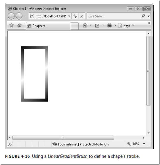
LinearGradientBrush to paint the rectangle’s stroke:
<Rectangle StrokeThickness="10" Canvas.Left="40"
Canvas.Top="40" Width="100" Height="200">
<Rectangle.Stroke>
<LinearGradientBrush >
<GradientStop Color="#FF000000" Offset="0"/>
<GradientStop Color="#FFFFFFFF" Offset="0.5"/>
<GradientStop Color="#FF000000" Offset="1"/>
</LinearGradientBrush>
</Rectangle.Stroke>
</Rectangle>
You can see how this appears on the screen in Figure 4-16.
Setting Stroke Width
You might have noticed in this example that the thickness of the stroke was set to 10. This
was done to better demonstrate the gradient, which doesn’t show up well using the default
stroke thickness value of 1.
Set the stroke width using the StrokeThickness property. This specifies the stroke width in
pixels:
<Rectangle StrokeThickness="10" Stroke="Black" Canvas.Left="40" Canvas.Top="40" Width="100"
Height="200" />
Setting Stroke Dash
The StrokeDashArray property is used to set the stroke dash pattern. You can combine this
property with the StrokeDashCap and StrokeDashOffset properties to fine-tune stroke dash.
To set the stroke of the rectangle to be dashed with a repeating pattern of dashes, you define
an array of double values that represents the length of the dashes as well as the space
between them. To define a dash pattern using a dash 4 units long, followed by a space 1 unit
long, followed by a dash 2 units long, followed by a space 1 unit long before repeating, you
would set the StrokeDashArray property to (4,1,2,1). Here’s an example:
<Rectangle StrokeThickness="10" Stroke="Black" Canvas.Left="40" Canvas.Top="40" Width="100"
Height="200" StrokeDashArray="4,1,2,1"/>
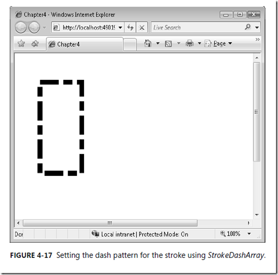
Figure 4-17 shows how this is drawn on the screen.
You can see that these dashes are rectangular in shape, with squared dash edges. You can
change this using the StrokeDashCap property. This property is set to a value from the
PenlineCap enumeration. It can contain the following values:
- Flat This is the default value, and it specifies that the cap doesn’t extend beyond the
end of the line—it is the same as not having a cap. - Round This specifies a semicircle with the same diameter as the line thickness.
- Square This specifies a square end cap.
- Triangle This specifies an isosceles triangle end cap, with the base length equal to
the thickness of the stroke.
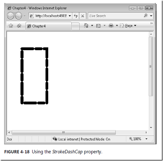
Following is an example of using the StrokeDashCap to set a rounded dash cap:
<Rectangle StrokeThickness="10" Stroke="Black" Canvas.Left="40" Canvas.Top="40" Width="100"
Height="200" StrokeDashArray="4,1,2,1" StrokeDashCap="Round"/>
Figure 4-18 shows how this will appear on the screen.
