Blacklight – Controls for Designers - v1.0 Released!
The first release of Blacklight is here! This release has really focussed on creating a set of controls that create visual effects that designers use in everyday work.
I have also worked on some improvements to the Drag Dock Panel controls, including being able to dynamically add panels at runtime, and change which side the panels dock on when one is maximised. Check out all of the details of this release below... and check out the new showcase here.
Silverlight Controls
For Silverlight 2, this release introduces 3 new Border controls – Clipping Border, Drop Shadow Border and Inner Glow Border, 2 new text controls – Drop Shadow Text Block and Stroke Text Block (Alpha) , a set of control styles, from Dave Crawford, and some improvements to Drag Dock Panel.
Clipping Border
In WPF, each border, panel and content control has a ClipToBounds property. This meant that if anything was placed inside a control that extends outside of the edge, you could tell the control to clip it. Silverlight doesn’t have this property, and code is always required to draw clipping regions around each control you want to clip. This became especially hard with borders and rounded corners.
The clipping border is a border, just like the Silverlight border, that allows you clip the content. Even with a different corner radius on each corner.
Below, shows a border with a rectangle inside, where the content in not clipped.

The clipping border can clip the content as shown below...
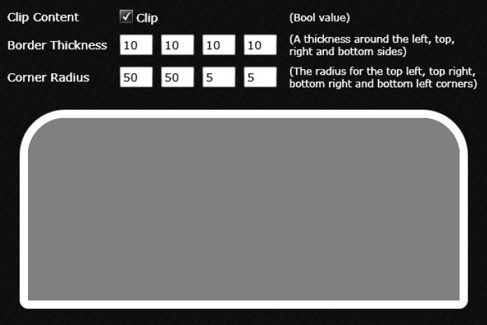
Clipping border is at the base of all of the border controls, so all Blacklight borders have a ClipContent property.
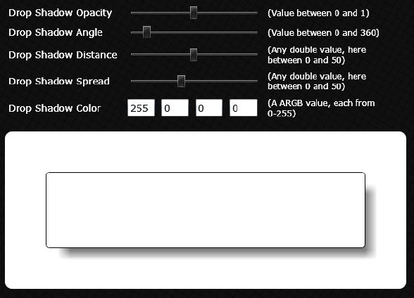
Drop Shadow Border
A fairly obvious control, the Drop Shadow Border draws a drop shadow below your main border. This effect is great if you want your border to look as though it is raise off of the page. You can adjust things like the angle of the drop shadow, the distance from the main border, the softness of the shadow (or spread) and the opacity and colour.
Here are some examples I have made...
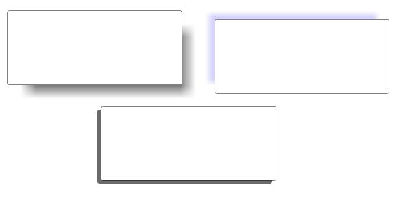
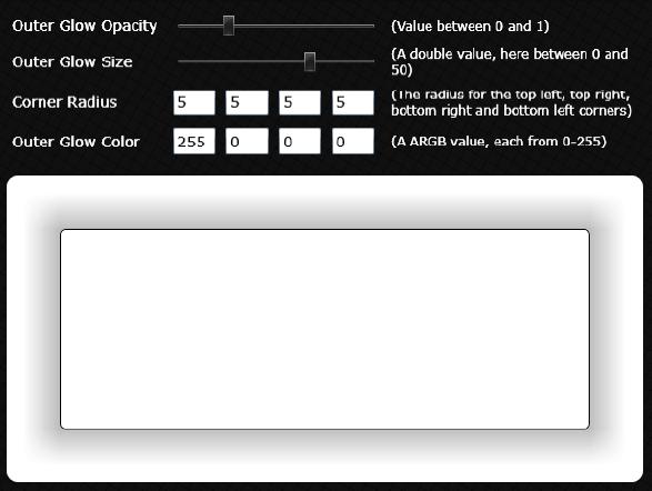
Outer Glow Border
This feature in v0.1, however, didn’t get a mention here. The Outer Glow border, is similar to the drop shadow border, however, the ‘shadow’ is drawn around all edges, creating more of a glow effect. You can change the glow size, colour and opacity, as well as all the normal border properties like border thickness, corner radius etc.
Inner Glow Border
Just like the outer glow border, however, the glow appears on the inside of the edges. This is a good effect for making a border look as though it has sunk into the page. You can change the glow size, colour and opacity.
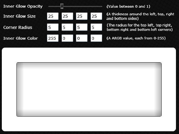
The difference here though, is you can choose the glow size for each edge, allowing you to really customise the effect, for example...

There is also a ContentZIndex property, which allows you to chose whether the borders content sits on top of the shadow, or underneath it. (0 for underneath, 1 for on top).
Drop Shadow Text Block
The drop shadow text block is just like a regular text block, with a drop shadow drawn below.

Just like the drop shadow border, you can change the angle, distance, colour and opacity of the shadow.
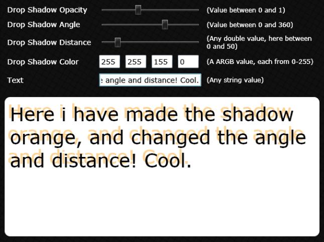
Although this effect is quite easy to achieve in Blend, it can be a pain to move around, duplicate and edit. Putting it into a control has hopefully made it very easy to manage.
Stroke Text Block (Alpha)
This text block has a stroke effect around the edges...

You can adjust all of the normal text properties, as well as the stroke thickness, colour and opacity.
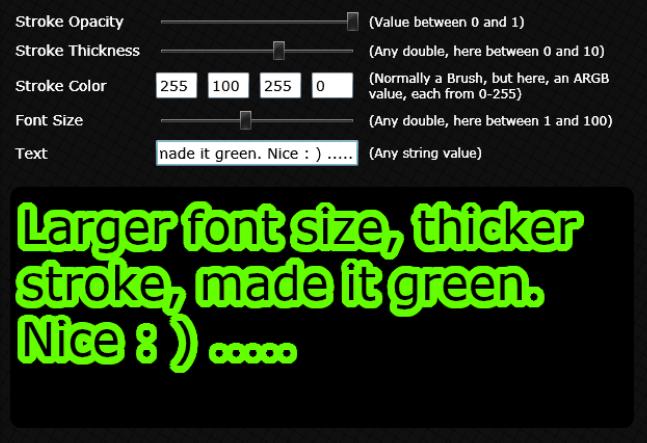
This is an Alpha version of this control, so it should be used VERY sparingly, with as smaller stroke thickness as possible. Why? The control works by replicating many text blocks in the background, and drawing them around the edge of a main text block. This can have performance implications, as the thicker the stroke, the more new text blocks are put on the screen. I hope to work on improvements to this control in the future.
Drag Dock Panel
The main changes here from v0.1 are...
1. Improved default template for the Drag Dock Panel
2. Can chose where the other panels go when one is maximised – either the top, right, bottom or left sides
3. Can add and remove panels dynamically at runtime to the host.
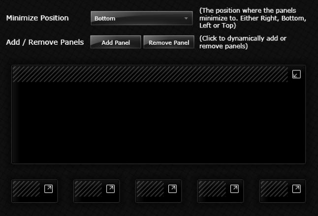
Head over to the showcase to see the sample running.
Silverlight Styles
In this release, Dave Crawford has kindly shared his glossy control styles. You will find the styles and templates for use in your application in the ResourceDictionaries folder in the Showcase.
WPF Controls
This release sees the first WPF control, under the Blacklight.Wpf namespace. It is actually the Drag Dock Panel control, ported over to WPF. There is a sample viewer that you can download from the releases page (in the binaries download) where you can see the panel in action.
Showcase Updates
There have been a few showcase updates, but most importantly, a guide to how to use Blacklight in Blend or Visual Studio 2008. So check those out. There is also a new ‘Who’s involved?’ page, so you can keep track on who is contributing to the project!
You can see all the bits running in the current showcase here. And you can download this release from here.
Next release is due end of November, and with lots planned; it should be a big one.
Enjoy,
Martin