#VisualizeChange - Comments in Words
Recently a retweet from @olivier_matrat came through my twitter feed and it struck a chord. It was the #VisualizeChange challenge part of this year's World Humanitarian Summit. Submissions are due 8/31, so there's still time for folks to work on it. Not sure if I'll actually enter into the contest, but I did do enough work on it to produce the below, hope you like it.
I also did some work to build an excel workbook that translates the raw table of data provided for the competition into something more usable. If you'd like to use the workbook, I've provided a link below where you can download it. To use it, you'll either need Excel 2013 with Power Query or Power BI Desktop (free) to pull in the data, or other tools that can read Excel files.
You can see it more interactively on Docs.com here.
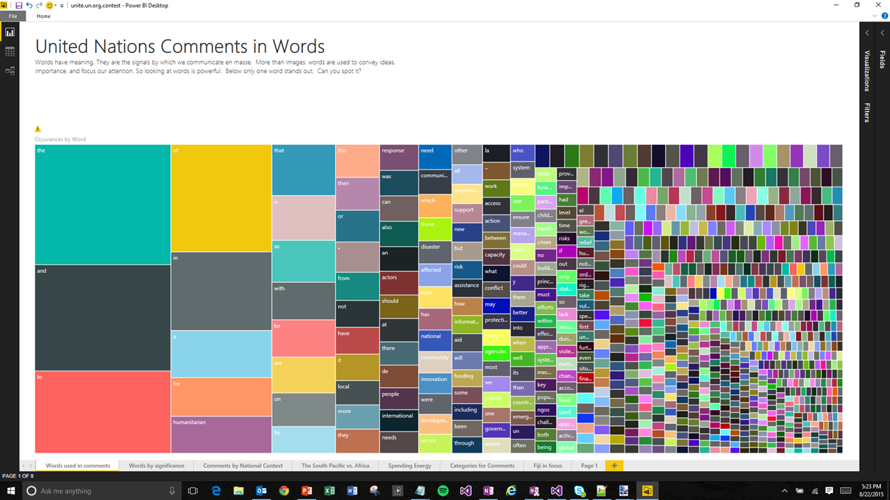
The treemap above shows a count of the occurrence of words in the contest data set. It's interesting to see what words are used to see what concepts or ideas are really important to the people making comments. To do that I used Power Query with various unpivot and split transforms to get to a table of words. I then asked Power BI Desktop to plot the count of words a a treemap. If you look at the excel file I mention below, you'll have tables of distinct words, distinct comments, and distinct documents. So you can take this approach much further. I'm toying with some basic heuristics to find 'meaningful' words for example and that's looking promising.
Resources:
Files on OneDrive, you'll want to grab a copy of [Master Data] WHS Master Consultation Data Collection (23 July 2015).xlsx at least.
If I end up making a contest submission, I'll post my entire submission, including the Power BI Desktop file as well so you can play with it.
HTH,
Lukasz