Using RibbonGallery Control
The Ribbon Control is a pretty big control owing to the complexity of the Ribbon design guidelines. You can give it a try by downloading from LINK
While there are several things to blog about, this post will focus on RibbonGallery. The download provides a sample that covers all features by implementing the Office Ribbon. This post will trim the sample to focus specifically on the RibbonGallery usage
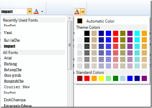
To whet our appetite, the dropdown of both the controls are RibbonGallery controls
The gallery can be hosted in the following Ribbon Controls:
§ RibbonApplicationSplitMenuItem
So lets take the first case. The xaml looks like:
 <ribbon:RibbonComboBox DataContext="{x:Static data:WordModel.FontFace}">
    <ribbon:RibbonGallery MaxColumnCount="1" >
        <ribbon:RibbonGallery.GalleryItemTemplate>
            <DataTemplate>
                <Grid>
                    <TextBlock Text="{Binding}" FontFamily="{Binding}"/>
                </Grid>
            </DataTemplate>
        </ribbon:RibbonGallery.GalleryItemTemplate>
    </ribbon:RibbonGallery>
</ribbon:RibbonComboBox>

Basically, we need a gallery with just one column (the fontFamily).
In addition, we need to bind the gallery to the itemsSource
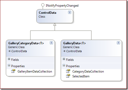
<!-- RibbonGallery --><Style TargetType="{x:Type ribbon:RibbonGallery}"> <Setter Property="ItemsSource" Value="{Binding CategoryDataCollection}" /> <Setter Property="SelectedItem" Value="{Binding SelectedItem}" /> <Setter Property="Command" Value="{Binding Command}" /></Style> <!-- RibbonGalleryCategory --><Style TargetType="{x:Type ribbon:RibbonGalleryCategory}"> <Setter Property="Header" Value="{Binding Label}" /> <Setter Property="ItemsSource" Value="{Binding GalleryItemDataCollection}" /></Style>
If you look at the drop down, we have 2 categories: Recently Used Fonts and All Fonts
In code, this looks like
 GalleryData<FontFamily> galleryData = new GalleryData<FontFamily>();

GalleryCategoryData<FontFamily> recentlyUsedCategoryData =
          new GalleryCategoryData<FontFamily>(){  Label = "Recently Used Fonts"  };
galleryData.CategoryDataCollection.Add(recentlyUsedCategoryData);

GalleryCategoryData<FontFamily> allFontsCategoryData =
         new GalleryCategoryData<FontFamily>(){ Label = "All Fonts" };
foreach (FontFamily fontFamily in System.Windows.Media.Fonts.SystemFontFamilies)
{
        allFontsCategoryData.GalleryItemDataCollection.Add(fontFamily);
}
galleryData.CategoryDataCollection.Add(allFontsCategoryData);

galleryData.Command = new PreviewDelegateCommand<FontFamily>(ChangeFontFace,
CanChangeFontFace, PreviewFontFace, CancelPreviewFontFace);
And this gives you the basic gallery control. You can modify the template of the gallery control and go as complicated as you wish.
For the second case, we could set the ItemTemplate as below using triggers to get a specific behavior for “Automatic Color”
<ribbon:RibbonGallery.GalleryItemTemplate> <DataTemplate> <Grid> <Rectangle x:Name="Rect" Width="16" Height="16" Fill="{Binding}" /> <Grid x:Name="AutomaticColorPane" Width="210" Visibility="Collapsed"> <Grid.ColumnDefinitions> <ColumnDefinition Width="Auto" /> <ColumnDefinition Width="*" /> </Grid.ColumnDefinitions> <Rectangle Width="16" Height="16" StrokeThickness="1" Stroke="Orange" Fill="{Binding}"/> <TextBlock Grid.Column="1" Text="Automatic Color" Margin="12,0,0,0" VerticalAlignment="Bottom" /> </Grid> </Grid> <DataTemplate.Triggers> <DataTrigger Binding="{Binding RelativeSource={RelativeSource AncestorType={x:Type ribbon:RibbonGalleryCategory}},Path=Header}" Value="Automatic Color"> <Setter TargetName="Rect" Property="Visibility" Value="Collapsed" /> <Setter TargetName="AutomaticColorPane" Property="Visibility" Value="Visible" /> </DataTrigger> </DataTemplate.Triggers> </DataTemplate></ribbon:RibbonGallery.GalleryItemTemplate>
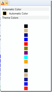
However,by itself you would end up with a control like
 So what we need to increase the number of columns and remove the Category Header
when the value is “Automatic Color”.
 <ribbon:RibbonGallery x:Name="FontColorGallery" ScrollViewer.VerticalScrollBarVisibility="Hidden">    <ribbon:RibbonGallery.CategoryStyle>        <Style TargetType="{x:Type ribbon:RibbonGalleryCategory}" BasedOn="{StaticResource
{x:Type ribbon:RibbonGalleryCategory}}">            <Setter Property="MinColumnCount" Value="10" />            <Setter Property="MaxColumnCount" Value="10" />            <Style.Triggers>                <Trigger Property="Header" Value="Automatic Color">                    <Setter Property="HeaderVisibility" Value="Collapsed" />                    <Setter Property="MinColumnCount" Value="1" />                    <Setter Property="MaxColumnCount" Value="1" />                    <Setter Property="IsSharedColumnSizeScope" Value="True" />                </Trigger>            </Style.Triggers>        </Style>    </ribbon:RibbonGallery.CategoryStyle>
Now you get the templated gallery as shown before.
 One more thing, you could use gallery in any WPF app – not necessarily in the ribbon.
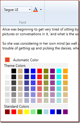
Below, you see the RibbonGallery as part of the RichTextBox.
The sample app is attached.


