WPF Ribbon Basics
The WPF Ribbon control is easy to use once you get the basics of it.
The structure is simple
<ribbon:Ribbon x:Name="Ribbon" >
<ribbon:Ribbon.ApplicationMenu>
<ribbon:RibbonApplicationMenu SmallImageSource="Images\SmallIcon.png" >
<ribbon:RibbonApplicationMenuItem Header="Open _File" ImageSource="Images\LargeIcon.png"/>
</ribbon:RibbonApplicationMenu>
</ribbon:Ribbon.ApplicationMenu>
<ribbon:RibbonTab Header="Home">
<ribbon:RibbonGroup Header="Group1">
So you have Ribbon, Menu, RibbonTab, and then the Ribbon Group. When you create a new Ribbon application, you get this wireframe ready – so its easy to start.
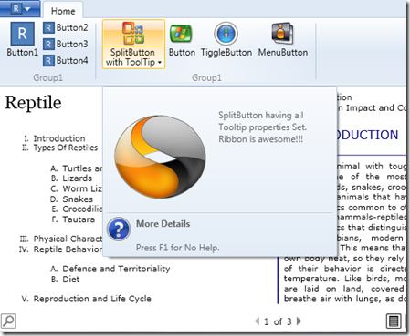
You got the group – lets populate it. If you look at the Xaml, the Ribbon controls have a SmallImageResource and a LargeImageResource property. This enables the ribbon to use the appropriate image when resizing. Each control can also have rich tooltips by setting the following properties.
ToolTipDescription="SplitButton having all Tooltip properties Set. Ribbon is awesome!!!" ToolTipImageSource="Images\Symantec.ico" ToolTipFooterTitle="More Details" ToolTipFooterDescription="Press F1 for No Help." ToolTipFooterImageSource="Images\Alert 04.ico"
Using the above for the SplitButton, we get the following
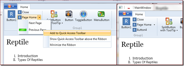
As mentioned earlier, the ribbon picks up the appropriate image sources when resizing. Take a look at the below image and notice how the controls and their associated images shrink when the window is resized. Pretty cool !!
You also have the MinimizeRibbon context menu. This is baked in.
Next in line is the QuickAccess Toolbar. This is the toolbar that appears in the Window Title bar right at the top. The context menu for the controls shows the option “Add to Quick Access Toolbar”. To have this enabled you need to have a command enabled on the control.
<ribbon:RibbonSplitButton SmallImageSource="Images\SmallIcon.png" Command="FirstPage" Label="Page Home" > <ribbon:RibbonMenuItem Header="Next Page" ImageSource="{x:Null}" QuickAccessToolBarImageSource="Images\Plus.ico" Command="NextPage"/>
Things to note is the enabled commands. Also, we have a QuickAccessToolBarImageSource on the menuItem. As the name suggests, you could set an additional image for the Quick Access Toolbar. In the image below the image in the Menu for PreviousPage is Green but its Red in the toolbar.
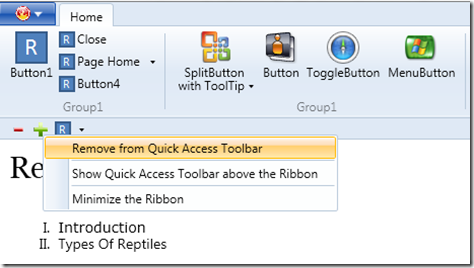
You could also move the Toolbar to be below the Ribbon as shown below
And then you have the removal options too
Finally, you could tweak the ribbon colors
<ribbon:Ribbon x:Name="Ribbon" Background="BlanchedAlmond" > <ribbon:Ribbon.ApplicationMenu> <ribbon:RibbonApplicationMenu SmallImageSource="Images\Open.png" Background="Maroon" >
That’s it for now. So lets see some Ribbon apps.
Sample code is attached
Leave a comment about your thoughts\feedback. Also, would love to see any apps that you create using the Ribbon Control.


