Why don't you Slide-r?
In this post, I hope to give an introduction to the Silverlight Slider that is part of the Silverlight 2 Beta 1 SDK and share with you some interesting usage scenarios that demonstrate how to use the Slider API's and change its default look and feel.
Anatomy of the Slider
The Silverlight Slider owes most of its design to the WPF Slider and we have tried to ensure that it is a subset of the WPF Slider both in terms of the API's and behavior. It consumes/builds on top of the following classes, all of which map back to WPF.
- RangeBase: The Silverlight RangeBase class mimics the behavior and API's of the WPF RangeBase class. Although, Silverlight does not support built-in value coercion, the RangeBase class fulfils all the WPF RangeBase coercion rules.
- RepeatButton: The RepeatButton class as in WPF fires click events at specified intervals until the mouse is released.
- Thumb: Thumb supports drag and drop events and enables the user to increase and decrease the value of the Slider by SmallChange.
Slider Template
Slider is made of 5 core visual elements:
- The RootElement which serves as a container to all the rest of the elements.
- The FocusVisualElement whose visibility is toggled when the Slider loses or gains focus.
- The LargeChangeIncreaseRepeatButtonElement which is overlaid on the Slider's root and when clicked, causes the value of the Slider to be increased by LargeChange.
- The LargeChangeDecreaseRepeatButtonElement which is overlaid on the Slider's root and when clicked, causes the value of the Slider to be decreased by LargeChange.
- The Thumb element which can be dragged around and causes the value of the Slider to be increased or decreased depending on the direction in which it is being dragged and the IsDirectionReversed property set on the Slider.
Some Template Tips:
Optional Horizontal and Vertical Template parts: The actual number default template parts of the Slider, however, exceeds 5. This is because the last three are duplicated for both Horizontal and Vertical Orientation of the Slider. If the users of your template would like to use the Orientation property, then you may want to provide both the Horizontal and Vertical parts If you do not specify the vertical template, create a Slider that consumes that template and set the Orientation to be Vertical then the Slider will not show up. The Horizontal usage will continue to work as expected.
Grid layout requirement: We require that the Slider's Vertical and Horizontal template elements be grids with three rows or three columns respectively containing the arrangement RepeatButton - Thumb - RepeatButton. Here is the XAML from the template that defines the Horizontal Template layout. The default template also demonstrates which one should have star-sizing and which ones should be Auto. This restriction has been put into place to respect the IsDirectionReversed property.
<!-- Horizontal Template -->
<Grid x:Name="HorizontalTemplateElement">
<Grid.ColumnDefinitions>
<ColumnDefinition Width="Auto" />
<ColumnDefinition Width="Auto" />
<ColumnDefinition Width="*" />
</Grid.ColumnDefinitions><!-- rest of the template -->
</Grid>
Slider examples
I have put together some examples that demonstrate simple customization of the Slider. You can download the zip to get the source code. I have used the bare minimum parts required to achieve my scenario, so you will see that I do not specify the Vertical template or the FocusVisualElement. Both the examples below do not use the Thumb. That was not a deliberate attempt to undermine the importance of the Thumb. I should have more Thumb examples coming up.
Slider to modify the Opacity of an Element
This Slider changes the opacity of an Image but shows no Thumb. To achieve that, I have changed the Width of the Thumb in the Template to be 0 to meet the layout requirement I mention above.
<Thumb Width="0" x:Name="HorizontalThumbElement" Grid.Column="1"></Thumb>
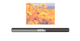
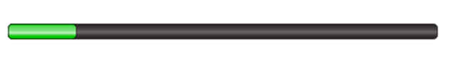
Slider behaving like a Progress Bar
This is a read-only Slider whose value is changed in response to a timer tick. The read-only feature comes from setting the IsEnabled property on the Slider to be false. That disallows any user input. The Slider value is still changeable programmatically. I have also updated the default disabled state of the Slider to not change the Opacity and hence it still looks like an active Slider. If you click on it or attempt to change its values using the arrow keys it does not respond.
<Slider x:Name="ProgressBar"
IsEnabled="False"
Margin="10, 10, 10, 10"
Minimum="0" Maximum="100"
Style='{StaticResource ProgressBarSliderStyle}'>
</Slider>
I hope to post more control customization examples in the near future. Please try it out the Silverlight controls and let us know what you like and don't like. What controls you really want to see coming from Microsoft?
We are listening!