Have you ever designed a dialog and wondered what’s the right control size, spacing, font, layout etc? This respectable document (46 MB!) contains a wealth of such information:
http://download.microsoft.com/download/e/1/9/e191fd8c-bce8-4dba-a9d5-2d4e3f3ec1d3/ux%20guide.pdf
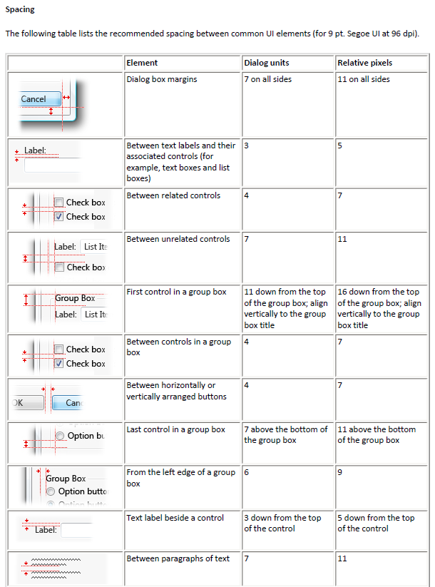
For example, did you know that the default size of a button (like OK and Cancel) needs to 73x21 pixels? Or that the vertical spacing between a label and a control needs to be 5 pixels? Here’s an excerpt from the document:
Hmm… I pressed Windows+R to look at the OK and Cancel buttons' size, and they are 86×24 on Windows 7? I looked on a Windows XP machine, and it is 73×21.
Weird!
that is because Microsoft doesn't follow its own human interface guidelines. just look at all their apps.
Windows Media Player and Office 2007/2010 is the prime example of that. "hey when we want to skin an app we just do it, disregard the HIG!"
They did a good job with Notepad though. That app has remained pretty much faithful to the MS HIG for all this time.
That document is glorious. Thanks for linking.
Thank you for this file it helps me a lot!!!