SharePoint for Developers Part 3 – Expression Blend and Silverlight
Part 3 of the SharePoint for Developers screencast series is posted to Channel9, “Expression Blend and Silverlight”.
In part 1 of this series, I introduced Visual Studio Extensions for Windows SharePoint Services 1.3 (VSeWSS). In part 2, we used VSeWSS to expose SharePoint lists as JSON data that can be easily consumed by AJAX clients. In Part 3 of this series, we don’t actually look at SharePoint at all, but rather focus on Expression Blend and Silverlight 2.
Why No SharePoint in This One?
The code built in this demonstration will be used in subsequent screencasts in this series. Rather than just surprise everyone with, “oh, I happen to have this Silverlight application laying around” or using a big honking code snippet, I thought it was valuable enough to demonstrate on its own. Besides, Expression Blend is not a tool that many developers are intimately familiar with yet, and I find it invaluable when building Silverlight applications. As more and more SharePoint sites integrate Silverlight, you will find this to be an invaluable part of your toolbelt as well. It simply made sense to walk through how to build a Silverlight application from scratch… we’ll hook it into SharePoint later.
Makes Sense… Show Me the Code!
As usual, I am not going to walk through all of the steps on how to build the application. I did that in the accompanying screencast on Channel9. Instead, I am posting the code so that you can easily recreate what I built.
To use this code, you need to go download Telerik’s RadControls for Silverlight. Rather than build my own Silverlight media player, their RadMediaPlayer fits the job quite nicely. Once you have the control installed and referenced in your project, here is the XAML that I used in the Page.
 <UserControl
    xmlns="https://schemas.microsoft.com/winfx/2006/xaml/presentation"
    xmlns:x="https://schemas.microsoft.com/winfx/2006/xaml"
    x:Class="SLScreencastDemo.Page"
    Width="Auto" Height="Auto"
    xmlns:telerikMedia="clr-namespace:Telerik.Windows.Controls;assembly=Telerik.Windows.Controls.MediaPlayer">

    <Grid x:Name="LayoutRoot" Background="White">
        <Grid.RowDefinitions>
            <RowDefinition/>
            <RowDefinition Height="25"/>
            <RowDefinition Height="100"/>
        </Grid.RowDefinitions>
        <telerikMedia:RadMediaPlayer HorizontalAlignment="Stretch"
            VerticalAlignment="Stretch" IsPlaylistVisible="False" AutoPlay="True"/>
        <StackPanel Height="Auto" HorizontalAlignment="Stretch"
            VerticalAlignment="Stretch" Width="Auto" Grid.Row="1"
            Orientation="Horizontal">
            <TextBlock  Text="Comment:" TextWrapping="Wrap"
                HorizontalAlignment="Left"
                VerticalAlignment="Center" Margin="0,0,20,0"/>
            <TextBox x:Name="commentText" Text="TextBox" TextWrapping="Wrap"
                 HorizontalAlignment="Left" VerticalAlignment="Center"
                Width="200"/>
            <Button Content="Add" Margin="20,0,0,0" Click="Button_Click"/>
        </StackPanel>
        <ListBox x:Name="commentList" HorizontalAlignment="Stretch" Margin="0,10,0,10"
            Width="Auto" Grid.Row="2" HorizontalContentAlignment="Stretch"
            VerticalContentAlignment="Stretch" Foreground="#FFFFFFFF">
            <ListBox.Background>
                <LinearGradientBrush EndPoint="0.5,1" StartPoint="0.5,0">
                    <GradientStop Color="#FF000000"/>
                    <GradientStop Color="#FF9E9E9E" Offset="1"/>
                </LinearGradientBrush>
            </ListBox.Background>
            <ListBox.ItemTemplate>
                <DataTemplate>
                    <StackPanel Orientation="Horizontal" Width="Auto"
        MouseEnter="StackPanel_MouseEnter"
        MouseLeave="StackPanel_MouseLeave">
                        <Button x:Name="deleteButton" Click="deleteButton_Click" Visibility="Collapsed">
                            <Image Height="16" Width="16" Source="delete.png"/>
                        </Button>
                        <TextBlock Text="{Binding}"/>
                    </StackPanel>
                </DataTemplate>
            </ListBox.ItemTemplate>
        </ListBox>
    </Grid>
</UserControl>
The interesting parts here are the ListBox.ItemTemplate, where we define the layout for the data binding as a stackpanel that contains a button and a textblock. When you mouse over the stackpanel, we want the delete button to appear, and when your mouse leaves the stack panel we want it to become invisible again. The XAML is really pretty simple once you read through it, the majority of the XML you see is positioning and alignment.
Once we have the XAML defined, we can now focus on the code-behind.
 using System;
using System.Windows;
using System.Windows.Controls;
using System.Windows.Documents;
using System.Windows.Ink;
using System.Windows.Input;
using System.Windows.Media;
using System.Windows.Media.Animation;
using System.Windows.Shapes;
using System.Collections.ObjectModel;

namespace SLScreencastDemo
{
    public partial class Page : UserControl
    {
        private ObservableCollection<string> comments;

        public Page()
        {
            // Required to initialize variables
            InitializeComponent();
            comments = new ObservableCollection<string>();
            commentList.ItemsSource = comments;
        }

        private void Button_Click(object sender, RoutedEventArgs e)
        {
            //Add a new comment to the list
            comments.Add(this.commentText.Text);
        }

        private void deleteButton_Click(object sender, RoutedEventArgs e)
        {
            Button b = sender as Button;
            string data = b.DataContext.ToString();
            comments.Remove(data);
        }

        private void StackPanel_MouseEnter(object sender, MouseEventArgs e)
        {
            StackPanel panel = sender as StackPanel;
            ((Button)panel.FindName("deleteButton")).Visibility = Visibility.Visible;
        }

        private void StackPanel_MouseLeave(object sender, MouseEventArgs e)
        {
            StackPanel panel = sender as StackPanel;
            ((Button)panel.FindName("deleteButton")).Visibility = Visibility.Collapsed;
        }
    }
}
There’s really not much code here, either. I create an ObservableCollection of strings, and set the listbox’s ItemSource to that collection. That makes it easy to add items to the collection, and through the notification pattern the UI is notified of the addition / removal of items and alters its display accordingly. You can see in the Button_Click handler that we simply add strings to the ObservableCollection. In the deleteButton_Click handler, we first determine who was the sender of the event (remember that we will have many buttons). Because we are using databinding, it is simple to access the DataContext to retrieve the data. This part took me awhile to figure out, hoping that this helps someone else.
Finally, we handle the mouse enter/leave events for the containing stackpanel. We know that a stack panel was the sender of the event, we then use the FindName method to find its child control named “deleteButton” and set the visibility accordingly.
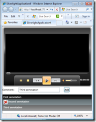
The final product looks like this:
For More Information
SharePoint for Developers Part 3 – Expression Blend and Silverlight
