Dive Right In: The Art of Menu Design in Action
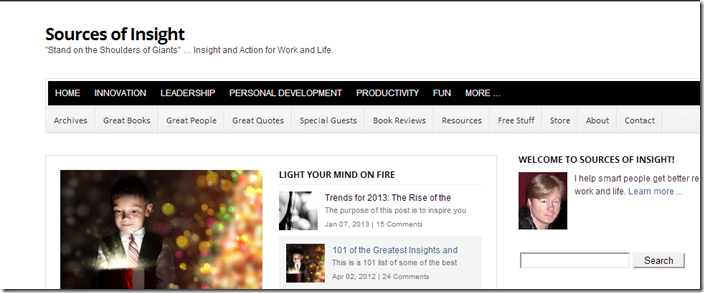
I’ve updated my menu at Sources of Insight to make it easy to dive into hot topics including Innovation, Leadership, Personal Development, Productivity and more. (here is the full Topics pages.)
I made them front and center on the top menu bar:
I’ll be testing the effectiveness of this new menu for the next 30 days.
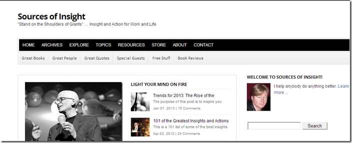
Here was my previous design:
There are pros and cons to both.
I’ve struggled with my menu, so I’ll share some of my learnings.
On My Previous Menu Design …
With my previous design of the top bar, Home | Archives | Explore | Topics | Resources | Store | About | Contact, it was easy to see the site navigation at a glance, and make sense of it. Another advantage is that the idea of Great Books, Great People, Great Quotes, was simple and clear, and it was easy to see Special Guests, including Best-Selling authors. The challenge is that it buried some interesting topics, under Topics.
So it was simple, but relatively generic, and some of the most interesting topics were nested under Topics.
On My New Menu Design …
With my new menu, Innovation | Leadership | Productivity | Personal Development | Fun are right in your face. Better yet, when you click More … , you have additional interesting topics right there, including Emotional Intelligence, Happiness, Intellectual Horsepower, Motivation, Strengths, and Time Management. This has several advantages. The main thing is that it puts hot topics at your fingertips. It also helps you get an instant sense of the scope of the site, and variety of coverage. It also makes it easy to showcase some interesting topics. Related, I can easily shuffle some of the popular topics to see which ones readers are hungry for, as well as test new topics. But a big downside is, my sub-menu looks more complicated now. I didn’t want to give up the Great Books, Great People, Great Quotes, or the Special Guests, since they are key features of Sources of Insight.
I’ve studied menus. Many menus. Many, many, many, too many menus. And, I’ve played around with my own menus for many years. Menus really are a living thing (or they die, and information starts to die.) That said, they are powerful when they are simple, intuitive, and help users achieve their goals, or explore and find interesting things (I’m a fan of supporting both River AND Goal people.)
Great Menu Guidance
I finally stumbled on a really good menu design article that clicked for me:
How To Design Effective Navigation Menus
What I liked was the simple flip through of many menu designs at a glance. This made it really easy to compare and contrast across multiple designs very quickly, as well as explore designs I hadn’t seen before.
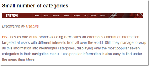
What caught my attention though, was the following section on how the BBC has enormous information, but slices into a simple set of seven categories:
There’s more to the story than that, but I liked the idea of a “Hot Button Bar” at the top, where, without thinking, you could simply “Dive In.”
While my site might not qualify yet as an enormous amount of information, it is getting there. I have more than 1,000 blog posts, and many of them are significant in size.
Here’s the most interesting thing to me, though. As soon as I chose this particular set of categories, I found myself wanting to produce some highly-targeted articles to really create a compelling experience for somebody drilling into these categories. I also want to create “Getting Started” articles for these Hot Spots as well as some Overview types articles, and definitely more How Tos, and more Checklists.
I think my driving philosophy behind my design is:
Think less, explore more, and yet make sense of the site at a glance.
I’m a fan of simplicity. On one hand, I feel like a lost some simplicity on the sub-menu. In fact, specifically, I just don’t like having too many options visible. I also don’t like that some of my most significant pages feel a little buried on my Resources page. My Trends page feels really lost and yet it’s my trends posts that change lives and companies. On the other hand, even though it’s more categories at a glance than I like up front, it does make it easy to dive into some very different parts of the site.
While I may not have “nailed it”, at least I think I’m trending in the right direction, and most people I think will quickly find information they need or want.
Site Navigation and Information Navigation at a Glance
I’m also hoping that I stumble on additional design moves for my menu that I don’t expect. I actually didn’t expect to put the current set of topics on the main menu. But, I like it. It’s effectively:
- Information Navigation on the top bar
- Site Navigation on the bottom bar
My open issue to solve is how to consolidate my sub-menu, while keeping the simple story of Great Books, Great People, Great Quotes, and making it easy to dive into key resources that are buried under the Resources page, including Checklists, How Tos, Lists, etc.
Keep in mind, as much as I’m complaining, all you really need to do is just click on the Resources page and you have bunches of resources at your fingertips.
But, like I said, I’m a fan of simplicity, and yes, I want my cake and eat it, too.
If you get a chance, dive in, take a look around, and let me know your thoughts.
There are articles in there that have helped people do amazing things.
If you just want some quick inspiration, take a stroll through my inspirational quotes collection.
Here is a sampling to get you started:
- “If you’re going through hell, keep going.” — Winston Churchill
- “Courage doesn’t always roar. Sometimes courage is the quiet voice at the end of the day saying, ‘I will try again tomorrow.’” — Mary Anne Radmacher
- “Life isn’t about finding yourself. Life is about creating yourself.” — George Bernard Shaw
- “What lies behind us and what lies before us are tiny matters compared to what lies within us.” — Ralph Waldo Emerson
- “If you cannot do great things, do small things in a great way.” — Napoleon Hill
Explore for more.


