Visualizing Climate Data in Phase Space
I've been reading the online draft (pdf) of Ray Pierrehumbert's excellent new book on climate science, Principles of Planetary Climate. On page 54, there's a nice graph of ocean 18O isotope levels over the past four million years. Using this data, we can infer how much of the planet's water was bound up in ice, as a function of time. The graph reminds me of the kind of trace you get from a nonlinear system that's in a chaotic state, so it seems like a neat idea to visualize this data in phase space. You may remember earlier posts of mine (here and here) on this subject. Previously, I used music as a real-time input to a phase-space visualizer. This time, I decided to whip up a quick-and-dirty WPF PhaseSpaceControl class to view climate-related data in phase space.
A quick search brought me to Dr. Maureen Raymo's site, which has a convenient archive of climate data. Dr. Raymo constructs a model of 18O isotope levels over the Pliocene/Pleistocene epochs, from three million to one million years ago (1). She uses a model of ice volume that's driven by the computed insolation (amount of solar energy) at Earth's surface. Insolation varies deterministically with Earth's distance from the sun, with Earth's wobble as it spins ( precession ), and with Earth's axial tilt ( obliquity ).
This adds up to the following insolation in the Northern Hemisphere (NH) and Southern Hemisphere (SH) computed for the two million-year period under investigation. Figure 1 shows the computed insolation on Summer Solstice at 65N and 65S latitudes, from one million years before present (ybp) to three million ybp.
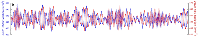
Figure 1. Calculated 65°N summer insolation records for NH (21 June) and SH (21 December) ( Raymo, et al. ).
Using a simple ice-climate model, the following ice-sheet histories are computed.
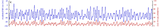
Figure 2. NH (blue) and SH (red) modeled ice volumes ( Raymo, et al. ).
These traces show the modeled advance and retreat of ice sheets (glaciation and deglaciation) in the Northern and Southern Hemispheres.
Putting all this together, Dr. Raymo models the global sea level and corresponding 18O isotope levels.
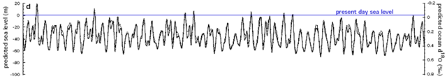
Figure 3. Predicted sea level (solid line) and mean ocean δ18O (dashed line), derived from the ice volume histories in Fig. 2 ( Raymo, et al. ).
Finally, the predicted mean ocean δ18O is compared with the actual values recovered from ocean sediment cores (2).
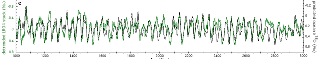
Figure 4. Comparison of predicted mean ocean δ18O and the LR04 stack ( Raymo, et al. ).
The agreement is pretty good. In particular, this model reproduces the puzzling 41,000-year (41 ky) frequency that dominates the measured δ18O record.
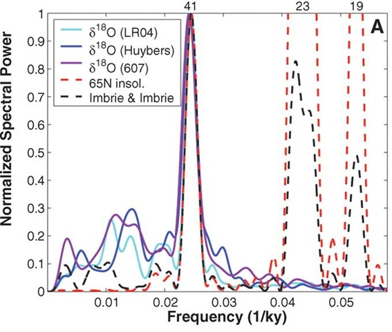
Figure 5. Spectra of the LR04 stack, the paleomagnetically dated δ18O stack of Huybers, the paleomagnetically dated benthic δ18O record, 21 June summer insolation at 65°N, and NH model output from Fig. 2.
Insolation drives Earth's climate system*. You might imagine that the climate system responds to a signal like Figure 1 in a complex way. How many parameters does it take to describe that response? How many variables dominate the climate system?
Because the climate system is enormously complex, it's easy to think that the number of parameters required to describe its behavior is large. But one of the interesting results from nonlinear dynamics ("chaos theory") is that complex dynamics can arise from simple systems (and vice versa). There's something about the δ18O trace that makes me think that the number of parameters is small. How to test this idea? Constructing a phase space portrait can help.
We have a one-dimensional set of time series data that comprises a "slice" of the total system dynamics (δ18O measurements from ocean sediment cores). It's possible to recover the dynamics of the remaining dimensions by "embedding" the one-dimensional signal in a two-dimensional space, a three-dimensional space, and successively higher spaces. In principle, this is done by plotting the signal against its higher moments, i.e. , against its first derivative, its second derivative, and so on. When we don't have direct measurements of these quantities, we can approximate them by plotting the signal against itself, with a time delay (for a 2D reconstruction) as follows.
x-axis: f(t)
y-axis: f(t-τ)
where f(t) is the signal, and τ is the time delay, usually expressed in number of samples.
This is the method of delays, and the resulting phase space reconstruction is sometimes called a pseudo-phase portrait.
For example, the Van der Pol oscillator can produce the following time series.
Figure 6. Signal from the Van der Pol oscillator viewed in the time domain (Van der Pol Oscillator).
When a one-dimensional Van der Pol signal is embedded in a two-dimensional phase space, the following phase portrait is the result.
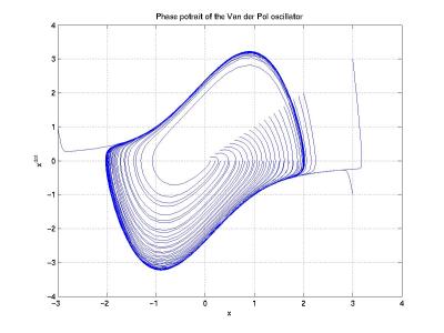
Figure 7. Phase portrait of the Van der Pol oscillator (Phase Space).
A three-dimensional embedding uses a delay of 2τ for the third dimension.
z-axis: f(t-2τ)
The following 3D phase portrait is reconstructed from electroencephalogram (EEG) data (3). The top trace shows the time series data, and the bottom diagram shows the corresponding phase portrait.
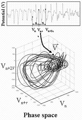
Figure 8. Three-dimensional phase space reconstruction of neurological data (Michel Le Van Quyen).
Now we can examine the phase portraits of climate data I promised so long ago. Here are the phase portraits of the computed Northern Hemisphere (NH) insolation from Figure 1. The two-dimensional embedding is shown in the left frame, and the three-dimensional embedding is shown in the right frame.
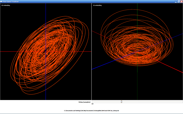
Figure 9. Phase portraits of the computed NH insolation from Fig. 1.
The value of τ = 32 samples is chosen by trial and error. I want the trace to intersect itself as seldom as possible. Because the 2D embedding looks "squashed" I assume that we need a 3D embedding to visualize the dynamics effectively. Not shown here is the rotation animation I've applied to the 3D phase portrait that lets me see it from different angles. Also, I've applied a cubic spline interpolation to the original data to make the phase portraits smoother. One interesting feature revealed by the 3D phase portrait is the presence of discrete bundles of orbits. This suggests that there is an attractor at work.
Here are the phase portraits of the computed global sea level, as a function of insolation and the simple ice-climate model used by Dr. Raymo.
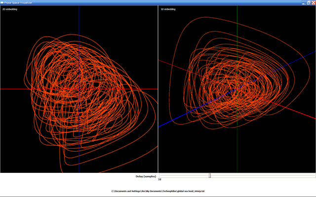
Figure 10. Phase portraits of the computed global sea level Fig. 3.
Here's the same portrait, with the 3D embedding viewed from another angle.
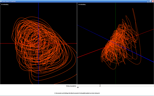
Figure 11. Phase portraits of the computed global sea level from Fig. 3.
What's interesting about the 3D portrait is the introduction of a funnel shape to the dynamics.
Here are the portraits for the modeled mean ocean δ18O from Figure 3.
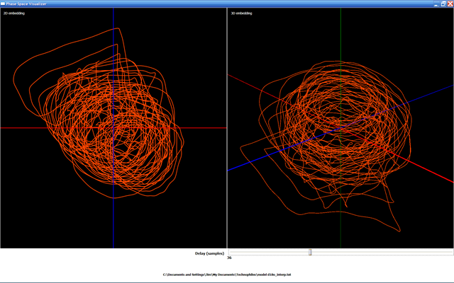
Figure 12. Phase portraits of the modeled δ18O from Fig. 3.
Banding in the phase portrait, similar to that in the insolation portrait (Figure 9), is still visible.
Finally, here's the phase portrait for the actual δ18O measurements from ocean sediment cores.
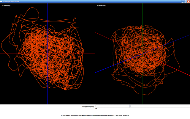
Figure 13. Phase portraits of the measured δ18O from Fig. 4. Original data have an applied cubic spline interpolation to smooth the portrait.
Okay, it's hard to tell much of anything from these. Banding isn't really apparent, and the overall portrait is a tangled mess. The only obvious similarity to the portraits in Figure 12 is the presence of the "outlier" orbits. We'll need a few more tools to tease anything out of these portraits. Future work includes:
- Visualizing Poincaré sections, which show slices of that tangle and may reveal an attractor pattern;
- Visualizing the phase-space flow, which involves displaying little arrows that follow the orbits around the phase portrait;
- Reworking the PhaseSpaceControl to use a Trackport3D, which lets the user tumble and zoom the portrait with the mouse.
I'll keep you posted as I implement these features.
Update: Dr. Raymo kindly pointed me to the work of Barry Saltzman, who pursued the question of nonlinear (chaotic) dynamics in climate models. She provided a couple of citations, and after a quick trip to the Fish/Oceans library at the University of Washington, I have a hardcopy of Dr. Saltzman's 1994 paper (4).
Dr. Saltzman proposes that for the last five million years, the climate system can be modeled with three slow-response variables: global ice mass, CO2, and ocean temperature. This is an exciting confirmation of my intuition, and I'll blog as I investigate further.
Another update: On to Part 2.
---
* Volcanism and heat diffusing from the molten interior contribute a very small quantity of energy to Earth's surface, around two orders of magnitude less than the sun's energy. This contribution is considered to be negligible.
[1] Plio-Pleistocene Ice Volume, Antarctic Climate, and the Global δ18O Record, Raymo, et al. [2006] Science.
[2] Lisiecki, L. E., and M. E. Raymo (2005), A Pliocene-Pleistocene stack of 57 globally distributed benthic δ18O records, Paleoceanography, 20, PA1003, doi:10.1029/2004PA001071.
[3] Disentangling the dynamic core: a research program for a neurodynamics at the large-scale, Michel Le Van Quyen, Biol. Res. v.36 n.1, Santiago 2003.
[4] Late Pleistocene Climatic Trajectory in the Phase Space of Global Ice, Ocean State, and CO2: Observations and Theory, Barry Saltzman and Mikhail Verbitsky,
Paleoceanography, 9(6), pp 767–779, 1994.
Technorati Tags: WPF,phase space,climate,chaos,ice sheet,glacier,glaciation,pliocene,pleistocene