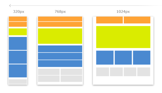
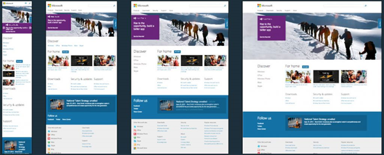
Horizontal Screen Breakpoints for Web Designers to Support
It’s difficult to create a site that looks great across browsers. The weaker web developers simply give up – supporting only a piece of the market, squandering opportunity for themselves or their customers.
But, now the ante is raised with responsive web design. Leveraging CSS media queries, developers rearrange content to accommodate the width (et al) of different screen sizes. And it’s not simply a normal site with a mobile site, too. Users are coming at you with a myriad screen sizes.
“…users may not be getting [a] webpage's best experience on devices like Apple iPad, Microsoft Surface, Amazon Kindle, XBOX 360, and other modern browsers on smaller or larger screens. These mobile experiences account for about 12% of the global internet traffic and are expected to grow quickly in the next 5 years (Business Insider, Nov 2012).” - https://www.modern.ie
Though I pick XAML as my Windows 8 UI, it’s undeniable that the web is an HTML/JavaScript playground. You can’t get by without ‘em, and the approach you take can change the experience of your user or your customer. Should you want to research more about responsive web design: Why the Web Is Ready for Responsive Web Design, by Rahul Lalmalani (MSDN Magazine March 2013)
Best of luck!


