Styling Microsoft’s WPF datagrid
Microsoft’s WPF datagrid has a lot of properties and styles you can tweak to get it looking right (if you are a designer).
Below, find my cheat sheet to styling the grid. It is not 100% comprehensive but it gets you far and has a few very useful tips & gotchas.
At the highest level in the DataGrid , you can change the look & feel by setting some of these:
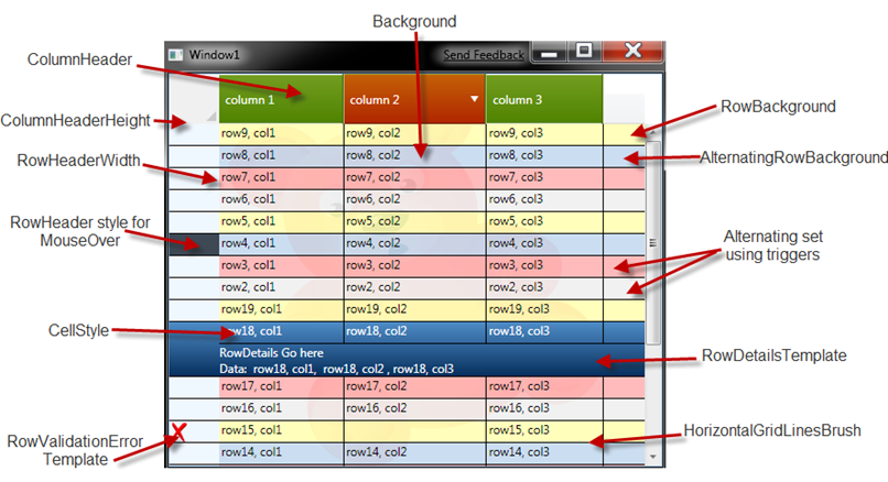
Here, you can see a visual representation for a few of these properties (the visual is not all inclusive); this will give you an idea of what this article will cover.
Backgrounds:
The interesting part are the relationships amongst the backgrounds:
- Background – sets the whole data grid’s background. Notice it can be any brush, solid and gradients is obvious, but why not a DrawingBrush like the bear above ( which you can see if you squint hard, it has Opacity =0.1)
- RowBackground and AlternatingRowBackground set the background for a row and alternating row.
Both of these have a higher z-order than DataGrid’s background of course, which means you can get visual composition w/ the grid’s background.
Notice that the default color for RowBackground is theme based (and default value is opaque); your DataGrid’s background will not be visible unless you override these row backgrounds to be partially transparent. - AlternationCount is the total number of styles or colors that will be used for the rows. This number is one-index based (meaning count starts at 1, not 0).
- If you set AlternationCount > 2, your rows from 3rd row to AlternationCount will be assigned the default background brush value (from the theme).
- The way to set the different backgrounds or styles for each row based on AlternationCount is by overriding the style for your DataGridRow and triggering based on AlternationIndex, which is actually zero-index based.
- If you set the AlternatingRowBackground brush, it will be assigned to the rows where the ( rownumber%AlternationIdex ) == 1
Here is an example of overriding RowStyle to tweak background based on AlternationIndex:
  <Style x:Key="DataGridDemoRowStyle"
       TargetType="{x:Type Custom:DataGridRow}">
    <Style.Triggers>
        <Trigger Property="AlternationIndex" Value="2" >
            <Setter Property="Background" Value="{StaticResource RowBackgroundAlternationIndex2Brush}" />
        </Trigger>
        <Trigger Property="AlternationIndex" Value="3">
            <Setter Property="Background" Value="{StaticResource RowBackgroundAlternationIndex3Brush}" />
        </Trigger>
    </Style.Triggers>
</Style>
Notice that, on purpose, I only override AlternationIndex = 2,3. For AlternationIndex=0, it uses RowBackground.
For AlternationIndex = 1, it uses AlternatingRowBackground from the datagrid.
Datagrid Column Headers
I usually customize the header on a data grid to accomplish one of two tasks:
- Tweak the background of the headers, including triggers for hovers, selected, etc.
- Tweak the Control template of the header, mostly because the default style to show Sorting is on top of ColumnHeader and I like it on the side.
My instinct was that customizing the header’s background would be a simple style override. Here is my try:
 <Style x:Key="DataGridColumnHeaderStyle" TargetType="{x:Type Custom:DataGridColumnHeader}"  >
    <Setter Property="Background" Value="#88800080" />
        <Setter Property="Foreground" Value="White" />
        <Style.Triggers>
        <Trigger Property="SortDirection" Value="{x:Null}">
            <Setter Property="Background" Value="{DynamicResource DataGridHeaderBackgroundBrush}" />
            <Setter Property="BorderBrush"  Value="Transparent" />
        </Trigger>
        <MultiTrigger>
            <MultiTrigger.Conditions>
                <Condition Property="IsMouseOver" Value="True" />
                <Condition Property="SortDirection" Value="{x:Null}" />
            </MultiTrigger.Conditions>
            <Setter Property="Background" Value="{StaticResource DataGridHeaderMouseOverBackgroundBrush}" />
            <Setter Property="BorderBrush" Value="{StaticResource DataGridHeaderBorderBrush}" />
        </MultiTrigger>

        <MultiTrigger>
            <MultiTrigger.Conditions>
                <Condition Property="IsMouseOver" Value="true" />
                <Condition Property="SortDirection" Value="{x:Null}" />
            </MultiTrigger.Conditions>
            <Setter Property="Background" Value="{StaticResource DataGridHeaderMouseOverBackgroundBrush}" />
            <Setter Property="BorderBrush" Value="{StaticResource DataGridHeaderBorderBrush}" />
        </MultiTrigger>
        <Trigger Property="SortDirection" Value="Ascending">
            <Setter Property="Background" Value="{StaticResource DataGridHeaderSortedBackgroundBrush}" />
        </Trigger>
        <Trigger Property="SortDirection" Value="Descending">
            <Setter Property="Background" Value="{StaticResource DataGridHeaderSortedBackgroundBrush}" />
        </Trigger>
    </Style.Triggers>
</Style>
If you run the sample code against that style, you will notice that the Sort direction arrow that is shown in the default style for the Datagrid disappeared'; the reason for it is that DataGridColumnHeader uses DataGridHeaderBorder in its template; DataGridHeaderBorder is a kind of smart Border that checks if you set a Background and if you did, it behaves like a Border; if you did not set a Background, it then acts smartly and does the code to render the triangle indicator for sort.
If you do want sort direction arrows, and a different background you should just override the template and use a regular Border or what ever you want for the background. Overriding the template is not too hard, here is an example:
 <Style x:Key="DatagridColumnHeaderCustomTemplateStyle"
         TargetType="{x:Type Custom:DataGridColumnHeader}">
      <Setter Property="SnapsToDevicePixels" Value="True" />
      <Setter Property="MinWidth" Value="0" />
      <Setter Property="MinHeight" Value="28" />
      <Setter Property="Foreground" Value="White" />
      <Setter Property="Cursor" Value="Hand" />
      <Setter Property="Template">
          <Setter.Value>
              <ControlTemplate TargetType="{x:Type Custom:DataGridColumnHeader}">
                  <Grid>
                      <Grid.ColumnDefinitions>
                          <ColumnDefinition Width="*" />
                          <ColumnDefinition Width="Auto" />
                      </Grid.ColumnDefinitions>
                      <Border x:Name="BackgroundBorder" BorderThickness="0,1,0,1"
                              Background="{StaticResource DataGridHeaderSortedBackgroundBrush}"
                              BorderBrush="{StaticResource DataGridHeaderSortedBorderBrush}"
                              Grid.ColumnSpan="2" />
                      <ContentPresenter Margin="6,3,6,3" VerticalAlignment="Center" />
                      <Path x:Name="SortArrow" Visibility="Collapsed" Data="M0,0 L1,0 0.5,1 z" Stretch="Fill"
                            Grid.Column="1" Width="8" Height="6" Fill="White" Margin="0,0,8,0"
                            VerticalAlignment="Center" RenderTransformOrigin="0.5,0.4" />
                      <Rectangle Width="1" Fill="#AAC377" HorizontalAlignment="Right" Grid.ColumnSpan="2" />

                      <Rectangle Width="1" Margin="0,0,1,0" Fill="#425B10"
                                 HorizontalAlignment="Right" Grid.ColumnSpan="2" />
                      <Thumb x:Name="PART_LeftHeaderGripper" HorizontalAlignment="Left"
                             Style="{StaticResource ColumnHeaderGripperStyle}"/>
                      <Thumb x:Name="PART_RightHeaderGripper" HorizontalAlignment="Right"
                             Style="{StaticResource ColumnHeaderGripperStyle}"/>
                  </Grid>
                  <ControlTemplate.Triggers>
                      <Trigger Property="SortDirection" Value="{x:Null}">
                          <Setter TargetName="BackgroundBorder" Property="Background"
                                  Value="{DynamicResource DataGridHeaderBackgroundBrush}" />
                          <Setter TargetName="BackgroundBorder" Property="BorderBrush"
                                  Value="Transparent" />
                      </Trigger>
                      <MultiTrigger>
                          <MultiTrigger.Conditions>
                              <Condition Property="IsMouseOver" Value="True" />
                              <Condition Property="SortDirection" Value="{x:Null}" />
                          </MultiTrigger.Conditions>
                          <Setter Property="Background" TargetName="BackgroundBorder"
                                  Value="{StaticResource DataGridHeaderMouseOverBackgroundBrush}" />
                          <Setter Property="BorderBrush" TargetName="BackgroundBorder"
                                  Value="{StaticResource DataGridHeaderBorderBrush}" />
                      </MultiTrigger>
                      <MultiTrigger>
                          <MultiTrigger.Conditions>
                              <Condition Property="IsMouseOver" Value="true" />
                              <Condition Property="SortDirection" Value="{x:Null}" />
                          </MultiTrigger.Conditions>
                          <Setter TargetName="BackgroundBorder" Property="Background"
                                  Value="{StaticResource DataGridHeaderMouseOverBackgroundBrush}" />
                          <Setter TargetName="BackgroundBorder" Property="BorderBrush"
                                  Value="{StaticResource DataGridHeaderBorderBrush}" />
                      </MultiTrigger>

                      <Trigger Property="SortDirection" Value="Ascending">
                          <Setter TargetName="SortArrow" Property="Visibility" Value="Visible" />
                          <Setter TargetName="SortArrow" Property="RenderTransform">
                              <Setter.Value>
                                  <RotateTransform Angle="180" />
                              </Setter.Value>
                          </Setter>
                      </Trigger>
                      <Trigger Property="SortDirection" Value="Descending">
                          <Setter TargetName="SortArrow" Property="Visibility" Value="Visible" />
                      </Trigger>
                      <Trigger Property="DisplayIndex" Value="0">
                          <Setter Property="Visibility" Value="Collapsed"
                                  TargetName="PART_LeftHeaderGripper"></Setter>
                      </Trigger>
                  </ControlTemplate.Triggers>
              </ControlTemplate>
          </Setter.Value>
      </Setter>
  </Style>
A few things to notice above: I replaced DataGridHeaderBorder for a normal border; I added a little “triangle” for sort direction, and then transform it (or flip it) based on SortDirection.
DataGrid Row Headers
For me, these are the most common ‘tweaks’ to RowHeader.
- Tweaking the width (as the default is too small)
- Tweaking the background to match my theme.
- Implementing row selection by clicking on the row header; this feature does not come out of the box.
- Error handling happens in the RowHeader
My very first try when looking at the API was to set Row Header Width via styles. Later on, I realized that DataGrid exposed the RowHeaderWidth property directly so I am now using that instead. This is a trivial property setter.
For tweaking the background, I first tried setting a the RowHeader style property in the datagrid. The basic style I tried looked like this:
  <Style x:Key="DataGridRowHeaderBackgroundStyle" TargetType="{x:Type Custom:DataGridRowHeader}">
        <Setter Property="Background" Value="Gray" />
    </Style>
It works, but similar to ColumnHeaders I lost functionality. At run-time, it looked like this:
As you will notice, it lost the row DataGridLines that separates each row; there are no hovers, etc.
I then proceeded to override the template. The change was actually trivial, I noticed that DataGridHeaderBorder defaults back to the rendering for it’s base class (Border), so this mostly implied setting a BorderThickness on it to fake the grid’s row separators, and binding the color to the DataGrid’s HorizontalGridLinesBrush..
Here is the template that I created for the DataGridRowHeader.. (and below the explanation on a few extra gotchas).
<Stylex:Key="{x:TypeCustom:DataGridRowHeader}"TargetType="{x:TypeCustom:DataGridRowHeader}">
<SetterProperty="Background"Value="{StaticResource RowHeaderBackgroundBrush}" />
<SetterProperty="Template">
<Setter.Value>
<ControlTemplate TargetType="{x:TypeCustom:DataGridRowHeader}">
<Grid>
<Custom:DataGridHeaderBorder IsSelected="{TemplateBinding IsRowSelected}"
IsHovered ="{TemplateBinding IsMouseOver}"
IsPressed="{TemplateBinding IsPressed}"
BorderBrush="{Binding RelativeSource={RelativeSource AncestorType={x:Type Custom:DataGrid}},
Path=HorizontalGridLinesBrush}"
Background="{TemplateBinding Background}"
BorderThickness="0,1,0,0"
Padding ="{TemplateBinding Padding}"
Orientation="Horizontal"
SeparatorVisibility="{TemplateBinding SeparatorVisibility}"
SeparatorBrush="{TemplateBinding SeparatorBrush}" Margin="0,-1,0,0">
<StackPanel Orientation="Horizontal">
<ContentPresenter SnapsToDevicePixels="{TemplateBinding SnapsToDevicePixels}"
VerticalAlignment="Center"/>
<Control SnapsToDevicePixels="false"
Visibility="{Binding RelativeSource={RelativeSource AncestorType={x:Type Custom:DataGridRow}},
Path=(Validation.HasError),
Converter={StaticResource bool2VisibilityConverter}}"
Template="{Binding RelativeSource={RelativeSource AncestorType={x:Type Custom:DataGridRow}},
Path=ValidationErrorTemplate}" />
</StackPanel>
</Custom:DataGridHeaderBorder>
<Thumb x:Name="PART_TopHeaderGripper"
VerticalAlignment="Top" Height="3"
Style="{StaticResource RowHeaderGripperStyle}"/>
<Thumb x:Name="PART_BottomHeaderGripper"
VerticalAlignment="Bottom" Height="3"
Style="{StaticResource RowHeaderGripperStyle}"/>
</Grid>
<ControlTemplate.Triggers>
<Trigger Property="IsMouseOver" Value="True">
<Setter Property="Background" Value="{StaticResource RowHeaderIsMouseOverBrush}" />
</Trigger>
<Trigger Property="IsRowSelected" Value="True">
<Setter Property="Background" Value="{StaticResource RowBackgroundSelectedBrush}" />
</Trigger>
</ControlTemplate.Triggers>
</ControlTemplate>
</Setter.Value>
</Setter>
</Style>
The interesting changes were:
I had to use an implicit style. Though the DataGrid does have have RowHeaderStyle property, it some how did not work for me; which is weird because RowHeaderStyle worked fine when I used style that did not override the template.
The BorderThickness of DataGridHeaderBorder is set to 0,1,0,0.. and that makes it draw the equivalent of a GridLine, I offseted the Margin by 0,-1,0,0 to make sure this aligned with the DataGridRow GridLines.
BorderBrush in DataGridHeaderBorder is bound to the DataGrid’s HorizontalGridLinesBrush.
I went ahead and added a trigger for IsRowSelected, bound to a local Brush in the dictionary. So now the RowHeader will display its Selected state visually.
I added a trigger for IsMouseOver, it is just ‘expected behavior’.
I set a Height of Size 3 to the Thumbs used for the grippers that resize the row. The reason I did this is because I like to be able to double click on a header and have it select the whole Row; this functionality is implemented in the datagrid, but the Thumbs are so big that they get on the way of trying to click in the RowHeader. A size of 2 or 3 for the Thumbs seems to do fine for dragging and leaves enough room for clicking on the RowHeader to select row.
Another interesting feature I learned when playing with RowHeader was that if you double click in the Thumbs that resize the row, it goes back to its original size. Nice touch (that I did not know about).
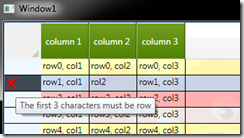
Moving on to the task of reporting errors in the RowHeader, I did not tweak the DataGridRowHeader at all to do any thing related to errors. I did it all via the DataGrid’s ErrorTemplate property to point to ErrorTemplate2 in my resource dictionary.
 <ControlTemplate x:Key="ErrorTemplate2">
       <Grid  MinWidth="20" MinHeight="20">
            <Rectangle Fill="{StaticResource ErrorTemplateBrush}" />
       </Grid>
</ControlTemplate>
<digression>
I do not like that ErrorTemplate is a ControlTemplate. In my opinion it should be a DataTemplate with access to the DatagridRow’s context and the DatagridRow’s error collection. As a ‘workaround you can try to pass this into the control yourself by tweaking the RowHeaderTemplate, and passing the DataContext into the control that acts as placeholder for ErrorTemplate, like this:
 <Control SnapsToDevicePixels="false"
Visibility="{Binding RelativeSource={RelativeSource AncestorType={x:Type Custom:DataGridRow}},
        Path=(Validation.HasError),
Converter={StaticResource bool2VisibilityConverter}}"
Template="{Binding RelativeSource={RelativeSource AncestorType={x:Type Custom:DataGridRow}},
        Path=ValidationErrorTemplate}"
                 DataContext="{Binding
                    RelativeSource={RelativeSource  AncestorType={x:Type Custom:DataGridRow}},
                    Path=(Validation.Errors)[0].ErrorContent }"
                    >
You can then tweak the ErrorTemplate datagrid with a tooltip:
 <ControlTemplate x:Key="ErrorTemplate2">
      <Grid  MinWidth="20" MinHeight="20" ToolTip="{Binding}">
           <Rectangle Fill="{StaticResource ErrorTemplateBrush}" >
           </Rectangle>
       </Grid>
</ControlTemplate>
and get something more helpful error message, like this:
</digression>
Cell Styles
By default the DataGrid’s cell show a themed, blue background when selected (see image in closing thoughts below), I did not like that, so I used DataGrid’s CellStyle to take care of that. Override the default template and remove the triggers for selection:
 <Style x:Key="DataGridCellStyle" TargetType="{x:Type Custom:DataGridCell}">
        <Setter Property="Background" Value="Transparent" />
        <Setter Property="BorderBrush" Value="Transparent" />
        <Setter Property="BorderThickness" Value="1" />
        <Setter Property="Template">
            <Setter.Value>
                <ControlTemplate TargetType="{x:Type Custom:DataGridCell}">
                    <Border Background="Transparent"
                  BorderBrush="{TemplateBinding BorderBrush}"
                  BorderThickness="0"
                  SnapsToDevicePixels="True">
                        <ContentPresenter SnapsToDevicePixels="{TemplateBinding SnapsToDevicePixels}"/>
                    </Border>
                </ControlTemplate>
            </Setter.Value>
        </Setter>
    </Style>
RowDetailsTemplate
The RowDetails Template is displayed when a row is selected. It is a DataTemplate with the context of the row. In this demo, the implementation is trivial, all I did was put a textblock, but you can do much more complex RowDetails on a real project.
 <DataTemplate x:Key="RowDetailsTemplate">
        <Grid TextBlock.Foreground="White">
            <Grid.RowDefinitions>
                <RowDefinition />
                <RowDefinition />
            </Grid.RowDefinitions>
            <TextBlock Text="RowDetails Go here"  Grid.Row="0"/>
            <TextBlock Text="{Binding }" Grid.Row="1"/>
        </Grid>

</DataTemplate>
The main reason to mention RowDetailsTemplate is to emphasize the ‘synchronization’ that needs to happen when a row is selected: RowDetailsTemplate, RowBackground, and RowHeader’s background should all align to make sure their backgrounds are color coordinated. In this case, if you look at the templates above, I did make sure they matched for selection and set the background to the ‘dark blue’ gradient.
Closing Thoughts:
This writing is not all inclusive; there is lots more you can do to style the datagrid.
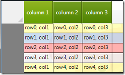
I do have to say, it is neat that in the usual “WPF designer friendly” mark-up tweaks, we went from a plain grid (see left) to a styled grid ( see right) with out writing a single line of code.
What now?
To compliment this styling tutorial, I recommend Colin Eberhardt’s “WPF Datagrid Practical Examples” article. He does a great job at sharing insights into data binding, validating and even styling the datagrid. Thanks Colin!
The source code for this writing is here. Thanks for reading this


