dabbling around the new WPF datagrid (part 1)
On Monday, the WPF team released the CTP of their new datagrid control.
You can download it from here. [Note that it requires .NET 3.5 SP1, released monday too]
I have been playing with it so I created this 3 part series.
- Part 1 (this write-up) is about the features in the grid and the ones missing from it.
- Part 2 is a hands-on exercise to apply the features to customize the presentation of data (aka view) of the datagrid.
- Part 3 includes a few tips & tricks on customizing/styling the datagrid.
The source for this sample is here.
Getting Started was trivial.
- I got the bits from codeplex,
- created a new WPF application, and
- added a reference to the WPFToolkit.dll.
- From my Window1.xaml, I added the xmlns declaration so I could refer to the datagrid. No need to map the assembly, the tools do that for you.
<Window x:Class="WpfApplication1.Window1"
xmlns="https://schemas.microsoft.com/winfx/2006/xaml/presentation"
xmlns:x="https://schemas.microsoft.com/winfx/2006/xaml"
xmlns:dg="https://schemas.microsoft.com/wpf/2008/toolkit"
Title="Window1" Height="300" Width="300"
>
I had some 'dummy' data simulating financial transactions so I took advantage of AutoGenerateColumns feature in the grid to get a quick 'fix':
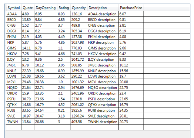
The results were quite rewarding for a line of code. I could Reorder the columns, Resize the Columns, Sort by Column, Add New Rows , Edit the data, Select Rows , and Copy to Clipboard .
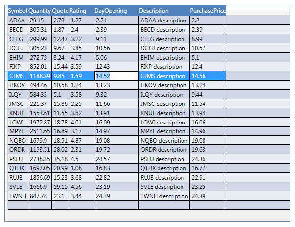
I then moved on quickly to styling it a little bit.. Like every thing else WPF, the datagrid is incredibly flexible on customization by using styles and templates.
In a few minutes, I hand-wrote this
 <Window.Resources>
        <SolidColorBrush x:Key="DataGrid_Style0_Header" Color="#FF4F81BD"/>
        <SolidColorBrush x:Key="DataGrid_Style0_Alt0" Color="#FFD0D8E8"/>
        <SolidColorBrush x:Key="DataGrid_Style0_Alt1" Color="#FFE9EDF4"/>

        <Style x:Key="ColumnHeaderStyle" TargetType="{x:Type dg:DataGridColumnHeader}">
            <Setter Property="Background" Value="{StaticResource DataGrid_Style0_Header}" />
            <Setter Property="Foreground" Value="White" />
        </Style>
        <Style x:Key="RowStyle" TargetType="dg:DataGridRow" >
            <Style.Triggers>
                <Trigger Property="AlternationIndex" Value="1" >
                    <Setter Property="Background" Value="{StaticResource DataGrid_Style0_Alt1}" />
                </Trigger>
                <Trigger Property="AlternationIndex" Value="0" >
                    <Setter Property="Background" Value="{StaticResource DataGrid_Style0_Alt0}" />
                </Trigger>
            </Style.Triggers>
        </Style>

    </Window.Resources>
and got this:
[We will cover styling in part3, let's first walk through all features]:
Selection Unit:
Under the hood with the grid, you are really selecting cells, but the grid has a couple nice modes to make it easier for developer to use the concept of selected rows:
- Cell - selects cells. In this mode, SelectedCells property has selected cells and SelectedItems is null.
- FullRow-- when a user selects a cell in a row, all of the cells in that row are selected. In this mode SelectedCells has all the selected cells in that row. SelectedItems has the selected rows.
- CellOrRowHeader - a mix from the two above, where full-row select happens when clicking on the RowHeader (if its showing). In this mode:
o SelectedCells has all the selected cells, including all the cells in a selected row when a row is selected through the RowHeader
o SelectedItems has the rows which are selected through the RowHeader, or is empty if only cells are selected (i.e., highlighting all the cells in a row will not add that row to SelectedItems)
Selection Mode:
In Single mode, I can choose a single unit (see above for unit) and in Extended Mode I can select multiple units.
The usual keyboard navigation short-cuts apply (Shift takes you to the end of current row, Ctrl preserves previous selection, etc.)
GridLines
Using GridLinesVisibility property, I can choose which gridlines are visible: All, Horizontal, Vertical, and None.
I can also choose the color for the horizontal and vertical gridlines.
Headers (Row & Columns)
By tweaking the HeaderVisibility property, I can choose which headers are visible: All, Column, Row, None.
The headers for each column can be customized/styled using a HeaderTemplate.
Column operations
Autogeneration of columns works quite well. The default mappings are:
| Data Type | Generated Column |
| string | DataGridTextColumn |
| Uri | DataGridHyperlinkColumn |
| bool | DataGridCheckBoxColumn |
| enum | DataGridComboBoxColumn* |
*the ComboBoxColumn is created only if the field is writeable ( which happens when the property is not read only).
For other types (e.g. DateTime or objects) the DataGridTextColumn will be the default with a ToString() on the object.
You can customize AutoGeneration of columns by handling the AutoGeneratingColumn event. You will see this in part2.
ReadOnly columns is missing from the CTP, but that is not a huge problem, you can easily accomplish ReadOnly behavior by using DataGridTemplateColumns and replacing the templates with read-only controls ( like TextBlocks).
Column Resizing and Reordering is implemented out of the box and is toggled on/off via the CanUserReorderColumns and CanUserResizeColumns respectively.
If you want to control reorder per column, there is a CanUserReorder property on the column itself.
Frozen columns. A frozen column is one that does not scroll out of view when the user scrolls in the horizontal direction. When a column is frozen every column displayed to its left are also frozen. Frozen columns is supported out of the box. You can control it by setting the IsFrozen property on a column.
You can see frozen columns in the demo I created by right clicking and showing the ContextMenu.
Row operations
Adding new rows is supported. You can enable it via CanUserAddRows. Deleting rows is supported too, controlled via CanUserDeleteRows.
For alternating rows, the datagrid has an AlternationCount property for controlling AlternateRows.
The way it works is you set AlternationCount to the total number of styles/colors to be used. Usually this is two colors, truly alternating, but it could be more colors if needed [and you like to get funky]
Once AlternationCount has been set, on your RowStyle you can create a trigger that checks AlternationIndex (which should be 0 to AlternationCount-1) and set the style there.
Editing Cells
Before getting into editing, I have to comment on entering Edit Mode.
The Datagrid requires you to have focus in the cell in order to get into edit mode. To get focus, you can click on a cell, or tab into it.
Once you have focus, the most common gestures to get into edit mode are supported:
- Using the Keyboard – cell has focus, start typing, goes into edit
- Using the Keyboard – cell has focus, enter edit mode command (ex. F2), goes into edit
- Using the Mouse – cell has focus, click, goes into edit
- Using the Mouse – cell may or may not have focus, double click goes into edit.
For programmatically manipulating the cell with focus or during edit mode, the datagrid has a property of CurrentCell and each DataGridCell instance has an IsEditing property
You can customize the Editing experience for any column by providing a CellEditingTemplate. [If you used one of the stock columns listed above, those automatically provide a template].
Editing a cell has three commands that are fired as you get in and out of edit mode:
- BeginEditCommand (any of the gestures above)
- CancelEditCommand ( press Esc )
- CommitEditCommand (press Enter, Tab to next cell, or change focus using mouse)
Other features Copy to Clipboard
is implemented. Ctrl-C works fine. The data format appears to be tab delimited. Which is nice as it works seamlessly with excel.
Keyboard Navigation [by using arrows and tab] works out of the box.
Some missing features already announced:
The big one is RowDetails. I hear it is already in later builds, so the expectation is that it will be in by RTM.
ReadOnly columns, and support for hidden columns. [Though I am thinking for those there is workarounds today].
Bugs along the way and known issues.
The only one I ran into is that DataTemplate.Triggers is not working on this build. I hear it will be working on later builds.
Show me the code (or demo).
Playing with all the features above is easy.
The sample app I Created has a little bit of UI data bound to the datagrid that lets you manipulate the grid to see most of the features above.
In Part2, we start using these features to build a more 'insightful' view of the data.