built-in Styling and generic.xaml
Most people already know (from ScottGu’s blog post for example) that in Silverlight 2 you can override the ControlTemplate for a Control and ‘re-define’ the look of the control. However, I have received a few questions around the use of generic.xaml to accomplish this same task; I will try to share a few thoughts on this to tease you into digging deeper on your own. If you are short on time, skip to [FAQs on built-in styles below]
Some definitions on the recurrent “what is difference between style and template?”
Style is an object (in Markup or in Code) that sets properties of a control.
All that a style can do is set the value of existing properties on the control. Imagine our control was a Car, a Style could say some thing like “wheelsize=17”, bodycolor=”cherry red”, “windowtreatment=”tinted”, etc..
A template actually defines the pieces or parts of the car. For example, a template for a cheap convertible might not have a roof at all :) or a template for a Car can decide if it is two doors or four doors, if it has four wheels or eight, etc.
When I explain it I always tell people, the template defines the skeleton, the Style dresses the pirate ( I like the pirate analogy cause some of them have one eye, or one leg, or one arm, etc. making good use of Templates).
Where things get interesting is that a Style can set any property in the control, and Template is itself a property, so what you see the tools (like Blend) do most often is when you want to override the Template of a Control, they override the whole style and the Template property with it.
Stay with me… even if the above does not make sense, the rest of the article will help.
Where generic.xaml comes in is in the “magic” that defines the default look for a control. Let’s imagine we want to create a GelButton ..
 public class GelButton : Button
{

}

Simple enough, now we want to use it in our Page.xaml user control, we add the namespace and the control.
 <UserControl x:Class="StylingSample.Page"
    xmlns="https://schemas.microsoft.com/client/2007"
    xmlns:x="https://schemas.microsoft.com/winfx/2006/xaml"
    Width="400" Height="300"
    xmlns:samples="clr-namespace:StylingSample">
    <StackPanel Width="50" >
        <Button Content="Top"  Height="50"/>
        <samples:GelButton Content="Cream" Height="50"></samples:GelButton>
        <Button Content="Bottom" Height="50"> </Button>
    </StackPanel>
</UserControl>
Would you be surprised if the outcome looked like this?
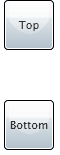
I can’t tell you if you should be surprised or not (I am undecided myself), but I can tell you what happened!
The control by default is lookless. You need to define the look for it. This is accomplished by assigning a valid ControlTemplate to the control [via the Template property in the Control class].
To assign the Template property, you could do some thing like:
 public GelButton ()
{
this.Template = XamlReader.Load ("<ControlTemplate xmlns='https://schemas.microsoft.com/client/2007'
 ><Grid ..> </Grid></ControlTemplate>");
}
but a better way to do it is to store the control template in a generic.xaml Resource Dictionary and then magically the run-time, will pick it up from there. Your template would be associated to your control via the TargetType attribute when defining the resource. This template would now become what we call the “built-in style”.
Here are the details on creating a built-in style.
Generic.xaml is a ResourceDictionary –a property bag for resources – that you include in your assembly, at the root of the project. If you are a WPFer you might be thinking it should be in themes\generic.xaml, I hear that is where it might end up, but for now (Silverlight 2 beta1), it needs to be in the root of the project. The default (empty) resource generic.xaml could look like this:
 <ResourceDictionary
    xmlns="https://schemas.microsoft.com/client/2007"
    xmlns:x="https://schemas.microsoft.com/winfx/2006/xaml"
>
</ResourceDictionary>
For defining the look & feel for our GelButton we need to start with some default template. Long term, this will be a right click inside Blend (like in WPF); temporarily since Blend does not yet support styling, I would recommend is using David Anson’s handy Stylebrowser application to copy the default Style for button and paste it into the resource dictionary.
[unfortunately the default button template is too verbose, so for practical purposes here I am going to use a much simpler template].
 <ResourceDictionary
    xmlns="https://schemas.microsoft.com/client/2007"
    xmlns:x="https://schemas.microsoft.com/winfx/2006/xaml"
    xmlns:samples="clr-namespace:StylingSample;assembly=StylingSample"
>
    <Style TargetType="samples:GelButton">
        <Setter Property="Background" Value="Black" />
        <Setter Property="Foreground" Value="White" />
        <Setter Property="Template">
            <Setter.Value>
                <ControlTemplate  TargetType="samples:GelButton">
                    <Grid x:Name="RootElement" >
                        <Ellipse Width="{TemplateBinding Width}"
                            Height="{TemplateBinding Height}"
                            Fill="{TemplateBinding Background}"
                        />
                        <ContentPresenter
                        Content="{TemplateBinding Content}"
                        ContentTemplate="{TemplateBinding ContentTemplate}"
                        Foreground="{TemplateBinding Foreground}"
                        VerticalAlignment="Center" HorizontalAlignment="Center"
                        />
                    </Grid>
                </ControlTemplate>
            </Setter.Value>
        </Setter>
    </Style>
</ResourceDictionary>
Let’s dissect the work needed to create this template:
- Added a xmlns:samples to the resource dictionary.
Notice the slightly different syntax from the namespaces you add to say a UserControl; in generic.xaml I included the assembly (which is the name of my DLL).
If I had tried xmlns:samples="clr-namespace:StylingSample; with out the assembly=”StylingSample” it would not work. [trust me, I make that mistake often]. - Next I defined the style and I told it the TargetType I wanted this Style to be applied to; you usually do this when defining a Style so your template can do discovery of the properties and validate these, but when doing this in generic.xaml, the magic that happens on built-in templates uses this information to create a relationship (or I would say bind) between this Style and the type; now when ever the type is instantiated, if no other style is applied, this style will be used as the default style.
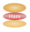
- The rest is simple styling stuff. TemplateBinding is probably the most interesting part, this creates a binding between the property we are setting and the actual controls’ property. For example: <ContentPresenter Foreground={TemplateBinding Foreground}" > creates a bind between the content presenter’s foreground and the Foreground in the actual control. This will our UI styleabe from within the tools. Inside Blend or in XAML you can declare a button <GelButton Foreground=”Red” > or a <GelButton Foreground=White> and get flexibility as the template will get the value carried through. F
For more info on all of this you should watch Karen Corby’s MIX presentation on “Rich,Dynamic UIs” ..
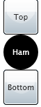
Now, I can run the same code, with changing nothing other than the Resource dictionary I added and I get:
Since I did create a Templatebinding for background/Foreground , I can even have some fun.. After all, I promised some “meat”.. Need food!! sorry about that it is 1:30 PM ..
So, I just wasted 10 mins of your time and 40 of mine introducing you to generic.xaml and built-in styles. I had promised to answer a few questions, here they are:
[REF: FAQs on built-in styles]
What are the benefits of built-in styles, why use generic.xaml instead of hardcoding the template?
It is nice to store all your templates in a resource dictionary that you can easily swap – as opposed to having to do it in code-. Imagine you needed to create three themes for your app, doing it with hardcoded templates would be hard.
Also, If you put your Template in the ResourceDictionary the template can now reference other resources in the dictionary itself.
Why is it that all examples I have seen are not using built-in styles? we are always told to apply the style inline from App.xaml
Built-in styles are designed for control authors, when you write a control, you provide look & feel. If you look at example above, I had to inherited from Button class. Most samples are purely styling a button, so they take a different approach.
In the financials demonstrator, you inherited from Button and did nothing other than provide the built-in style, is this a best practice?
I liked that approach (but I come from an enterprise background where we create bloated frameworks that often inherit just to create an abstraction in case some thing changes later) ; the one benefit you get is you can use your button any where with out having to explicitly refer to a style.
The disadvantage of course is that inheriting takes a bit of extra performance and memory; but this is pretty negligible from what I have seen.
Again, I don’t call it a best practice, more of a personal preference for me. If you look at financials demonstrator now, I ended up adding a property later UseReflection, so now the button does have a reason to be its own class.
Built-in styles sounds like I can change it all in one place? I don’t want to crowd my code with <Button Style=”{StaticResource GelButtonStyle}” >.
That is right, if you can afford inheriting and the classes are not sealed. That said, after building a few solutions I realized I had a false sense of centralization [yes I made up the term].
The argument is
1) With built-in styles, I can change the style in one place. It is the same using App.xaml you change the style itself in one place for all. What you are replicating a lot is the name of the style, but the style itself is in one place.
When can I not use built-in styles?
if the class was sealed or they had protected the Template property then you would not be able to use this.
Can I just create a generic.xaml and override the System.Windows.Controls templates with out inheriting?
Not that I know of. It does not sound like a good idea; I tried it just to see if it worked and it did not work for me.
Is applying a built-in style going to break or affect my state and parts?
No. As long as your style uses the same names, the code will still pick all that as if it was an inline Style.
We would not need built-in styles if you allowed TargetType every where, including on regular dictionaries, like WPF does.
Fair point, these features are all being considered for later versions after 2.0 stay tuned, right now this way works, it is flexible and comprehensive.
Will this approach work with Blend? Will I still be able to style in Blend.
Yes! Blend works with this already; that is how it picks the look & feel for System.WIndows.Controls today.
Why do styles & Control templates always go together? Can I just do my Control template?
My personal opinion is that if you need a template and not the style your template might be too stringent or too hard coded; it would be the equivalent of writing a ControlTemplate that does not have any TemplateBinding on it; don’t get me wrong, I am not saying this is wrong, I am just saying 99% of the time, this does not happen. With regards to simply providing the ControlTemplate in generic.xaml, I don’t believe that would work.
In the financials demonstrator, you named your class Button, for some thing that inherited from Sysetm.Windows.Controls.Button.. Is using the same name required?
Absolutely not. I chose the name because I was going to override all controls, but I ended up changing my mind and that made it more confusing. Sorry about that; the name does not matter (as long as it does not conflict); from experience calling it Button will confuse you, don’t do that.
If I use the built-in style, does that mean a ‘consumer’ of my button will not be able to style the button later?
No!A consumer will still be able to style the button later and as well as override your template.
--
OK, I need to go eat. This at least answers the questions I had; will try to come back to this at a different time.