WPF's Declarative Model = XAML + Services.. not just mark-up.
I spend a lot of time talking to devs, architects and [a few] designers about Windows Presentation Foundation; one of the biggest surprises to these people is the "power and comprehensiveness" behind WPF's declarative model. Conversations always begin with a "yes declarative like <insert mark-up flavor of preference here, usually HTML>" ... and end up with a "Wow, this is way more than I expected "...
In this write-up, I will do a very brief intro into to some of the WPF "services" that enable the richness in the declarative model. It is not my goal to explain the services comprehensively; that has taken books (See [9]). This is also not a view of the full WPF platform; we will not touch on the vector-based hardware accelerated engine, the rich integration of UI stacks ( video, 2D, 3D, Text, etc.).
The goal was to keep the read to 15 mins. This is an early draft.. I am posting it here to get feedback... what did I miss? What should I dive into more? what is not making sense? Next week I hope to spend another couple of hours to polish it .. let me know if you think it would be worth it (or not) ... then will find it a home where I can version it [ I think I can post this as a page here, or maybe a wiki for people to expand ]..
----------
Why are declarative models important?
There are way too many reasons, but most touted ones are:
- Toolability -- with a well structured mark-up language that is easily parsed, you can optimize for tooling.
Microsoft will have a good showcase of this with their "Expression Blend" and "Visual Studio 2007" products; two totally different tools, optimized for different profiles (designers and developers) , yet sharing a mark-up language that round trips across both tools [1].
A rich declarative model is a great foundation for ecosystems to grow-on:
- Tool vendors find it easy to export this declarative model, providing choice to the UI creator. [12]
- Tool improves over time, there fore making the UI creator's job easier over time.
- As the tools improves, more people leverage the platform because it is easier, and more productive than any other platforms. This leads to other demands for tools, controls, etc.
- Separation of presentation - it is a recognized best practice to create applications where the UI and business logic are separate. Declarative models tend do a good job at enforcing this separation.
- Improved User Experiences. As a corollary to toolabilty - with great tools and choice of tools- you get improved developer to designer collaboration. The benefits of this collaboration are still to be proven or quantified. There is the obvious time-to-market, lower 'creation' cost, etc.. but IMHO the more interesting benefit is this new world where designers play a role in application development process: if developers and designers can collaborated towards and improve the user experience, the business benefits will be significant: end-user productivity, improved decision making, improved usability, pride of ownership, lower training costs, etc.
Introducing XAML
WPF's declarativeness begins with eXtensible Application Markup Language (XAML, pronounced ZAMEL).
XAML is an XML language for creation and instantiation of objects. It is a generic language (not WPF specific); for example, our Workflow Foundation team uses it to represent workflows.
A XAML snippet can look like this:
<DockPanel xmlns='https://schemas.Microsoft.com/winfx/2006/xaml/presentation' xmlns:x='https://schemas.microsoft.com/winfx/2006/xaml' Width="Auto" TextElement.FontSize ="20"> <StackPanel Name="Content"> <TextBlock Name="theTextBox" Text="Hello World" /> <TextBlock Text="{Binding ElementName=theTextBox, Path=Text}"> <TextBlock.BitmapEffect> <OuterGlowBitmapEffect GlowColor="Red" GlowSize="5"/> </TextBlock.BitmapEffect> </TextBlock> </StackPanel></DockPanel> |
Notice a few things:
- The XAML representation is hierarchical - so is User interface- and this leads to a very interesting optimizations/features with WPF's Visual Tree.
- XAML is extensible. The {Binding ... } is a binding markup extension. OOB WPF includes some useful mark-up extensions for databinding and resource lookups, etc. You can also write your own mark-up extensions [2].
- Notice the syntax used for some properties; "TextElement.FontSize"; does not look like a regular property (e.g. Width="Auto"). We will explain this decoupling later.
Two very important things you can't notice on the XAML snippet above are:
- XAML is a direct instantiation of an object
- WPF exposes a XAML Serializer and De-serializer. See [3].
Introducing the "tree"
As mentioned above, XAML and WPF services revolve around the 'tree'. See [4] for details on tree. An oversimplification of the tree is that visual elements in WPF are stored in a tree-like structure that the engine parses in order to know what (and when) to render. Example in the RHS shows the hierarchy of a DockPanel containing a StackPanel with two textblocks in it. The tool used is XAMLPad, comes with the SDK. |
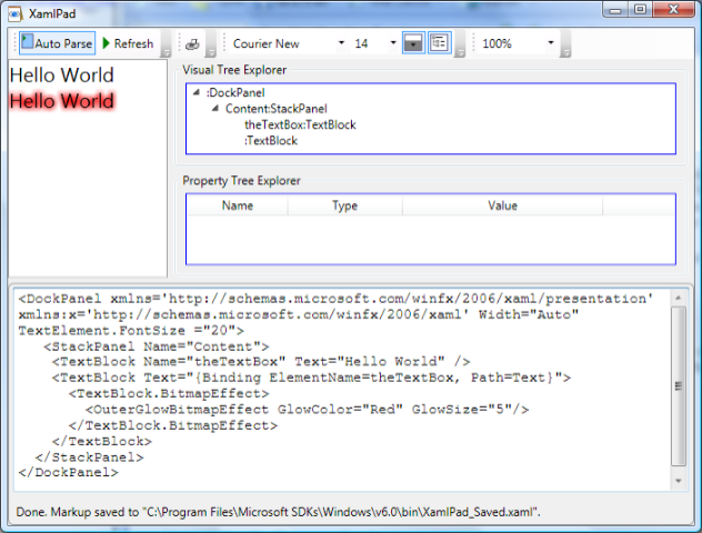 |
The tree is important because t shows the parent-child relationship across all WPF elements. These relationships define scope for how and where "things" are applied, resolved, and inherited. Most of this is explained below.
Introducing the 'base services"
[The base services are our declarative model (xaml), property system, eventing, and some services not discussed here-in (like accessibility, input, etc.). They are highlighted as base because the higher level services build up on these]
Property System
WPF introduces a new Property System optimized to create applications declaratively.
The properties are called dependency properties because their actual value 'depends' on multiple sources: databinding, styling, animation, etc. See [5]
Explaining the property systems in full is beyond the scope of this intro paper, but we should highlight a few of their features to explain their synergy with our declarative model.
A dependency property is usually a static Property in a class defined like this:
public abstract class TextElement : FrameworkContentElement, IAddChild { public static readonly DependencyProperty FontSizeProperty; ... static TextElement() { ..
|
}
Several things you can notice from the dependency property:
1)It uses sparsed storage. Notice it is static for the type, which means since it is applied to multiple instances there is some storage for it elsewhere. This is a huge advantage, imagine every Label or TextBlock that uses this property had a 'regular' FontSize property per instance of the label. This would consume much more memory and lead in the long-run to less flexibility (as the framework designer could only add so many of these properties).
2) Notice that uses Metadata; in the sample above, TextElement affects Render, and Measure-. This meta-data is critical for users that are creating their own controls. The engine gets triggered for what and when to Render based on this metadata. Using this metadata, the engine can potentially optimize how it renders as it knows how to handle all meta-data in the system.
3) Notice that this is an Inherited property (FrameworkPropertyMetadataOptions.Inherits). If you see the sample XAML, we started by setting TextElement.FontSize in the Grid -which technically is not a TextElement however, since the property is inherited, this means unless overridden lower in the tree, any child in the tree that needs TextElement's FontSize will inherit this value automatically from the Grid. .
4) Notice the property is an "attached property" (uses RegisterAttached). This means it can be "attached" to any object in the tree; regardless of whether the object is of the type defining the attached property. This is not as intuitive the first time you see this syntax, but attached properties are quite useful to accomplish [at least] two interesting things:
- inheritance: if any object down the tree needs this property -and it is an inherited property- the value carries through.
In our XAML snippet above, DockPanel is setting the TextElement.FontSize to 20. This means the TextBlock and TextBox are inheriting the value and we don't have to set the FontSize in these individual elements. We set it on one place for unlimited number of children. - A de-coupled query mechanism. For example, a Grid's Layout is handled by Grid 'querying' its children in the tree of where they must go. Grid does not have to know any thing about the children other than querying the Grid specific dependency properties (Row,Column).
Of course, this ' decoupled extensibility' pattern can be applied to any thing, not just layout. I hope your mouse is starting to churn.. :)
Note: Dependency properties also provide change notification [e.g. for data binding or for triggers].
Triggers
Triggers consume the change notification from dependency properties to declaratively specify actions based on the state of these dependency properties.
Here is an example of a trigger for a ListBoxItem.
<Style TargetType="{x:Type ListBoxItem}"> <Style.Triggers> <Trigger Property="IsSelected" Value="True"> <Setter Property="Foreground" Value=“Red" /> </Trigger> <EventTrigger RoutedEvent="Mouse.MouseEnter"> <EventTrigger.Actions> <BeginStoryboard> <Storyboard> <!-- <DoubleAnimation />--> </Storyboard> </BeginStoryboard></EventTrigger.Actions> </EventTrigger> <DataTrigger Binding="{Binding Path=Content}" Value="WA"> <Setter Property="Foreground" Value=“Green" /> </DataTrigger> </Style.Triggers></Style> |
There are three types of triggers:
- Property triggers execute an action when a dependency property has a specific value.
WPF controls are 'optimized' to take advantage of this model.
The listboxItem above not only has a "Selected" event, but also has an "IsSelected" dependency property, so a trigger can easily be written for the IsSelected state; there are a lot other similar dep properties optimized for triggers (e.g. "IsMouseOver", "IsEnabled", "IsFocused", etc.) - Event triggers are executed when an event is fired. This is a declarative way to react to an event. [We will cover eventing's flexibility further down, and event triggers will then be more appealing to you]. In WPF v1, Event triggers are limited to Storyboards, so mostly involves visual or (sound) feedback.
- DataTrigger - can be triggered by any .NET property [not just a dependency property] as long as it is declared via Binding. If the value of the data matches, the trigger's value, then the trigger would be in effect.
In the listboxItem above, if the Value of the Content Property is == "WA" then the foreground would be green because WA is the "EverGreen state"..
Notice that the triggers are helping us
- Avoid writing code (handler for SelectionChanged event in ListBox, to turn Foreground to Red).
- Keep the UI designer (or developer or analyst whoever owns the experience) in control of UI logic, with out diving to business objects. [11]
Eventing :
Events in WPF are still in code-behind; but we should highlight a couple of things about WPF eventing that is relevant for our declarative model discussion:
- Events can be wired in XAML, but separation of presentation is preserved. WPF embraces a code-behind model where XAML is in one file, and code is in a different code but the compiler merges these to create a single class.
- There are several strategies for 'routing' events in WPF:
- Tunneling - when an event happens, it gets 'tunneled' down the visual tree. If we use our example above for Visual tree, let's assume some event happens in the TextBox, the DockPanel would get to 'Preview' the event before the StackPanel that in turns gets it before the TextBox. if no one intercepted and handled the event, the TextBox would then get it.
- Bubbling - Once the event has been tunneled, the TextBox gets it, and it starts to bubble it up the tree... (TextBox, StackPanel, DockPanel)
What is special about WPF RoutedEvents is that they can be 'attached' similar to what we did with Attached Properties, so for example, let's say the DockPanel wanted to know if TextChanged in it's children without coupling itself to the children-- then we could do some thing like
<DockPanel xmlns='https://schemas.microsoft.com/winfx/2006/xaml/presentation'xmlns:x='https://schemas.microsoft.com/winfx/2006/xaml' Width="Auto" TextElement.FontSize ="20" TextBox.TextChanged="HandleBubbledTextChanged" > <StackPanel Name="Content"> <TextBox Name="theTextBox" Text="Hello World" /> <TextBlock Text="{Binding ElementName=theTextBox, Path=Text}"> <TextBlock.BitmapEffect> <OuterGlowBitmapEffect GlowColor="Red" GlowSize="5"/> </TextBlock.BitmapEffect> </TextBlock> </StackPanel></DockPanel> |
Now the DockPanel declaratively just wired up to handle the event, not needing to know any thing about its children; if it had no TextBoxes as its children, then the event would just never fire.
Higher UI services
Lookless Controls
WPF controls separate their behavior from their looks. The look & feel of the control is defined by the Control's template. A control template is a XAML representation of the "Visual Components" of a control. For example, a Button in WPF is a Content Presenter inside a rectangular Chrome [see below]...
If we replaced the Button's template we could radically change the look & feel of the button, but it would still have a "Click" behavior. Below see three examples of what a button could look-like with just a little tweaking of the template. Notice the potentially unlimited flexibility for customizing the look & feel of a button declaratively. {No more ownerdraw nightmares for lots of us}.
[Note: the controls are ugly and hard-coded for XAML brevity; I mostly wanted to focus on how components (border, paths,etc.) make the visuals for the control.
These templates were created in Expression Blend, no code just drag/drop and clicks (5 mins). I cut out a lot ( other style properties, and triggers, etc).]
| Description | XAML | looks like |
Default Vista look, technically it has a template (chrome + contentpresenter) |
N/A | 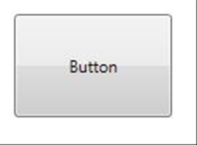 |
Template consists of a border with rounded corners and a content presenter. |
<ControlTemplate TargetType="{x:Type Button}"> <Border x:Name="Border" Background="{TemplateBinding Background}" BorderThickness="1" BorderBrush="Red" Width="Auto" Height="Auto" CornerRadius="15,15,15,15"> <ContentPresenter HorizontalAlignment="Center" VerticalAlignment="Center"/> </Border> </ControlTemplate> |
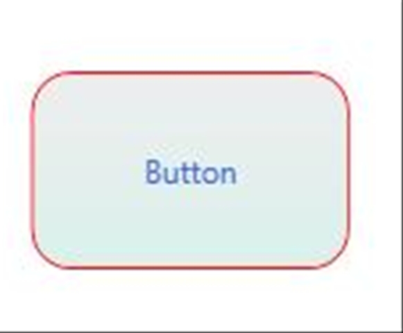 |
Template consists of a Grid with a vector path (the star) as well as the content presenter. |
<ControlTemplate TargetType="{x:Type Button}"> <Grid> <Path Name="star" Fill="{TemplateBinding Background}" Stroke="SkyBlue" Stretch="Fill" Data="F1 M 145.637,174.227L 127.619,110.39L 180.809,70.7577L 114.528,68.1664L 93.2725,5.33333L 70.3262,67.569L 4,68.3681L 56.0988,109.423L 36.3629,172.75L 91.508,135.888L 145.637,174.227 Z " /> <ContentPresenter HorizontalAlignment="Center" VerticalAlignment="Center" /> </Grid></ControlTemplate> |
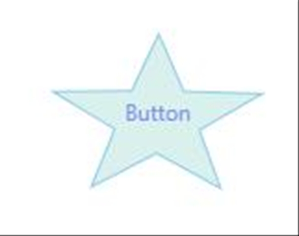 |
For more details on the control set for WPF see [7]
Data binding & Templates
WPF supports rich data binding to XML or any .NET object; this means you can bind to any business object and also across UI Elements.
As we mentioned earlier, XAML supports declarative data binding via the Binding markup extension; the extension offers a lot of options; For example: Mode(One time, OneWay, Two Way, etc.), Path ( to property name, if binding to an object), XPath ( if binding to xml), etc. All of these options are accesssible from XAML. To see full list of options in {Binding} extension refer to [8].
WPF also introduces Data templates; these are templates that define the user interface for a specific data type; best explained with an example:
Step1Take a regular C# class |
Step2Create the DataTemplate |
Step 3 The results.. |
class Car { string Image {get;set} string Model {get;set] }
|
<DataTemplate x:Key="carTemplate"> <Border BorderBrush="Blue" BorderThickness="2" Background="LightGray" Margin="10" Padding="15,15,15,5"> <StackPanel> <Image HorizontalAlignment="Center" Source="{Binding Path=Image}" /><Border HorizontalAlignment="Center" BorderBrush="Navy" Background="#DDF“ BorderThickness="1" Margin="10" Padding="3"> <TextBlock FontSize="18" TextContent="{Binding Path=Model}" /></Border></StackPanel></Border></DataTemplate> |  |
A large percentage of a rich application is spent in the "glue" that takes business objects and turns it into User Interface; with Data templates a bit of that glue goes away (the procedural code part). The 'look' still needs to be defined, but it is now defined declaratively, leveraging data binding, and stored in a potentially reusable manner (we will cover resources below).
A few people try to compare data templates to 'users controls or components'. I think that is apples & oranges; templates are much lighter weight, require no code and can go in many interesting places where user controls have never been before. For example, this "Car" data template can be applied to a ListBox with a list of cars; the template will expand once per car.. That said, templates do lack controls features like encapsulation, but that is only needed some times it is nice to have the option of templates or controls.
Styles
A Style is a logical grouping of properties to customize the looks of a visual element.
This 'pattern' has been proven widely by Cascading Style Sheets (CSS) in HTML. The main benefit/advantage of styles is a centralized, reusable definition of User Interface look & feel.
Here is an example of styles in action:
<DockPanel xmlns='https://schemas.microsoft.com/winfx/2006/xaml/presentation'xmlns:x='https://schemas.microsoft.com/winfx/2006/xaml' Width="Auto" TextElement.FontSize ="16" > <DockPanel.Resources> <Style x:Key="greenBkd" TargetType="{x:Type Button}"> <Setter Property="Background" Value="LightGreen" /> </Style> <Style x:Key="{x:Type Button}" TargetType="{x:Type Button}"> <Setter Property="Background" Value="Yellow" /> </Style> </DockPanel.Resources> <StackPanel Width="240" VerticalAlignment="Center" ><StackPanel.Resources> <Style x:Key="redBkd" TargetType="{x:Type Button}"> <Setter Property="Background" Value="Red" /> </Style> <Style x:Key="redBkdWhiteForeground" BasedOn="{StaticResource redBkd}" TargetType="{x:Type Button}" > <Setter Property="Foreground" Value="White" /> </Style> </StackPanel.Resources> <Button Content="Gets system style" Style="{x:Null}" /> <Button Content="Not styled, but gets DockPanel's "/> <Button Content="Styled" Style="{StaticResource redBkd}" /> <Button Content="Styled" Style="{StaticResource redBkdWhiteForeground}" /> <Button Content="Scoped from DockPanel" Style="{StaticResource greenBkd}" /> </StackPanel></DockPanel> |
Notice:
|
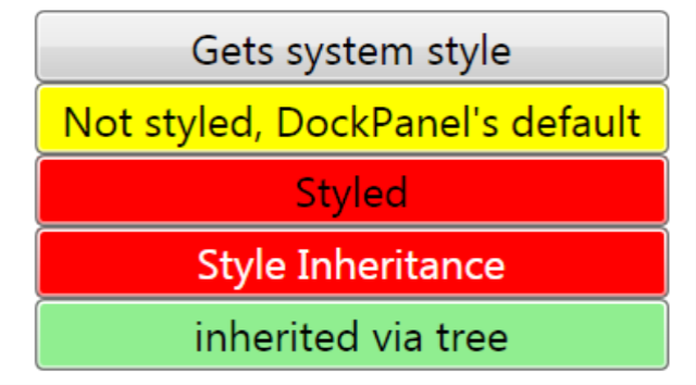
Some of the interesting details on styles:
WPF styles are defined declaratively using XAML (well structured xml, not CSS )
Styles can be applied based on Key -an element specifically specifies its style by name, equivalent to class="stylename" in CSS or based on Type (same style for all buttons, similar to .div { } in CSS ).
WPF styles are scoped via the resource resolution scope tree ( to be discussed below).
In WPF, styles can be strong-typed -you tell it the TargetType and this gets validated at compiled time - you also have the option of sharing styles with heterogeneous types by directly specifying TypeName.Property (ala 'attached') ; WPF will 'ignore' the properties that a type does not have.
Styles can be inherited [as you see in sample above].
Resource [dictionaries]:
All of the declarative goodness above: control templates, data templates, styles, etc. needs to be packaged for easy reuse.
Resource dictionaries are named value pair collections (or property bags) for packaging objects. These are very generic containers, the Resource Dictionary knows nothing about Styles, Templates, etc. You can put any object that can be instantiated via XAML in a resource dictionary, common ones are: : XmlDataProviders, ObjectDataProviders, Brushes, Colors, etc. Any thing you want to reuse.
Some of the advantages of resource dictionaries are:
- WPF Elements know how to interact resources. Most elements have a .FindResource () method that walks up the tree.
- The rules are well defined for how resources are scoped, since it follows the 'tree' model, it fits really well with hierarchical UI.
- It is also easy to 'merge dictionaries' to create bigger dictionaries.. so packaging of dictionaries in XAML files can be done in a way that makes sense and then include them in each page. Similar to #includes in C++ or <link href=" .... "> in CSS.
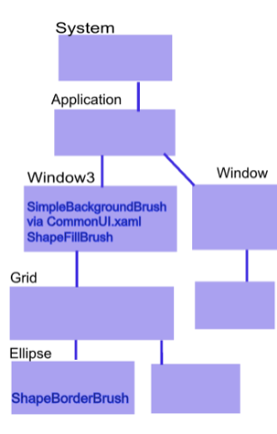
Here is an example of what a resource dictionary called "CommonUI.xaml" could look like..
<ResourceDictionaryxmlns="https://schemas.microsoft.com/winfx/2006/xaml/presentation"xmlns:x="https://schemas.microsoft.com/winfx/2006/xaml"><!-- Resource dictionary entries should be defined here. --> <SolidColorBrush x:Key="SimpleBackgroundBrush" Color="Black"/> <LinearGradientBrush x:Key="DefaultedBorderBrush" EndPoint="0,1" StartPoint="0,0"> <GradientStop Color="#777" Offset="0.0"/> <GradientStop Color="#000" Offset="1.0"/> </LinearGradientBrush> <Style x:Key="SimpleButtonFocusVisual"> .... </Style> <Style x:Key="greenBkd" TargetType="{x:Type Button}"> ... </> <DataTemplate x:Key="carTemplate"> ... </> </ResourceDictionary> |
This dictionary would be merged with the resources collection of a Window, Page, or any visual element..
<Windowxmlns="https://schemas.microsoft.com/winfx/2006/xaml/presentation" xmlns:x=https://schemas.microsoft.com/winfx/2006/xamlx:Class="Buttons.Window3" x:Name="Window"Title="Window3" Width="272" Height="208" Background="{DynamicResource SimpleBackgroundBrush}"> <Window.Resources> <ResourceDictionary> <ResourceDictionary.MergedDictionaries> <ResourceDictionary Source="CommonUI.xaml"/> </ResourceDictionary.MergedDictionaries> <SolidColorBrush x:Key="ShapeFillBrush" Color="Gray"/> </ResourceDictionary></Window.Resources> <Grid x:Name="LayoutRoot"> <Ellipse Fill="{DynamicResource ShapeFillBrush}" Stroke="{DynamicResource ShapeBorderBrush}" Height="99" StrokeThickness="4"> <Ellipse.Resources> <SolidColorBrush x:Key="ShapeBorderBrush" Color="White"/> </Ellipse.Resources> </Ellipse> </Grid></Window>
|
Explanation of how resources are scoped in this model.. It is bottom up, where the bottom can see every resource 'above' ..
|
Layout & Animation
These two simply need to be mentioned so you have a sense of most UI services. They are a good example of declaratively consuming the base services.
WPF includes rich layout ( Canvas, StackPanel, WrapPanel, DockPanel, Grid, etc.) . All layout is accessible declarative and it tends to leverage some of the services above (Styling, data binding, attached properties, etc. ). Layout is of course extensible[13]. Expression Blend has very good drag & drop support for laying out forms.
WPF's animation system uses dependency properties to animate nearly any element in WPF. The animations are type-based (e.g. animating a Double, or a Color, etc.) so there is quite a bit of them. The animations are time-based ( as opposed to frame-based in Flash). There are several types of animations: linear interpolation (from X to Y) , Linear Keyframes ( specific values at specific times), and SplikeKeyFrames. The animation system is of course accessible declaratively.
Blend has a pretty good timeline editor for creating animations. As you already saw above, animations go well with triggers. Storyboards can be started when a trigger is executed.
Conclusion:
Windows Presentation Foundation is a very powerful presentation stack for creating stunning applications that run on Windows. See [10] for some amazing showcase apps.
WPF was designed from the ground-up to embrace a declarative model that enables great toolability and designer/developer collaboration. To accomplish a comprehensive declarative model, WPF goes far beyond a declarative language (XAML); it includes a very rich set of base services designed for declarativeness, and a rich set of higher-level UI services that build upon these base services. [15]
----------------- -
My attempt to avoid digressing too much.. leads to these random footnotes..
[1] As of 2/15/07 Expression Blend is still in beta, "Cider", the VS 2007 designer is not in beta yet. It still in CTP. The public CTPs have not been updated in many months, so the public are still looking at rudimentary functionality, but look for a major update by when Vs2007 goes beta1.
[2] Mike Hillberg has an example of a MarkupExtension for supporting Generics in XAML. I have worked in the past with enterprises that explored use of extensions for Session data (quite similar to Binding, and arguably could have been the same, but they wrote it to fit into a bigger framework) and I explored it for Role-based UI...
[3] This feature can be quite useful for meta-data driven UIs, plug-ins, and even styling. That said, I like de-coupling but I am not a fan of items compiled at run-time it is error prone and unsecured... so if you see your self trying to do this, please revisit and make sure what you are trying to do can't be accomplished with say templates, compiled styles, etc.
[4] Technically there are several trees: a visual tree and a logical tree.
[5] The dependency properties value precedence.
[7] WPF out of the box contains the usual set of controls (listbox, checkbox,etc.) but a couple line of business controls are missing (datagrid, month calendar, etc.). Most of these missing controls are available as 'good quality' community samples in Kevin Moore's ( Controls PM in WPF team). The WPF datagrid control is available for free from our partner xceedsoft. Other 3rd party control vendors [e.g. infragistics] also have grids.
[8] Reference to Binding markup extension
[9] Adam Nathan's WPF Unleashed. Charles Petzold's Applications = Code + Markup
[10] Refer to Tim Sneath's WPF showcase apps ... https://blogs.msdn.com/tims ..
[11] For the record, I am not a huge fan of data triggers; it seems to me these can lead to mixing UI and business logic. Still, I guess the option is nice if you arrive at right scenario.
[12] Mike Swanson keeps a list of tools that export to XAML..
[13]
[15] I hope this read helped you realize a lot of these WPF services ( de-coupled eventing, rich databinding, styling, resources, etc.) are software development best practices that converge in a single, declarative UI stack. When you couple these great services, with great tools and the raw power of the graphics engine, you can end up with beautiful and solid architected applications (an architecture/developer/designer dream?).