Windows Mobile 6.5
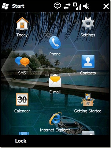
There is plenty to like in the Windows Mobile 6.5 but one of the things that really appeals to me is incredibly simple: In order to make the touch screen easier to use, especially for people with stubby fingers like me, the icons are arranged in a honeycomb pattern. This means that there is more space between the icons and therefore it’s less likely you’ll press the wrong one.
What appeals to me about this is that it’s one of those really simple ideas once you’ve seen it, but must have taken a leap of lateral thinking to do it.
The obvious thing with touch screens – and what everyone else does – is just to ape the arrangement you had before touch screens came along ie a grid of icons. But that is not as effective as this honeycomb arrangement for touch. I love seeing thinking of this kind - not just transferring what used to work on an old format to a new format, but thinking about what the new format means and re-thinking the accepted wisdom.
