XAMLでFlyout - Windows 8 ストアアプリテンプレート
Entertainment Photoアプリテンプレートでは3つのFlyoutパネルを使っています。
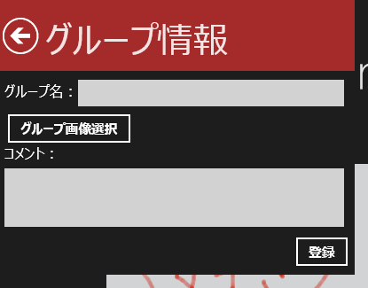
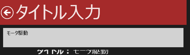
XAMLでFlyoutパネルを表示する基本は、XAMLで表示する内容をデザインしてPopupを使って表示、です。Entertainment Photoアプリテンプレートでは、グループ登録、タイトル入力、コメント入力の三つのFlyoutパネルを用意しています。ファイルは順に、AddGroupFlyout.xaml、EditTitleFlyout.xaml、EditCommentFlyout.xamlです。AddGroupFlyout.xamlを例に説明すると、XAMLではPageを基に、
<Page
xmlns="https://schemas.microsoft.com/winfx/2006/xaml/presentation"
xmlns:x="https://schemas.microsoft.com/winfx/2006/xaml"
xmlns:local="using:Entertainment_Photo"
xmlns:d="https://schemas.microsoft.com/expression/blend/2008"
xmlns:mc="https://schemas.openxmlformats.org/markup-compatibility/2006"
x:Class="Entertainment_Photo.AddGroupFlyout"
mc:Ignorable="d">
<Page.Width>
<x:Double>400</x:Double>
</Page.Width>
<Page.Height>
<x:Double>310</x:Double>
</Page.Height>
<Grid Background="{StaticResource ApplicationPageBackgroundThemeBrush}">
<Grid.RowDefinitions>
<RowDefinition Height="80"/>
<RowDefinition Height="*"/>
</Grid.RowDefinitions>
<StackPanel Background="Brown" Orientation="Horizontal">
<Button x:Name="buttonBack" Style="{StaticResource BackButtonStyle}" Margin="0,0,0,0" VerticalAlignment="Center" HorizontalAlignment="Left" Click="buttonBack_Click_1"/>
<TextBlock Margin="5,0,0,0" FontSize="40" Text="グループ情報" VerticalAlignment="Center" Style="{StaticResource PageHeaderTextStyle}">
</TextBlock>
</StackPanel>
<Grid Grid.Row="1" Margin="5">
<Grid.RowDefinitions>
<RowDefinition Height="40"/>
<RowDefinition Height="40"/>
<RowDefinition Height="100"/>
<RowDefinition Height="40"/>
</Grid.RowDefinitions>
<StackPanel Orientation="Horizontal">
<TextBlock FontSize="16" Text="グループ名:" VerticalAlignment="Center"/>
<TextBox Margin="0,5" FontSize="16" Width="300" BorderThickness="2" x:Name="tbNewGroupName" HorizontalAlignment="Left" VerticalAlignment="Center"/>
</StackPanel>
<StackPanel Grid.Row="1" Orientation="Horizontal">
<Button x:Name="buttonAddPhoto" Content="グループ画像選択" Click="buttonAddPhoto_Click_1" Margin="1"/>
<TextBlock x:Name="tbPhotoPath" VerticalAlignment="Center" FontSize="16"/>
</StackPanel>
<StackPanel Grid.Row="2" Orientation="Vertical">
<TextBlock VerticalAlignment="Center" FontSize="16">
<Run Text="コメント:"/>
</TextBlock>
<TextBox Margin="0,5" x:Name="tbDescrip" Width="383" Height="66" BorderThickness="2" AcceptsReturn="True" FontSize="16" HorizontalAlignment="Left"/>
</StackPanel>
<StackPanel Grid.Row="3">
<Button x:Name="buttonAddGroup" Content="登録" Click="buttonAddGroup_Click_1" HorizontalAlignment="Right"/>
</StackPanel>
</Grid>
</Grid>
</Page>
とまぁこんな感じで、グループ名の入力用TextBox、グループ画像選択でFilePickerを表示するためのButton、コメント入力用TextBox、情報登録用Buttonをデザインしています。このFlyoutパネルの表示は、GroupedItemsPage.xaml.csの83行目から始まる
private void buttonAddGroup_Click_1(object sender, RoutedEventArgs e)
{
var popup = new Popup();
popup.Child = new AddGroupFlyout();
popup.Closed += popupAddGroupFlyout_Closed;
popup.IsOpen = true;
buttonAddGroup.IsEnabled = false;
}
で、popupを作成、ChildプロパティにXAMLで定義したAddGroupFlyoutを作成して代入、IsOpenをtrueに指定して表示、という流れでFlyoutパネルの表示を行っています。更にpopupのClosedイベントにハンドラを登録し、Flyout上で必要情報の入力が終わりパネルを閉じたときに呼ばれるハンドラを登録しています。あとは、AddGroupFlyout.xaml.csのコードビハインド側で、各入力項目からデータを取り出すためのプロパティを用意してClosedイベントに登録したハンドラで参照すれば、入力データの取得ができます。また、細かい点ですが、アプリバー上に用意しているAddGroupFlyoutの表示を指示するボタンのIsEnabledをfalseにし、Flyoutパネルを表示している際に更に同じFlyoutパネルが表示されないようにしています。
これが多分XAMLでFlyout的なパネルを表示する最も簡単な方法です。各自のアプリでFlyoutパネルが必要になったら、これらのコードを参考に追加してみてください。
現在のFlyoutパネルは、左上にパッと表示されるようになっています。表示の場所を変えたい、すっと表示させたいなどの修正については、また別のポストで解説しますね。