All About Load Test Results and the Results DB (Part 2 - Why Do The Results Conflict With Each Other)
Why are the values in the table view different than the values in the graph view?
When you view the results from load tests and compare some of the summary values shown in the "Tables" view against the same summary values in the "Graphs" view, you may see that the values are not quite the same. In fact, sometimes the MIN and MAX values can be vastly different. The reason that the values are different is because they are collected and computed differently. They also serve different purposes for performing analysis of the results (at least in my world, they do).
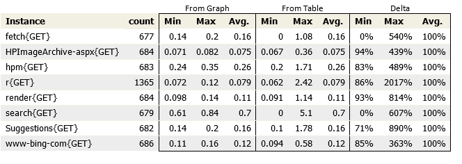
To demonstrate, I created a simple web test that uses the Bing Search page with the auto-suggest feature to drive load. The load test was set to run for two minutes with a constant user load of 10 users, typing in different search phrases. Think time was disabled. The results for the run are shown below
From Graph
The graph view in Visual Studio is a graphical representation of Perfmon data and is designed to give you an overview of the general behavior of the application under load. If you refer back to my previous post, you will see that the values used in the Perfmon graphs are gathered through sampling. Each data point stored represents a sampled value and may contain an aggregate of several values. Therefore, I consider the Perfmon data to be approximations (I do not know what algorithm Visual Studio uses to come up with the aggregate values reported on each sampling interval, but I will probably look into that soon).
From Table
Again, referring back to the previous post, you will recall that the data shown in the Tables is calculated using every actual value. This allows the table summaries to be accurate. Since every value is used to compute the summaries, you are guaranteed to get the proper value for the Longest, or the shortest, or the 90%, etc.
Why isn't this a bug?
In my next post, I will go into more details about how I use graphs for analysis and troubleshooting application issues, but for the moment I will say that the data in the views is used in completely different ways. In other words, the "Graph" view and the "Table" view serve very different purposes when analyzing results. Therefore, the way the data is gathered and presented reflects the "best" way to handle the needs of that particular view.
When does it usually occur?
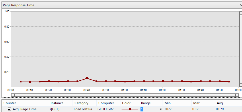
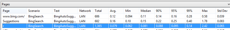
I tend to see larger variances on runs where the rate of page requests for specific pages far exceeds the sampling rate. This usually occurs when I run tests without any think time. It is also more likely to show up with pages that have much shorter overall response times. This is because any variance is more pronounced in the results and is easier to "smooth out" with sampling. I have attached the results from the run to this post so you can look at the data directly. Feel free to play with it yourself.