Typography Tip #3.
Changing the line spacing in your document can have a dramatic effect on the how your page will look, whether it’s a Microsoft Word document, a PowerPoint presentation or a Web page. The term ‘linespacing’ has now superseded what used to be known in typographic terms as leading. The visual results are the same regardless of the term used. Most Word processors, Web Layout programs, and all high-end Page Layout software will allow you to change the line spacing in your document.
What are the benefits of changing the linespacing? Does the software not know the best line spacing and set it automatically?
The answer is yes and no. All fonts have a built in default line spacing, and this is usually sufficient to produce a good looking page. However the default is not always perfect, and the amount of line spacing needed varies depending on the font you choose. For example the space between the lines may appear more open when the font used has a smaller x-height.
Try setting different values on some different fonts you use to see the difference it can make. In Microsoft Word you can do this by selecting the text you want to add the line spacing to, go to the Format menu – choose Paragraph and then look for the ‘Line spacing’ option. Word offers you a few choices here. ‘Single’ is usually the default. Next is ‘Double’. This type of line spacing is sometimes required in legal documents or term papers. I am unsure of the reasons for this, but I suspect it has more to do with how things were always done, than for reasons of improving the readability of the document. Students like it as it can turn a 5 page term paper into an impressive 10 pager.
The option in Word I prefer to use is the last choice, ‘multiple’. Setting this option allows for the line spacing always to be a multiple of the point size you are using, so changing the size of the text in your current document will not result in line spacing that is too tight. This option also allows for the finest control, and can be edited to be 1.1, 1.2, 1.3 etc.
Here is a sample of the font Georgia at 10 point, set with default Single linespacing and then set with the multiple option set to 1.2
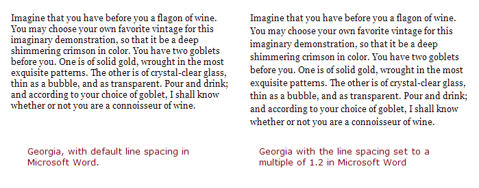
The difference here is quite dramatic and can open up the look of your document and make it more readable. Along with good margins and good letter spacing, appropriate line spacing can help towards the goal of making a page with much more even ‘typographic color’. In PowerPoint, following the same steps as above can help improve the line spacing in your presentation.
Mike
Edit: Update Image Reference