The Liquid Crystal Goblet
A lot of people take reading on a computer screen for granted. Most don’t even notice the type, while others may think (if it were even to cross their minds for a fleeting second) that its just fonts, they come with my PC, they just work, probably made by some automatic process. This is actually far from the truth, but if we are doing our job well, then it’s not a bad reaction. We don’t want you to notice the type, we want you to read it.
The title of my post refers to a famous essay written by Beatrice Warde, called The Crystal Goblet. Her call for clarity is just as important today for reading on computer screens. In future posts, I will go into more details, a behind the scenes look at the “black art” of making your fonts invisible.
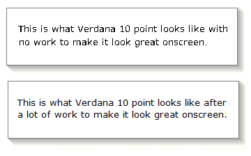
In the meantime, a picture speaks a thousand words!
btw. My name is Mike Duggan, from Dublin, Ireland, I have worked in the area of Screen Typography at Microsoft for about 15 years.
mike
Edit: Update Image Reference