Windows Phone Developer Tools Beta Released
It’s been a while since we released an update for those of you working on Windows Phone 7 projects! Well, wait no more! Today we’ve released an updated version of Expression Blend that supports all of the latest changes made to the Windows Phone 7 runtime along with some cool new features.
First, download everything you need below:
| Windows Phone Developer Tools (Beta) |
As you can see, you no longer need to download and install Expression Blend separately. You can just run the single Windows Phone Developer Tools installer and get Windows Phone variants of Expression Blend, XNA Game Studio, and Visual Studio for free.
Note
This version of Expression Blend installs and runs side-by-side with Expression Blend 4 and only supports working with Windows Phone projects.
New Features
As mentioned earlier, beyond supporting the changes made to the runtime since the last release, we’ve added a lot of new functionality that makes designing Windows Phone 7 applications easier. Some of the more notable features are described below.
Improved Design Time Previewing
Because your applications can be viewed in different orientations, themes, and accent colors, we’ve made it easier for you to visualize within Expression Blend what your application would look like.
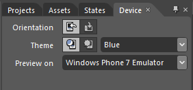
All of this functionality is exposed via the improved Device panel:
The Device Panel now provides you with easy access to preview between Landscape and Portrait orientations, Light and Dark themes, and Accent color.
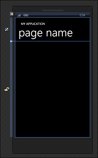
For example, here is a preview of what your application looks like in the default Dark theme:
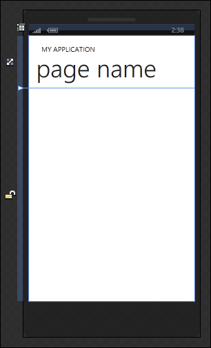
Clicking the Light theme button in the Device panel swaps out all of the dark theme resources to display the light theme variants of them:
This allows you to design and make sure that your applications look the way you want regardless of which light/dark mode the user has their phone in.
Preview Text Styles
Windows Phone 7 applications emphasize consistent use of text as a key design element. To make it easier for you to preview and apply existing text styles, we’ve added the ability to preview inline what a particular text style would look like:
Initial Application Bar Design Experience
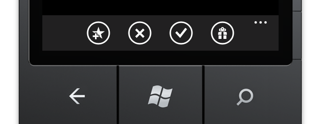
One of the unique and differentiating features found in Windows Phone 7 when compared to Silverlight and WPF is the Application Bar:
In this release, we have exposed a very early preview of our support for allowing you to design the Application Bar. You have the ability to create an Application Bar, add Application Bar Buttons, and add Application Bar Menu Items. Because Application Bar Buttons display a 48x48 PNG icon, you can specify your own icon or pick from a collection of icons we have provided for you:
A future blog post will go over in greater detail how to use what you have today to design a working Application Bar!
Easier Page Navigation
Because Windows Phone applications are very page centric, we decided to make navigating between pages easy. To navigate from one page to another, we exposed a Navigate To context menu:
This menu can be accessed when you right click on any element that you wish to start the navigation when clicked.
Updated FluidMoveBehavior
We have revised the FluidMoveBehavior to be on par with the improvements we made for Silverlight 4 and .NET 4. You can learn more about what this means by reading Kenny Young’s blog post on this topic.
Optimizing the On-screen Keyboard
Unlike Silverlight and WPF where a full keyboard for input is almost always guaranteed, Windows Phone users may not have that luxury when working on their phones. While a on-screen keyboard is available, given the size of the screen, having the full keyboard with all of the keys appear on-screen may not be ideal for all situations either. It may be helpful to users if the keys displayed were optimized for the type of information they would be entering at that particular moment.
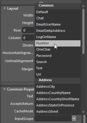
To address that need, we improved our support for the InputScope property on TextBox that allows you to specify what kind of data will be entered:
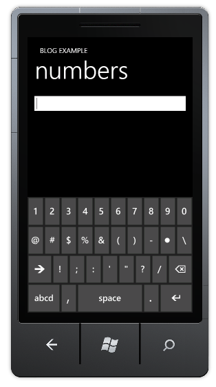
For example, if Number was selected for the InputScope on a TextBox, here is what the on-screen keyboard looks like when you focus on it on the emulator/device:
Notice that you are not seeing the traditional full keyboard. Instead, you are seeing a keyboard optimized only for numerical input.
As always, if you have any questions or feedback, please feel free to comment below or post on our forums.
Thanks,
Expression Blend Team
