Creating your Own Vista "Chrome" Style Button
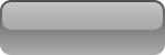
In this blog post I’d like to show a way to create your own “chrome” like button template that can be easily modified and used over and over again using Expression Design. This post is targeted for the absolute beginner, so if you've never tried using Expression Design before, this post should help you become familiar with it. What you should get by the end of this exercise is a button that looks like this:
So let’s begin:
Lets start by creating a rectangle on the art board, setting its width to 150 pixels and its height to 50 pixels:
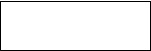
While you could use the adorners, you can more precisely use the Action Bar to set the width and height instead:

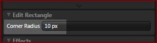
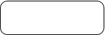
If you look at the final button shown above, you will notice that it has rounded corners. That means we need to make our rectangle have rounded corners also. Select your rectangle and modify its corner radius on the Properties Panel to 10px:
Once you have made your changes, your rectangle will now have curved corners:
Now we’ll add a gradient to our button. For the sake of simplifying things, we will use the default gradient swatch and make this button a silver (grayscale) button:
When you apply your gradient, your button will now look as follows:
As you can see, we have quite a bit of work to do before we have it looking nice! First, we’ll remove the stroke from the button by clicking on the stroke tab and setting it to none:
Setting the Stroke to none has the effect of removing the black outlines you see in your curved rectangle:
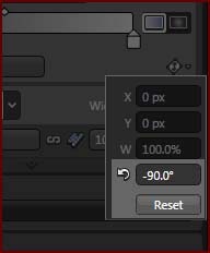
With the stroke gone, let's focus our attention on the fill. Notice that the gradient on the button pans from Left to Right. We want to change this so it pans from Top to Bottom. Using the gradient rotation angle tool, change the rotation angle to 270 degrees or -90 degrees as shown below:
Once you change the rotation angle for your gradient, your button will now look like what is shown in the following image:

Now that we have our smooth gradient, we’re ready to move on to the next step. The shine! Or what some might call the light layer, or what I like to call it, the Bling!
Copy your button object to the clipboard and use the PASTE IN FRONT feature from the EDIT MENU to place another copy on top. While on top we’ll make some adjustments to give it that look that we want.
Select your new button object and do the following:
- Return to the ACTION BAR and change your new objects width and height to (146x25). Your second button object becomes centered on top of the original.
- Also change the corner radius of your new shape to eight (8) pixels to give your new object smaller corner roundness.
- Nudge your object upwards to the top of your underlying object until it’s about 4 pixels away from the top of your underlying object. You might want to zoom in a bit to do this more precisely.
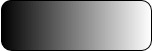
- Change the gradient rotation angle to 90 degrees. It should have been set to -90 degrees from copying and pasting from your underlying object.
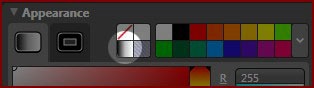
- Return to the properties panel. Replace the black gradient stop with the color white so that you have white on both ends of the gradient.
At this point, your button will look a lot different:

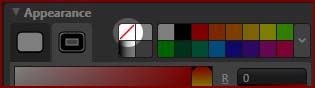
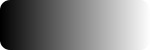
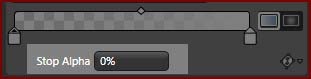
While still on the same gradient stop, change the Stop Alpha to 0%:
Boo-yah! Your button is now complete and should look like this:
Here is the trick. Click on the bottom object and try replacing the black gradient stop with any color you’d like and watch your button color Scheme change as you browse through the spectrum. You can even go further and experiment with more than two gradient stops.
Hint: You can make your button darker by increasing the midpoint of the gradient.
Here is the expression design file with some of the assets used in this tutorial: Download Chrome Style Button Design File
Have fun!
Sam Paye